OK, not "destroy" mirrors, but certainly make them less visible. Surely you can agree with that? I thought the video was as clear evidence as possible since I held the two coins side-by-side, but I'll try another one if you still don't get the point I'm trying to make...
I can pretty much guarantee you, if the dime was the size of the half, with the toning the dime has, the mirrors would be just as obvious as the half currently is. It's just that the flash will be off of darker surfaces.
My apologies, but I'm not sure of the point you're trying to make other than toned mirrors are not as flashy (or obvious?) as white mirrors? Darker surfaces do perhaps need a different tilt into the light to see the mirrors, but as my photos above show, if you tilt it right, you might just see some beautiful (and highly desirable) color come through.
All right, just to make you happy, I switched to comparing the toned proof dime with a non-toned proof Half Dime so you can't claim it's the size difference that makes the mirrors more (or less) visible:
zqzkqCiozvg
Yes, if you hold the dime in the just the right light at just the right angle, you can see some reflectivity. That doesn't change the fact that the reflectivity is not visible in most cases, however. And that was the only point I was trying to make. Not that toning "destroys" mirrors but that it makes the mirrors less visible.
Quote: I'm not sure of the point you're trying to make other than toned mirrors are not as flashy (or obvious?) as white mirrors?
Finally! Yes, that is my point. With a heavily toned coin, the mirrors are not as flashy or obvious, and my question was whether or not that matters to anybody (other than myself, of course). I'm not sure why you had to go on the whole "toning doesn't affect mirrors" tangent, to be honest, since it obviously does.
Barry, the obverse fields on that Barber dime have stunningly beautiful mirrors! Yes, the toning does affect the way the mirrors are visible but it does not actually affect the mirrors themselves. Light needs to reflect off a bit differently than a coin without toning. I would take that toned Barber over an untoned one any day of the friggin' week!
Quote: I would take that toned Barber over an untoned one any day of the friggin' week!
Glad to hear that! As for me, I just find the toning too dark to really appreciate the proof qualities of the coin and will probably end up "upgrading" at some point, even if it means finding a lower grade example.
Here are my current proof Barber coins. One of these things is not like the other:
I'd probably take the Dime over the Half too. In your first video, the half appears to have album slide marks on the neck and jawline. To ME that would be more distracting than some toning that obscures the reflectivity of the mirrors in certain light.
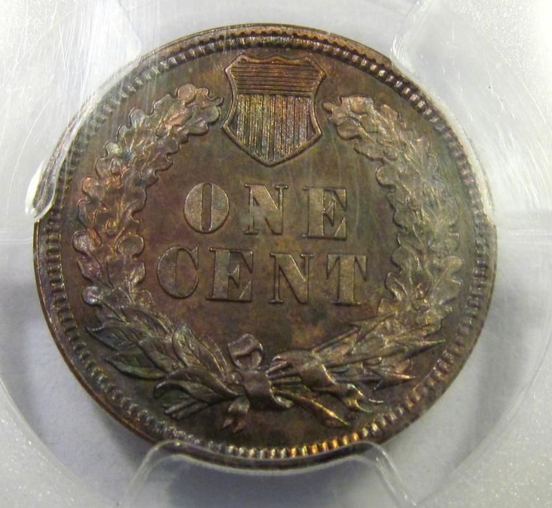
Yeah, my proof Indian Head cent is the other heavily toned proof coin that I'm not 100% crazy about:
If you catch the light just right, it looks like this:
Overall, however, the mirrors are not very visible and it could pass for just a very well struck MS example. I'm sure that Prethen and many others would find it to be beautiful, but I just wish it weren't so toned and had more obvious mirrors. When I go back to the annual coin show next year, I might bring both of these with me and see if I can swap them for less toned examples.
barryg - Oh gosh, those dime and cent coins are just ruined, yes ruined from the toning| Let me send you my address to take them off your hands - as a favor of course. I will even send you two nice new and bright dimes and two bright shiny cents so you will make a profit. I will dispose of the coins and end their misery and your worry in a respectful way. I'll just send you my address. For everybody else, nothing to see here at all - move along, these aren't the ones you're looking for.
Actually, if you hadn't guessed, I really like them as I do most toned older proofs
Quote: Actually, if you hadn't guessed, I really like them as I do most toned older proofs
I guessed...
Strangely enough, I do like toned coins and have many examples in my collection. I just feel that toning detracts from the thing that makes proof coins proof-like in the first place. For your edification, here's a toned non-proof dime from my collection that I would take any day over a "blast white" example:
Well, in that case, I should post my 1880 quarter. It has light toning, very reflective fields and looks like a cameo proof. It graded as an MS64+ circulation strike..... This coin is kind of on the line between a proof and circulation strike.
Yeah, I have no problem with light toning on a proof coin. It's really only the dark toning I have trouble with due to the fact that it makes the mirrors harder to see and makes the coin less flashy. Hard to believe that quarter isn't a proof!
Quote: Hard to believe that quarter isn't a proof!
Yes I know. Before I sent it in, I had it cataloged with my proofs. I sent it in to be slabbed as a proof coin also and was really surprised it came back as a circulation strike. There were so few quarters made in 1880 (all of the 1880s for that matter), I think that perhaps circulation strikes were sometimes struck with proof dies.... Though hard to see in the photos, even the recessed lines in the eagles shield are like little mirrors.
Disclaimer: While a tremendous amount of effort goes into ensuring the accuracy of the information contained in this site, Coin Community assumes no liability for errors. Copyright 2005 - 2026 Coin Community Family- all rights reserved worldwide. Use of any images or content on this website without prior written permission of Coin Community or the original lender is strictly prohibited. Contact Us | Advertise Here | Privacy Policy / Terms of Use