| Author |
 Replies: 19 / Views: 6,367 Replies: 19 / Views: 6,367 |
Page 2 of 2
|
|
|
|
Valued Member
France
285 Posts |
unfortunately I prefer pictures than real coin 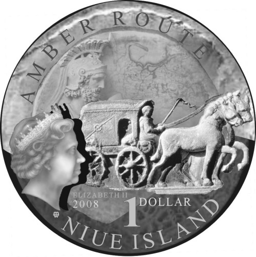  |
|
Valued Member
United States
64 Posts |
The illustration is pretty impressive, but I always prefer real pictures rather than design illustrations from the Mints. They often show 'intentions' instead of what ended up being actually minted.
This coin looks really good!
|
|
Pillar of the Community
United Kingdom
2217 Posts |
It's a very interesting coin but I'd like to know the mintage before I chose to pay any amount for a coin, even if it is rather novel! Hmm having seen the mintage figures I'd probably pay about 20 GBP for it, just to be safe  Edited by NumisMattyUk
07/01/2008 7:37 pm
|
|
New Member
United States
3 Posts |
hello people
How much of this coins ?
|
|
Pillar of the Community
Germany
1238 Posts |
Quote:
What has this amber and Kaliningrad got to do with Niue? If somebody can demonstrate a definite connection between the two the coin would be more interesting.
Cannot offer you any explanation other than that some major coin dealer probably made a deal with Niue - "let us produce and sell that piece in your name, and we'll share the revenue". But you can always try and get the "real" piece - the Polish 20 zl Amber Route coin from 2001:   Christian |
|
Pillar of the Community
Poland
3201 Posts |
Ugh the Polish mint has been producing lots of this ugly stuff recently. For some other countries too. I can stand well colorized coins (not having all possible colors added) but this..  makes me think of starting a topic called "ugliest coin design". Or is there such a topic already? |
|
Pillar of the Community
Germany
1238 Posts |
In the case of that coin from Poland, the issuing country does at least have something to do with what is depicted. Some of the recent Polish coins are stunning, but I am glad they do not include such gimmicks every time.
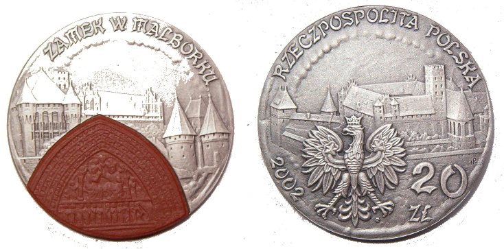
When I first saw that 2001 Amber Route coin, I found it cool - but only a year later they issued another coin with a piece of amber ... for the 2002 FIFA World Cup. Hmm. And I have mixed feelings with regard to the 2002 Malbork coin - the tympan in reddish ceramics (not sure what material that is) looks very interesting. But it could have been done in silver, like the rest of the coin, and the piece would still look good.
Christian
|
|
Pillar of the Community
Poland
3201 Posts |
The 2002 20 z³ Malbork is exactly the one that comes to my mind when thinking of something I wouldn't want to have in my collection.
I agree, even though the thinking Amber Route theme -> amber in coin is obvious, the FIFA -> amber is dubious.
|
|
New Member
United States
3 Posts |
|
|
New Member
United States
3 Posts |
|
|
Pillar of the Community
Poland
3201 Posts |
|
|
Pillar of the Community
United Kingdom
2934 Posts |
Yes there are some odd ones from Poland - Here is one of mine with a porcelin insert - representing a stained glass window Image:  poland20.jpg poland20.jpg77.24 KB Edited by Bacchus2
07/24/2008 12:34 pm
|
|
Pillar of the Community
Germany
1238 Posts |
Yep, that is the Malbork coin that DL20K and I mentioned before. Does not look bad, but had they made the tympan from the same material as the rest of the coin, it would still look very good. Well, maybe they got the attention of more collectors this way ...  Christian |
|
Pillar of the Community
Poland
3201 Posts |
Yeah, that's the one. Anyway, you've at least got a coin whose value is rising (I suppose). I prefer traditional ones as I mentioned many times, although I have one colorized coin and I like it.
|
|
Pillar of the Community
United Kingdom
2934 Posts |
I really don't go much for modern coins of any type - but I picked this up mainly because of the typeface used -- I really like that 1930' gothic style on coins -- German ones have it as wall as some of the other countries of the area.
Malcolm
|
|
Page 2 of 2
|
Replies: 19 / Views: 6,367 |
Page 2 of 2
|








 First Page

 Posted 07/01/2008 6:47 pm


 poland20.jpg


