| Author |
 Replies: 20 / Views: 2,266 Replies: 20 / Views: 2,266 |
Page 2 of 2
|
|
|
|
Bedrock of the Community
United States
36782 Posts |
Dark toning hurts the eye appeal in my opinion. Rainbow and bulls eye are much more appealing.
Edited by IndianGoldEagle
03/24/2024 12:02 pm
|
|
New Member
Canada
13 Posts |
I enjoy toning, I feel the way to make metal worth more than its weight is to make it a piece of art, to make art worth more it just needs to be a one of a kind and toning does that to coins. IMO
As for this specific coin, I don't mind the toning but the finger print kind of ruins the over all experience
|
|
Pillar of the Community
Canada
9162 Posts |
No I don't like that kind of toning.
|
|
Pillar of the Community
 Canada
1766 Posts |
 As well, the finger prints are a spoiler.  I have a couple of 1973 dollars that are toned, due mostly to the RCM double dollar packaging. (certainly ruined the specimen cents) Edited by Sharks
03/24/2024 1:58 pm
|
|
Pillar of the Community
Canada
1505 Posts |
Depends on the toning. There is attractive toning that enhances the coin and toning that detracts. I suspect this one looks much nicer in hand than the pics show. Assuming nice redish/blueish/purplish colors, which is common in coins from those cases.
|
|
Bedrock of the Community
 United States
10563 Posts |
Quote:
Is this coin ugly Yes.........Ugly, Dark, Fingerprint! |
|
Bedrock of the Community
United States
10563 Posts |
Quote:
I just checked the bay for comparisons and the horse is facing right? The horse is facing left........... 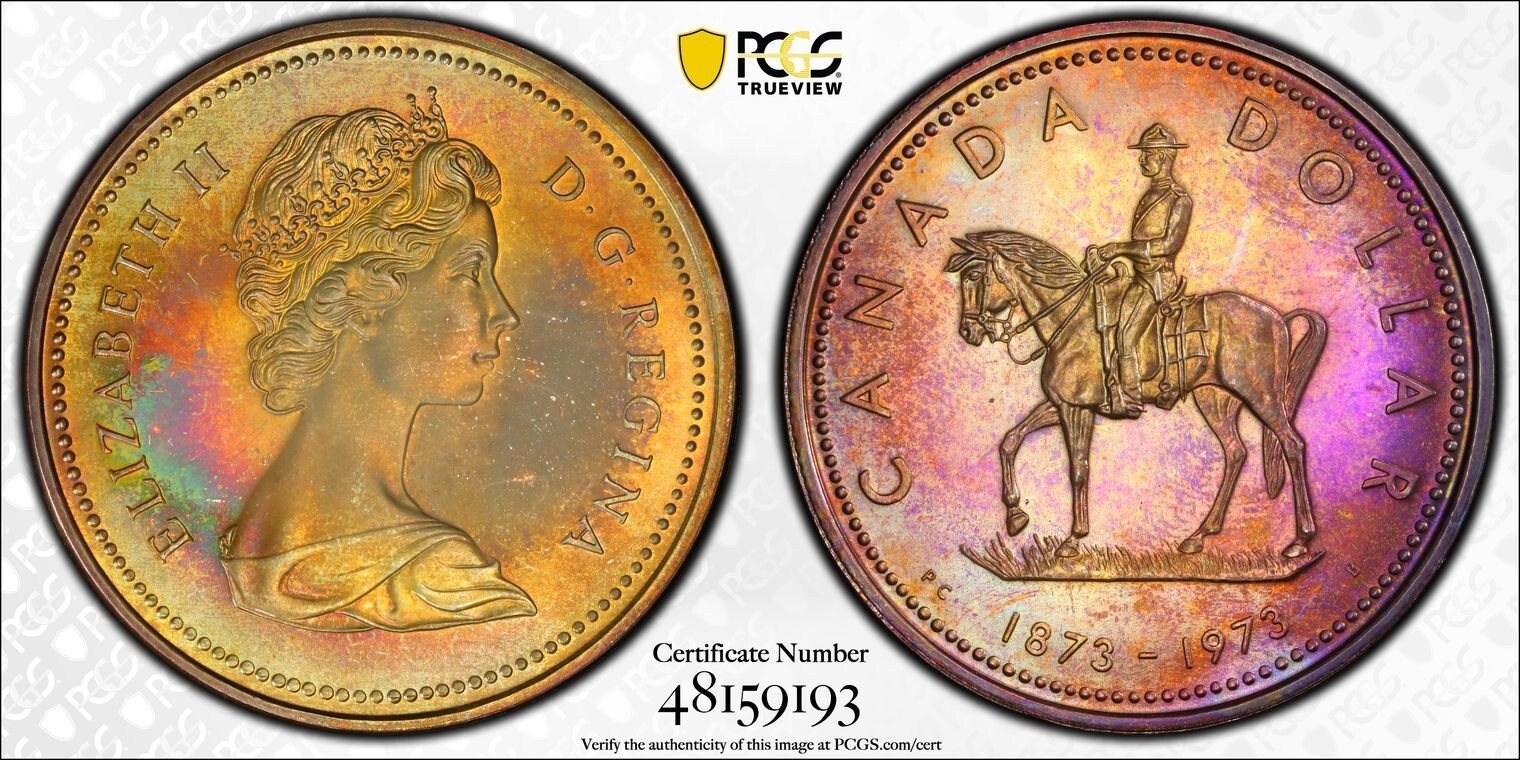 |
|
Bedrock of the Community
United States
94367 Posts |
|
|
Pillar of the Community
United States
2703 Posts |
It's a beautiful piece with a lot of character.
I would soak it in verdecare for about 12 hours to lighten it up ever so slightly.
AU-53
|
|
Moderator
United States
56855 Posts |
The OPs' coin is facing left, the ones on the bay are facing right and the date is in a different spot as well.There must be different varieties. John1  |
|
Bedrock of the Community
United States
10563 Posts |
Quote:
The OPs' coin is facing left, the ones on the bay are facing right and the date is in a different spot as well.There must be different varieties. Interesting - can you post a picture of the facing right variety? |
|
Pillar of the Community
Canada
1766 Posts |
On the 1973 Canadian commemorative quarter the horse is facing right, on the 1973 commemorative specimen silver dollar it is facing left. There are other differences as well (¢25 Mountie holding lance, etc.)
Edited by Sharks
03/25/2024 1:54 pm
|
|
Moderator
United States
56855 Posts |
Thanks John1 |
|
Valued Member
United States
467 Posts |
The fingerprint kills it for me. But, if you like it, that's all that matters.
|
|
Valued Member
United States
104 Posts |
Toning gives each coin a unique personality. Some of my favorites have the cameo effect.
|
|
Page 2 of 2
|
Replies: 20 / Views: 2,266 |
Page 2 of 2
|


