I was reading a report recently and came across the following regarding the 1959
Lincoln Cent:
Many people snapped up the new pennies as "collector's items," particularly following a news story pointing out the small "o" used in "THE UNITED STATES oF AMERICA" as an error at the Mint. This impression was quickly corrected by artist [Frank] Gasparro who said that the small "o" was not done in error but rather had been done deliberately to give design appeal to the lettering on the penny. Citing precedents for the lowercase letter, such as the Franklin half dollar, the Liberty Walking half dollar, the Peace dollar, and several commemoratives, he said, "I did it to break up the pattern." 1959 Lincoln Cent, Memorial Reverse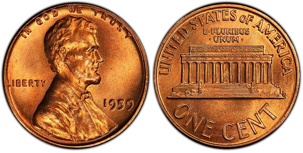 (Image Credit: Image courtesy of PCGS CoinFacts, http://www.PCGS.com.)
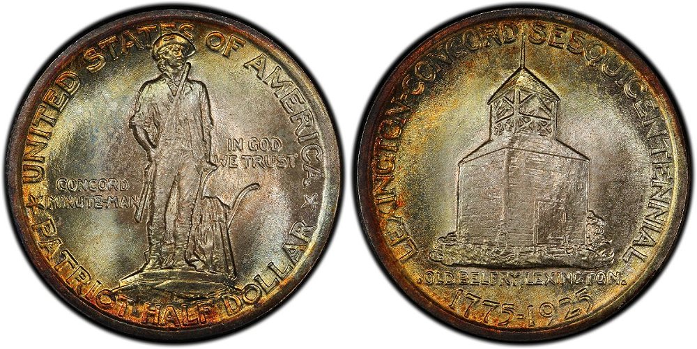
Of course, this got me thinking about to which US commemorative coins Gasparro was referring. I had noticed the same design feature on the 1925 Lexington-Concord half dollar, but couldn't immediately recall which others had the same design trait. So, it was off to my library for a bit of quick image review!
One thing that became apparent when reviewing the lettering on early US commemorative coins is the fact that the lettering was created by hand and so slight variations in letter height exist (I've briefly discussed this previously:
Typeface Used On Norse Medal.). So, to be included on my list, the coin in question had to display an obvious, intentional difference in font size for the "O" vs. the "F" in "OF" to qualify. In short, I wanted to identify coins that seemed as if the artist was "sort of" presenting the "OF" in lowercase vs. the uppercase lettering used for the other words.
Here's what I came up with:
1925 California Statehood 75th AnniversaryThe "O" is smaller and vertically centered vs. the "F" in "UNITED STATES OF AMERICA" on the coin's reverse.
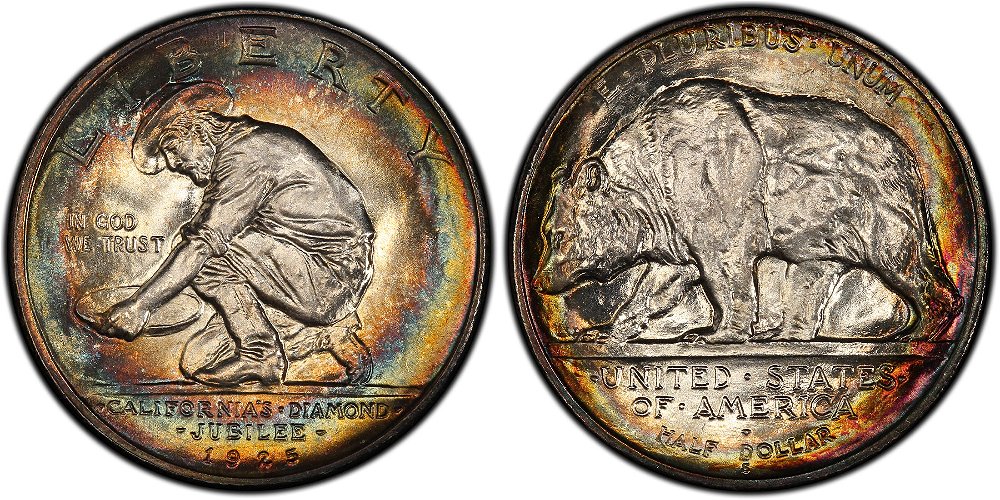 (Image Credit: Image courtesy of PCGS CoinFacts, http://www.PCGS.com.)1925 Lexington-Concord Sesquicentennial
The "O" is smaller and slightly above the baseline for the lettering in "UNITED STATES OF AMERICA" on the coin's obverse.
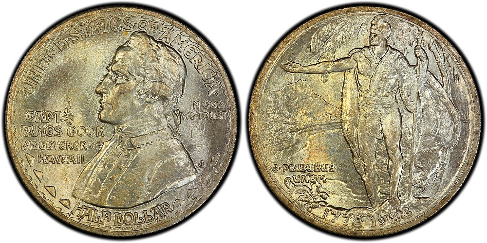
 (Image Credit: Image courtesy of PCGS CoinFacts, http://www.PCGS.com.)1928 Hawaiian (European) Discovery Sesquicentennial
The "O" is definitely smaller than its surrounding letters in "UNITED STATES OF AMERICA" on the coin's obverse. Also, due to the font style used, the arms of the "F" in "OF" are connected/closed off causing the letter to look more like a "P" than an "F" - the observer "sees" the letter as an "F" due to its context.
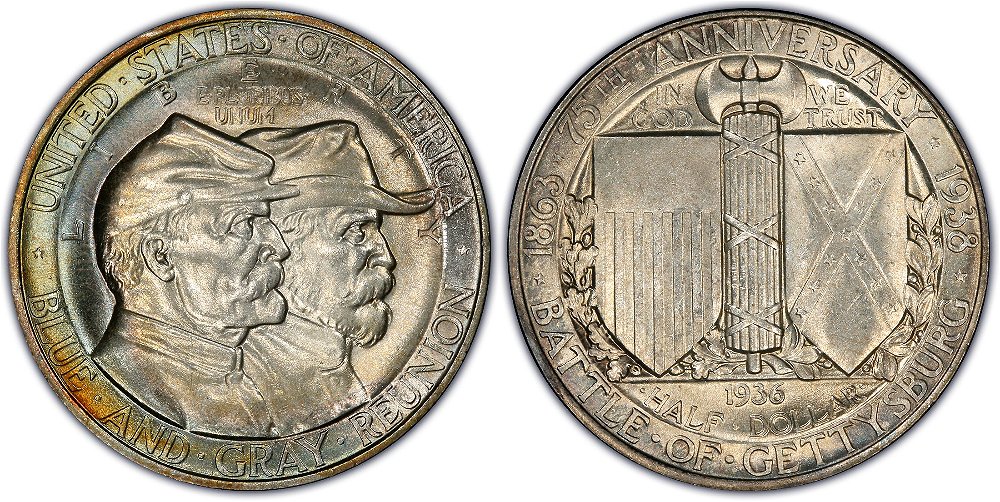
 (Image Credit: Image courtesy of PCGS CoinFacts, http://www.PCGS.com.)1936 (38) Battle of Gettysburg
The "O" on the Gettysburg is slightly smaller than its surrounding letters in "UNITED STATES OF AMERICA" on the coin's obverse. Though slight, the difference is enough for me to think that it was intentional.
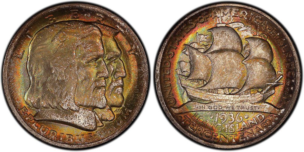
 (Image Credit: Image courtesy of PCGS CoinFacts, http://www.PCGS.com.)1936 Long Island Tercentenary
The "O" on the Long Island coin is definitely smaller then the surrounding lettering in "UNITED STATES OF AMERICA" - the legend is the coin's reverse.
 (Image Credit: Image courtesy of PCGS CoinFacts, http://www.PCGS.com.)
After reviewing the designs of all of the classic-era commemorative coins, I feel safe in saying that the
Lincoln Memorial cent has a more pronounced disparity between the "O" and "F" vs. what is seen on the commemorative coins I identified.
Note: I realize that this type of dive into the design trivia of early US commemorative coins is not for everyone, but I think it helps enhance a collector's appreciation of the artist's design approach for these pieces. I hope that the post has found a few interested eyes!


