| Author |
 Replies: 32 / Views: 1,249 Replies: 32 / Views: 1,249 |
|
|
|
Pillar of the Community
Canada
9286 Posts |
Yep pics look good, the only thing I see is the Canadian Dollar looks small compared the cent and nickel you have , try to use the same editing on all coins.
|
|
Pillar of the Community
United States
587 Posts |
But, mcshilling, the ground rules say to eliminate unnecessary background when cropping. If they're all cropped to scale, the Cent would have a lot more uncropped background than the Dollar.
|
|
Pillar of the Community
 United States
5695 Posts |
Quote:
the ground rules say to eliminate unnecessary background when cropping That's true, but in this case the dollar coin has more space around it than the other coins, making the coin look smaller. I would try to keep the same amount of space around all edges for every coin. You could also use the straightening tool in GIMP on images that are rotated to give a more finished look. Also, I would second @HondoB's suggestion to place the coin on top of a small disk to raise it off the background (smaller diameter than the coin). This encourages the focus to stay on the coin rather than jumping into the background. But great job with the photos, they look excellent! |
|
Pillar of the Community
Canada
9286 Posts |
I like Zurie explanation he said it better than I did, thanks.
|
|
Valued Member
 Canada
167 Posts |
Thanks folks! I will plan to crop my images the same from now on. I'm sure I can work with the straightening tool in GIMP but my question is what feature on the coin should I use for alignment - main design feature? date? coin dependant?
I did try using a small pad maybe 1/8th inch thick smaller than the coin to lift the coin for some of the images but then I saw a shadow I couldn't seem to get rid of with positioning things so then I just laid the coin on a paper background printed with 18% gray which I saw somewhere as a good background choice. I see the point though and perhaps that might have explained some of my focus issues. I'll be mindful of that.
One other thing I've been wondering about is image resolution and the effects of image manipulation (scaling, lossy compression, etc). Ultimately, I think you want a result that fairly captures the visual aspects of the coin as well as the actual design detail to a level that allows you to grade or inspect details on the coin and not of the image.
Edited by lahave56
05/20/2026 10:05 am
|
|
Pillar of the Community
United States
5695 Posts |
Most of the time the date or other horizontal words should be straight, but sometimes you just have to eyeball it, like the obverse of the Jefferson nickel. I would try raising the coin at least an inch off the surface to avoid distracting focusraising it just 1/8 inch might actually make the problem worse. |
|
Valued Member
Canada
167 Posts |
Thanks Zurie - I'll find something to raise the coins up higher then. I guess I was focusing more on a nice image than orientation yesterday. Normally I try to set the coin up to make rotation less necessary.
|
|
Pillar of the Community
United States
6661 Posts |
If you are having focus problems, there are a number of free camera apps that provide manual focus. I use Yamera. I had the same problems getting my iPad to focus correctly. Now I just tap to get an approximate focus and lighting exposure, then switch the focus to manual for fine adjustments. It works fine for basic coin photos.
|
|
Valued Member
Canada
167 Posts |
Took a few more photos today trying suggestions from Zurie and Brandmeister. Results below using just the "proof" Jefferson as well as a pic showing the 1.5 inch lift I was able to give the coin Although I don't see a difference in focus in this case I still think Zurie's point is correct. The Yamera app is cool but sitting in a chair I can't get up high enough to effectively manipulate it so I went with the auto setting which seemed pretty good. As an aside I'm getting better at using GIMP. It' a powerful tool but maybe not for everyone. Cheers! 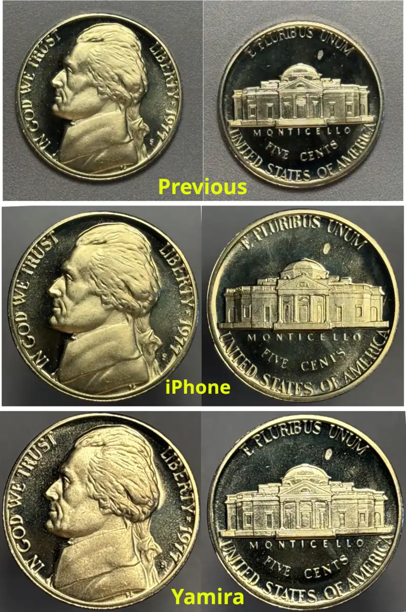 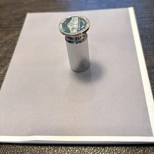 |
|
Moderator
 United States
191400 Posts |
Quote:
As an aside I'm getting better at using GIMP. It' a powerful tool but maybe not for everyone. Excellent!  It is always on my Linux machines and was my program of choice at one time. However, now I prefer Paint.net for Windows, which I know does not help you on Mac, but I always feel compelled to mention it.  |
|
Valued Member
Canada
167 Posts |
Quote:
not help you on Mac jbuck turns out I'm a Windows user and only use iOS on the iPad and iPhone. I spent a good part of my life using Unix and then Linux (RedHat) and still use GNU emacs from time to time. The good old days. Retired now and living the life. I'll check out Paint.net |
|
Pillar of the Community
Canada
9286 Posts |
That Yamira pic is the best one, congrats.
I'm with jbuck on the use of Paint.net tried others and I think it is the best.
|
|
Bedrock of the Community
United States
26204 Posts |
lahave, latest pics look great! I'll be coming to you for help now!
Inordinately fascinated by bits of metal with strange markings and figures
|
|
Valued Member
Canada
167 Posts |
Quote:
I'll be coming to you for help now Funny one! We'll keep working at it but I sure appreciate all the suggestions. Thanks! |
|
Moderator
United States
191400 Posts |
Quote:
jbuck turns out I'm a Windows user and only use iOS on the iPad and iPhone... Ah. The forum user list shows the Apple and Safari icons for you, but I must have misidentified the icon that shows phone or desktop. They all kinda run together in the list.  Quote:
I spent a good part of my life using Unix and then Linux (RedHat) and still use GNU emacs from time to time. The good old days. Retired now and living the life. I may get there eventually. Quote:
I'll check out Paint.net Excellent! |
| |
Replies: 32 / Views: 1,249 |


