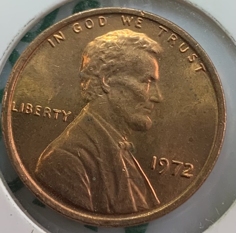
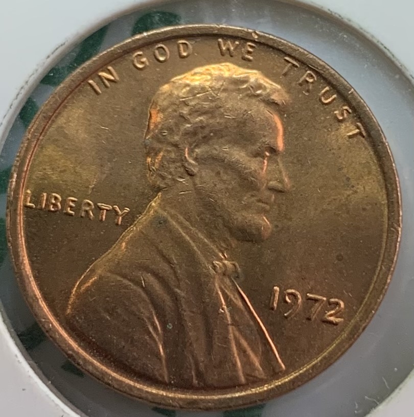
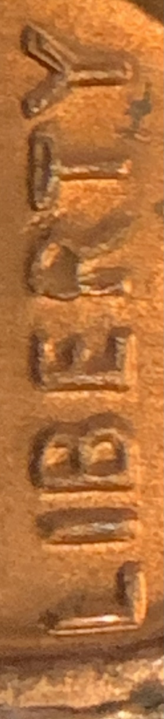
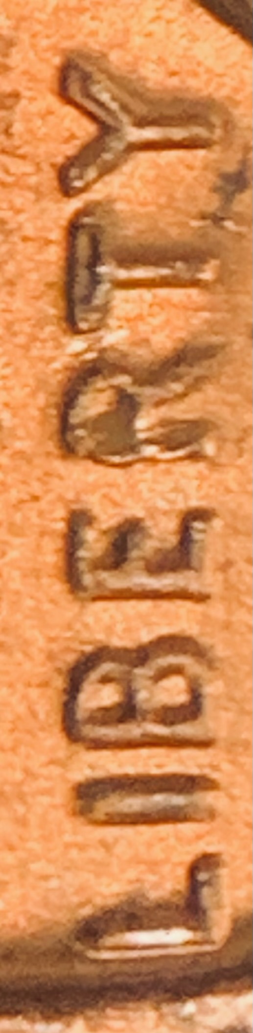
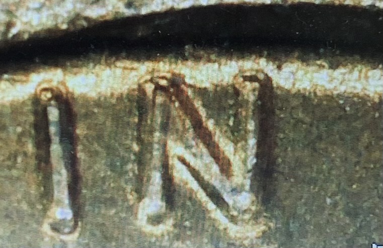
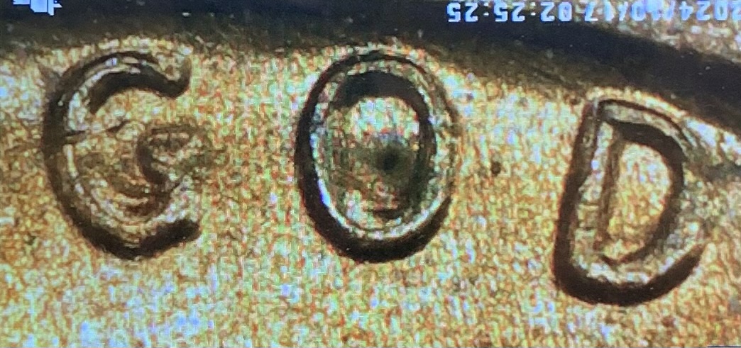
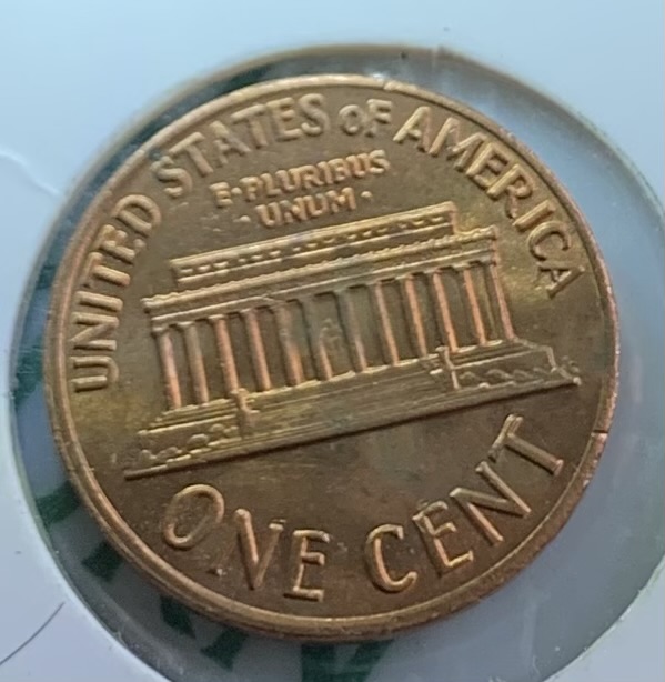
Hello all, I hope someone can help me, I need an explanation as to what process would cause these lettering, I think it's some sort of Machine Doubling but what type, if I can get a link to direct me to learn more , that would be very appreciated, thanks
Please no more photos of your screen. There are many types of doubling we all need to learn,here is a link to bookmark and study...click on thumb nails to enlarge:https://koinpro.tripod.com/Articles...Doubling.htm Also best to remove coins from holders before taking pics whenever possible. John1
Disclaimer: While a tremendous amount of effort goes into ensuring the accuracy of the information contained in this site, Coin Community assumes no liability for errors. Copyright 2005 - 2026 Coin Community Family- all rights reserved worldwide. Use of any images or content on this website without prior written permission of Coin Community or the original lender is strictly prohibited. Contact Us | Advertise Here | Privacy Policy / Terms of Use









 Posted 10/17/2024 3:55 pm


