| Author |
 Replies: 209 / Views: 24,539 Replies: 209 / Views: 24,539 |
|
|
|
Valued Member
United States
359 Posts |
I'm throwing my hat into the ring.  I decided to incorporate key elements from this site into my design. This community has been so great to my success and enjoyment of the hobby. I wanted my submission to reflect what our family here means to me (and hopefully to the rest of you). The obverse stays true to the classic typeset of the "Coin Community Family" logo. It includes the founders' tagline and calls out four key values I think of when I think of our community: History, Knowledge, Facts, and Trust. I also added the year of mintage. The reverse pays homage to the "CC" logo we see every time we visit the site. It references the web address and notes the year of establishment. This side also features a wreath, giving a head nod to to some of the most classic and beautiful coins. I look to Mom, Dad, and the mods to approve the actual wording (especially the key values). I hope you all enjoy my prototypes! {Edit: I added an alternate look to my designs per a suggestion. If I'm honored by winning, we can all obviously tweak things to get a group consensus!} 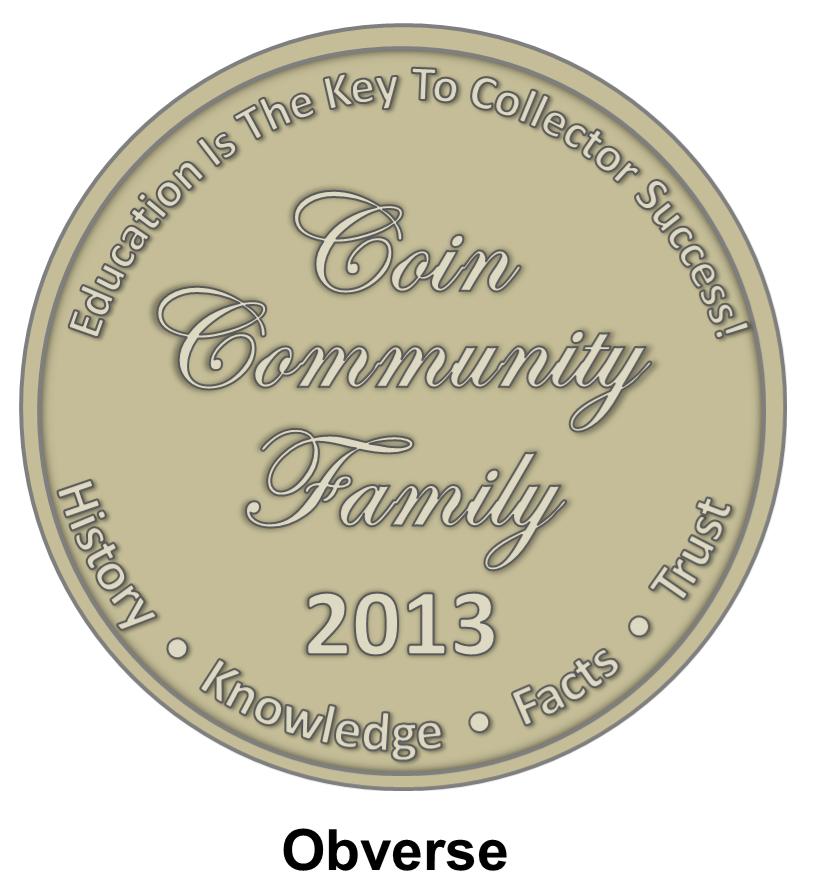  Some alternate tweaks to the above design: 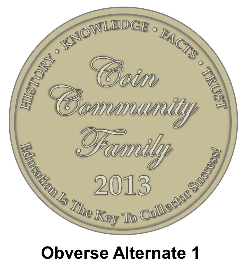 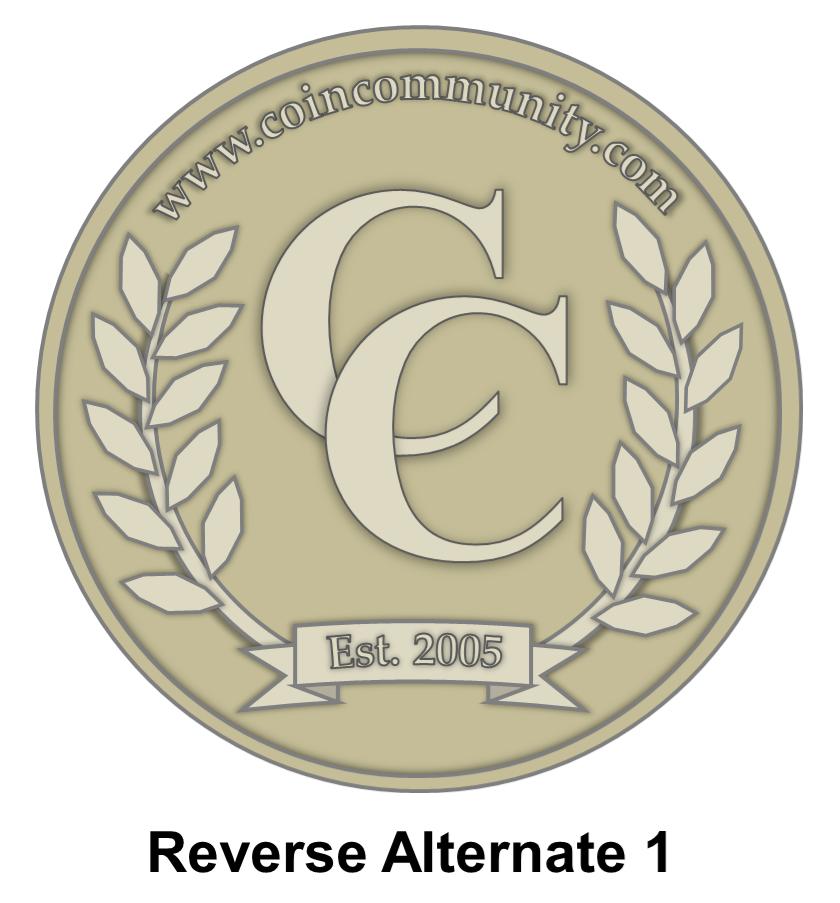 Another alternate obverse in case we don't want to have the date of issue. We could add eight stars as a reference to the number of years CCF's been around at the time of this medallion's design? Or we could add ten stars just because it looks more balanced to my eyes than eight.  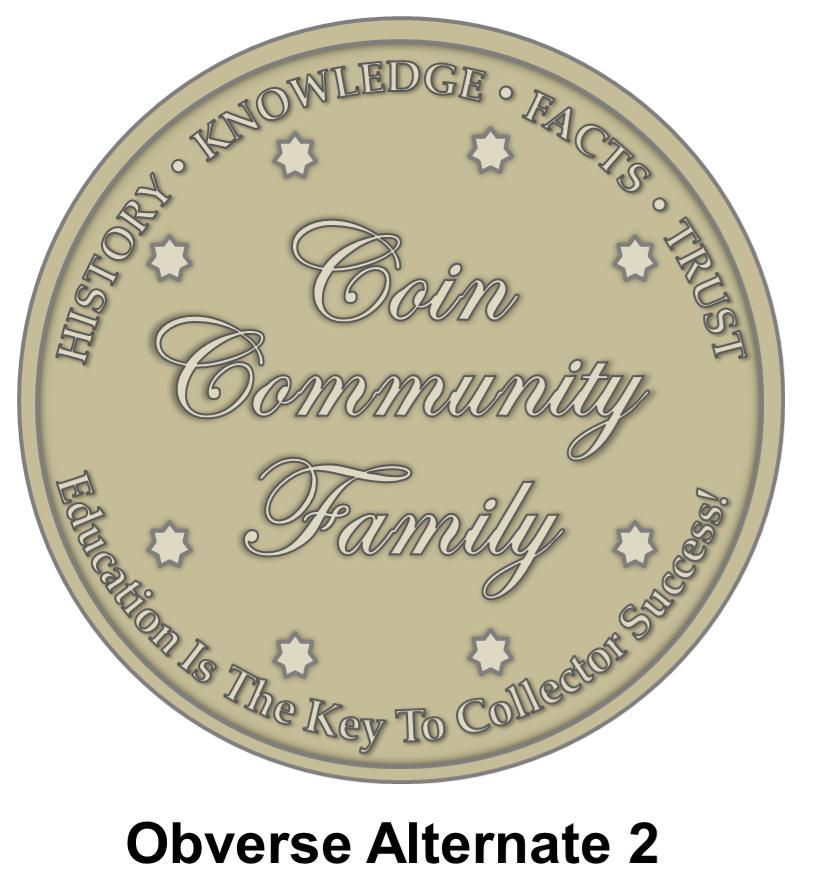 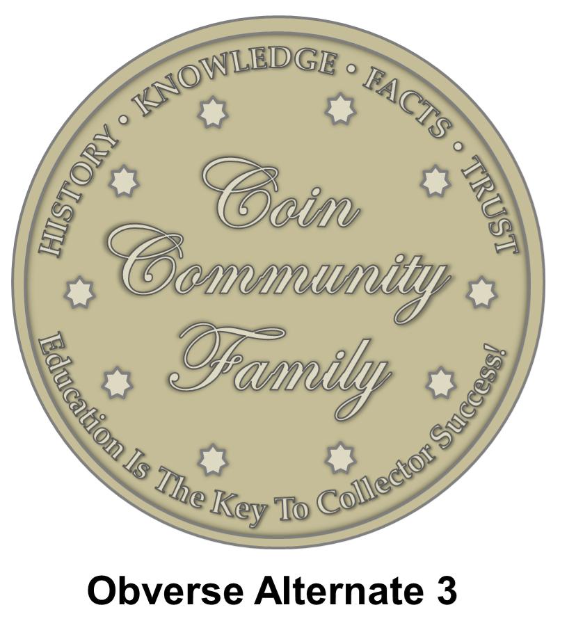 Edited by cheezyfryes
03/12/2013 2:48 pm
|
|
Pillar of the Community
Canada
3167 Posts |
|
|
Valued Member
United States
359 Posts |
(Note, maybe you'd want to remove the year of mintage of this is intended to be an ongoing promotional item for the community.)
|
|
Pillar of the Community
United States
1088 Posts |
Great design! That looks really nice.
|
|
Pillar of the Community
United States
648 Posts |
Wow! Some great designs being posted. Gonna be hard to vote.
|
|
Pillar of the Community
United States
1195 Posts |
Great prototype Cheezy!
Some changes I would make:
1) serif font on the obverse text around the rim.
3) Arc "HISTORY * KNOWLEDGE * FACTS * TRUST" (all caps) goes on top, "Education is the key to collector success!" on bottom
|
|
Valued Member
United States
359 Posts |
Thanks, agrentum. I edited my original post with an alternate design with those tweaks for everyone's review.
|
|
Pillar of the Community
United States
1432 Posts |
cheezy ... great work. I took your alternates and dropped the date. Just thinking that if the forum has these made to give out at events it would be more cost effective to not have to mint a new series every year. I would definitely carry one of these with me at all times. 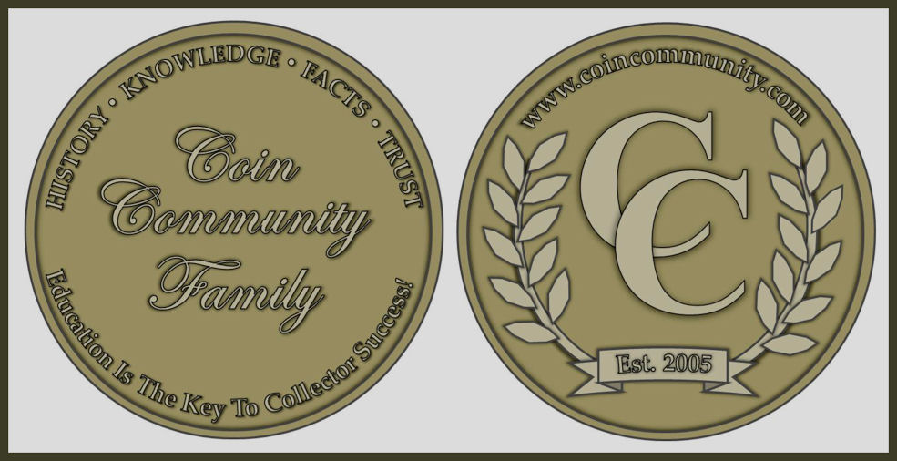 |
|
Valued Member
United States
359 Posts |
I threw a couple more Obverse alternates into my original post.
Edited by cheezyfryes
03/12/2013 2:48 pm
|
|
Pillar of the Community
  United States
5953 Posts |
An idea for the Reverse. I am limited to windows paint out here so its a little hard to layout. 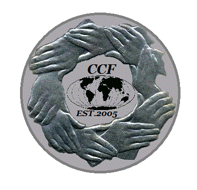 |
|
Pillar of the Community
United States
524 Posts |
Thought I would give it a try. Obverse then Reverse  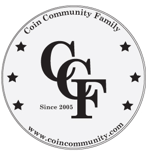 |
|
Pillar of the Community
United States
8517 Posts |
Good idea NoHope, Thing and his cousins on the reverse !
Oregon coin geek.....*** GO BEAVS ! ! ! ***
|
|
Pillar of the Community
United States
2480 Posts |
Quote:
Good idea NoHope, Thing and his cousins on the reverse !  duh duh duh duh (snap snap) Some really great designs already. Hmm, wonder if there is a free CAD program online, I have an idea worth rendering... |
|
Pillar of the Community
United States
655 Posts |
ThisIsFun, check out SnapFiles, you'll find some pretty good freeware at that site. Although it isn't a CAD program one of my favorites is PhotoFiltre.
|
|
Pillar of the Community
United States
1088 Posts |
What program does everyone use to make their designs?
|
| |
Replies: 209 / Views: 24,539 |


