| Author |
 Replies: 209 / Views: 24,543 Replies: 209 / Views: 24,543 |
|
|
|
Pillar of the Community
Canada
3167 Posts |
|
|
Valued Member
United States
359 Posts |
{EDIT: UNDER REDESIGN GIVEN THAT ONE SET OF DIES WILL BE USED REGARDLESS OF METAL CONTENT, WILL SUBMIT NEW DESIGNS WITHOUT METAL CONTENT WORDING SOON}
Edited by cheezyfryes
03/18/2013 5:07 pm
|
|
Pillar of the Community
United States
3486 Posts |
I want to make something clear:
My design is intended to be struck in Aluminum (or anything cheaper) and passed out at coin shows.
No mention of 2013 since I want this token to be producable indefinitely.
I am not a designer.
|
|
Pillar of the Community
  United States
5953 Posts |
cheezyfryes great designs but there will only be one set of dies regardless of the metal the tokens are minted from. The dies will be used to initially produce copper tokens withe the possibility of future runs in silver.
|
|
Pillar of the Community
United States
2480 Posts |
I want so badly to sketch up a design but really need to do it with modeling software (3d) or at least a vector illustrator and wow, that's some complicated stuff to learn. Been meaning to become familiar with that type of software though so maybe I can do it in time for this project. Some good designs have been posted already, especially cheezyfryes' offerings.
|
|
Valued Member
United States
359 Posts |
Quote:
cheezyfryes great designs but there will only be one set of dies regardless of the metal the tokens are minted from. The dies will be used to initially produce copper tokens withe the possibility of future runs in silver. Oh, so that means we shouldn't stamp the metal content on there. Back to the drawing board... |
|
Pillar of the Community
United States
5953 Posts |
Correct additional dies for each metal would be prohibitively expensive. Edge lettering is a possibility.
|
|
Valued Member
United States
359 Posts |
Alrighty, here are my final-for-now submissions to the design contest!  I changed all text to caps. I also reverted to the eight-star motif to maintain homage to the eight years of CCF. I added an optional world picture as a reverse background to reflect our worldwide membership base. The other design rationale remains from my original prototypes: Quote:
I decided to incorporate key elements from this site into my design. This community has been so great to my success and enjoyment of the hobby. I wanted my submission to reflect what our family here means to me (and hopefully to the rest of you).
The obverse [or reverse] stays true to the classic typeset of the "Coin Community Family" logo. It includes the founders' tagline and calls out four key values I think of when I think of our community: History, Knowledge, Facts, and Trust. I also added the year of mintage.
The reverse [or obverse]pays homage to the "CC" logo we see every time we visit the site. It references the web address and notes the year of establishment. [One option] also features a wreath, giving a head nod to to some of the most classic and beautiful coins.
I look to Mom, Dad, and the mods to approve the actual wording (especially the key values). I hope you all enjoy my prototypes! Final font and design element size/shape/position are subject to change in order to create a workable planchet die. This has been a lot of fun!   |
|
Pillar of the Community
United States
3453 Posts |
Man, I can't wait to vote!  |
|
Pillar of the Community
United States
5953 Posts |
All in good time
I want no one to say that they were not given enough time to submit a design
|
|
Pillar of the Community
United States
3453 Posts |
Ok, two popcorns then! |
|
Pillar of the Community
Canada
3167 Posts |
Well, here they are (for now). They are kinda boring (for now). If I get a chance (aka more time in life) I will revise them or try something else...  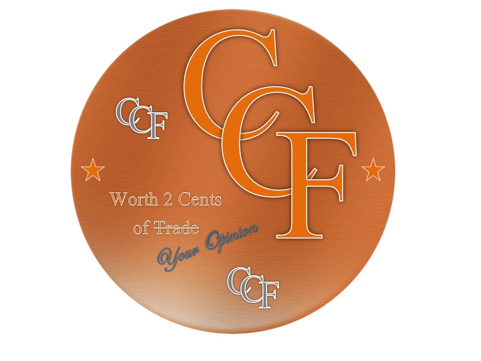 |
|
Pillar of the Community
United States
1660 Posts |
As long as it has Arrows & Rays  |
|
Pillar of the Community
United States
5953 Posts |
|
|
Pillar of the Community
United States
1080 Posts |
Here's a new version of my reverse design. I felt like the medal was too Amero-centric (though I tried to make the major lines on the work map travel through Great Britain, China, Australia, and Canada instead of the US). This reverse includes a list of world currencies printed in the space around the window. (A much more contemporary element than the rest of the medal's design -- inspired by the Dutch architecture commemorative 5 euro.)  Edited by specksynder
03/18/2013 10:08 pm
|
| |
Replies: 209 / Views: 24,543 |


