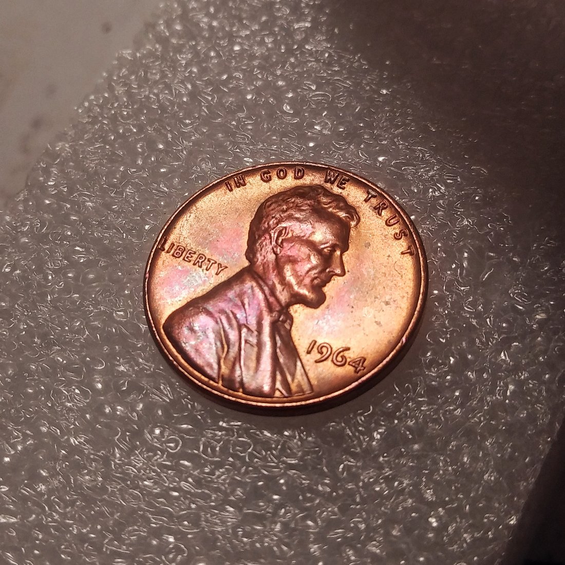
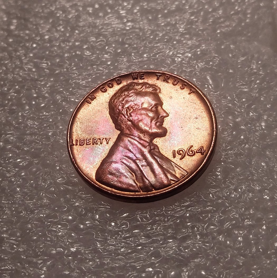
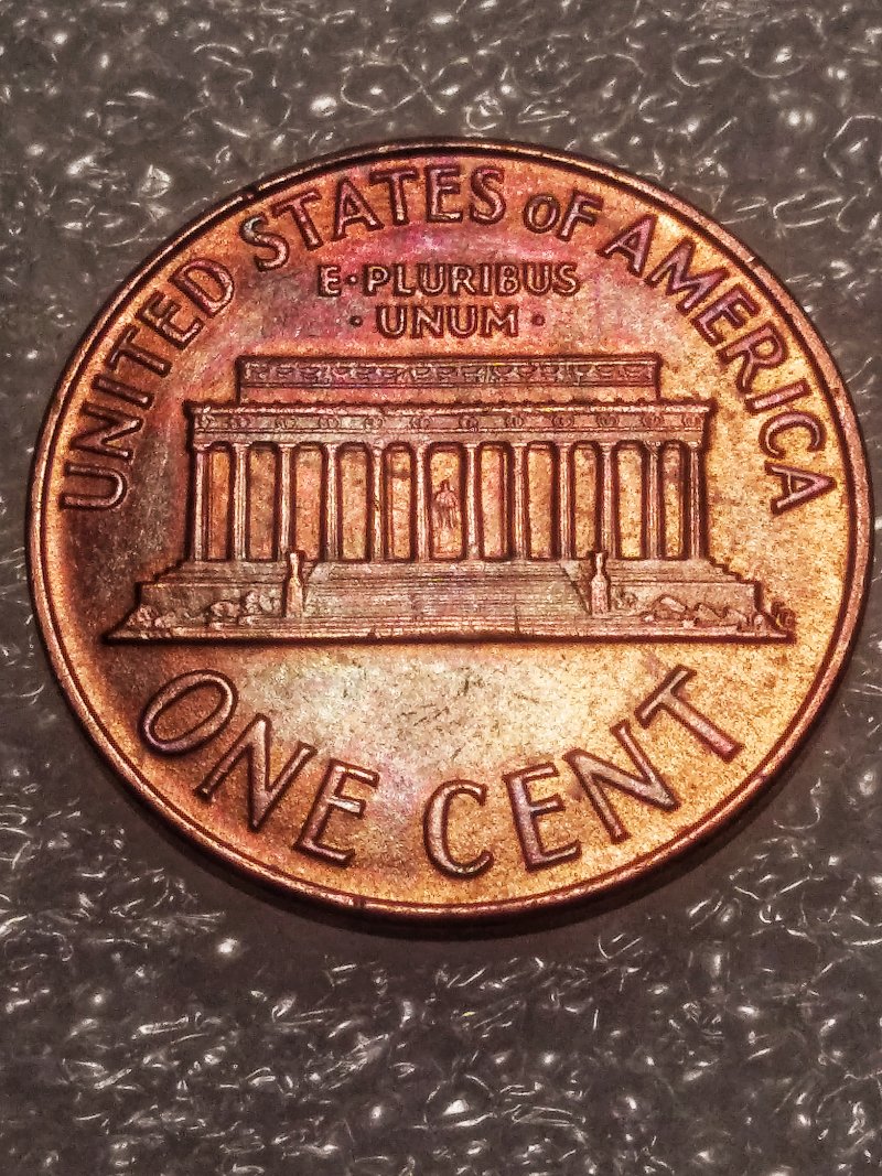
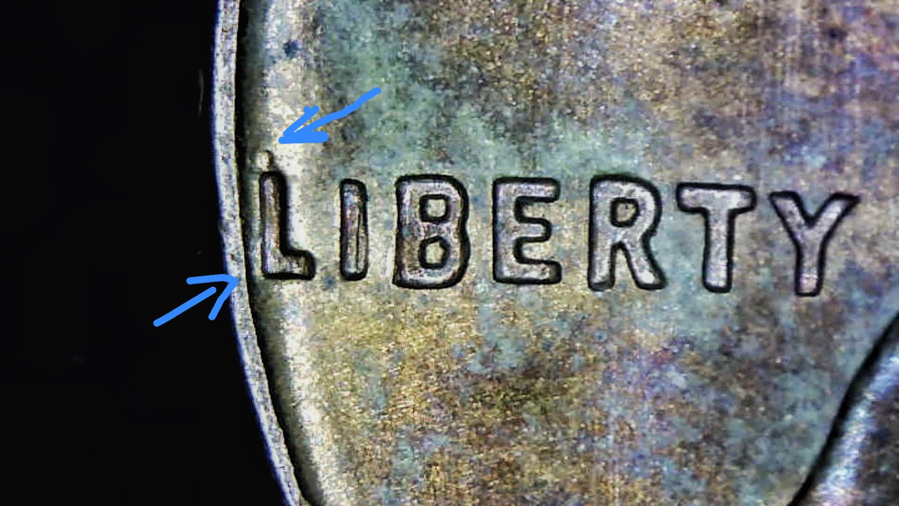
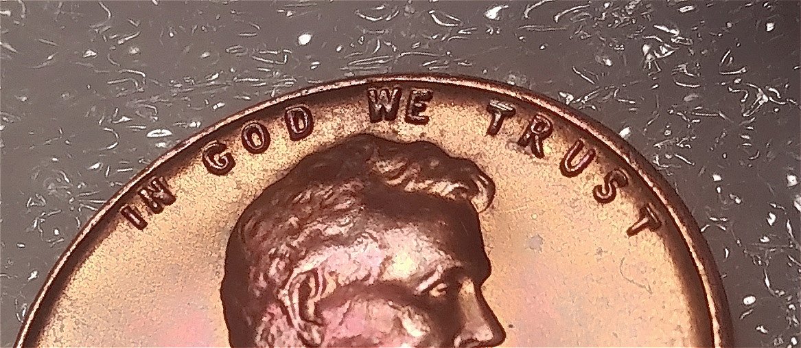
I don't know if variety vista is a good source to reference but this one is apparently a DDO-022 except the extension of the L in LIBERTY looks more like the dot for a lowercase "i" the IN in IGWT shows the most dramatic spread I hope these pics are ok?
to CCF. Please crop pics before posting,also no need for so many photos. One full coin photo of the obverse and one of the reverse and one or two close ups if needed. John1
I thought I did crop them? sorry I'm posting from my android smartphone and not using a computer format so idk if makes a big difference. thanks for the heads up tho
There might be some doubling somewhere, but I'm not really seeing it. Appears to be a fairly normal looking cent. Toning it's experiencing isn't too "weird" in fact to me it's rather pleasing, but not all people see it that way. Some love toning, some hate. Officially toning is a form of damage, but it's you like it, keep it!
I agree... you gave us too many photos. Next time, only a few, ok? Your photography it'self was really good!
Disclaimer: While a tremendous amount of effort goes into ensuring the accuracy of the information contained in this site, Coin Community assumes no liability for errors. Copyright 2005 - 2026 Coin Community Family- all rights reserved worldwide. Use of any images or content on this website without prior written permission of Coin Community or the original lender is strictly prohibited. Contact Us | Advertise Here | Privacy Policy / Terms of Use









 to CCF. Please crop pics before posting,also no need for so many photos. One full coin photo of the obverse and one of the reverse and one or two close ups if needed.


 Posted 06/26/2020 06:03 am





