
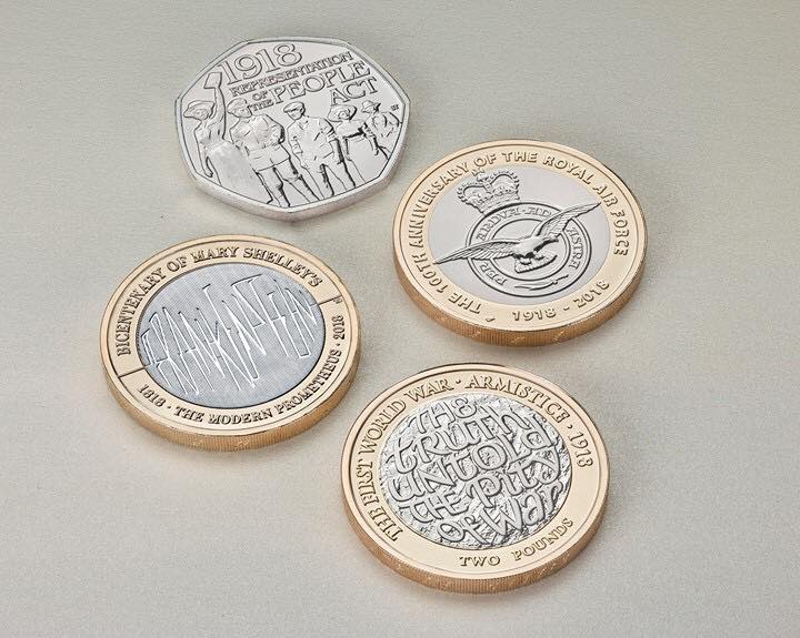
I agree the Frankenstein coin looks like they forgot to design something and just threw letters on it. The Armistice coin is disspointting as well but do like the Air Force one. Their 2017 group was much more attractive overall
The Frankenstein and Armistice designs are disappointing. I think, okay predict, the Royal Canadian Mint will probably honour the ARMISTICE anniversary with a $2 circulation commemorative, too. Looking forward to their design.
In my opinion very interesting designs... But I will agree they have not used too good lettering for 'Frankenstein'. It's like filling the gap with just anything. RAF looks pretty good, though.
Disclaimer: While a tremendous amount of effort goes into ensuring the accuracy of the information contained in this site, Coin Community assumes no liability for errors. Copyright 2005 - 2026 Coin Community Family- all rights reserved worldwide. Use of any images or content on this website without prior written permission of Coin Community or the original lender is strictly prohibited. Contact Us | Advertise Here | Privacy Policy / Terms of Use