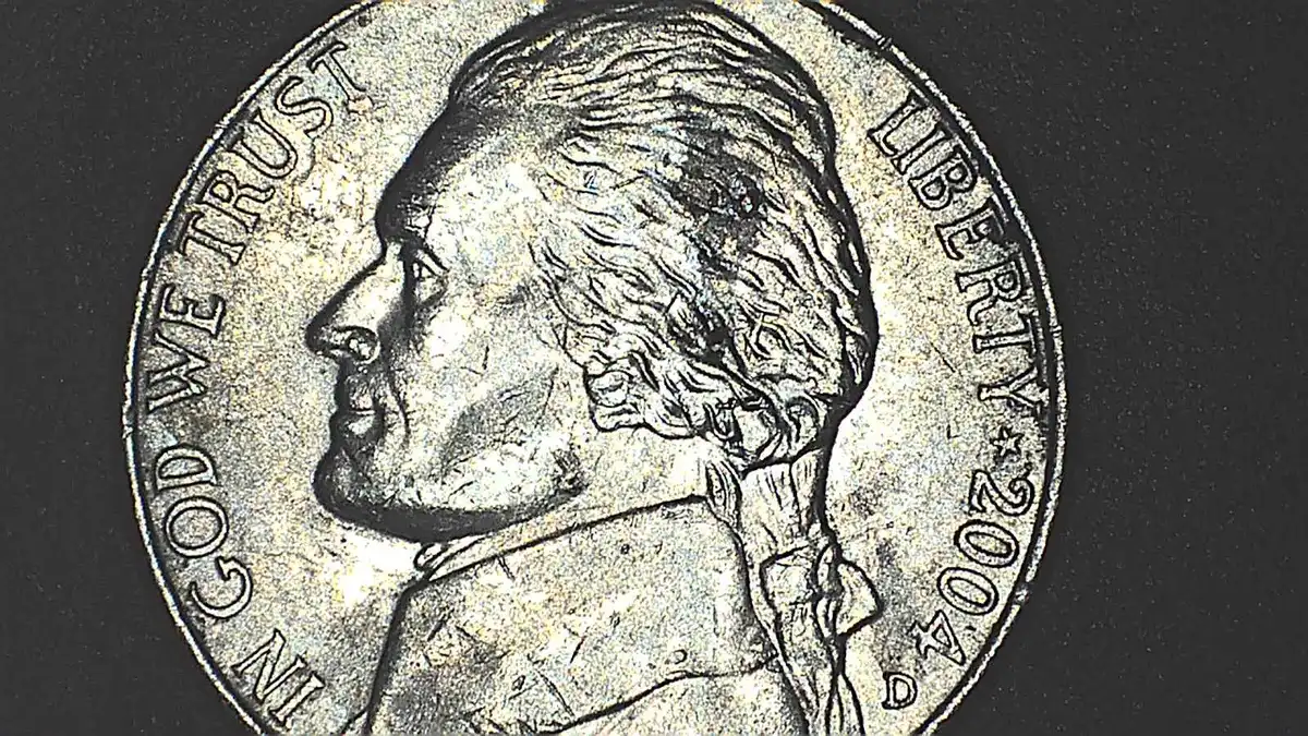
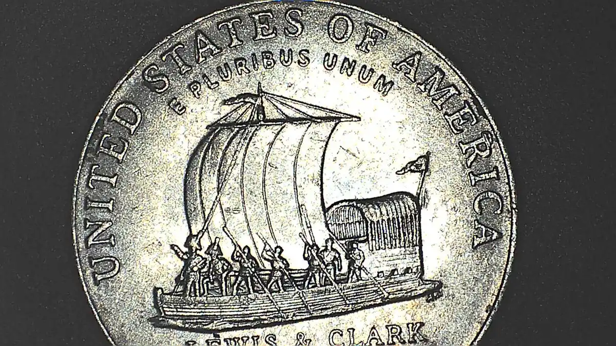
Going back thru some 2004's and found this. A little extra going on over the "R" in America, but the "A" in States caught my eye first. The area to the left is raised. Tried moving the light source a little to make it stand out. None of the other letters have this issue. Always looking for a little education!
Disclaimer: While a tremendous amount of effort goes into ensuring the accuracy of the information contained in this site, Coin Community assumes no liability for errors. Copyright 2005 - 2026 Coin Community Family- all rights reserved worldwide. Use of any images or content on this website without prior written permission of Coin Community or the original lender is strictly prohibited. Contact Us | Advertise Here | Privacy Policy / Terms of Use








 Replies: 3 / Views: 61

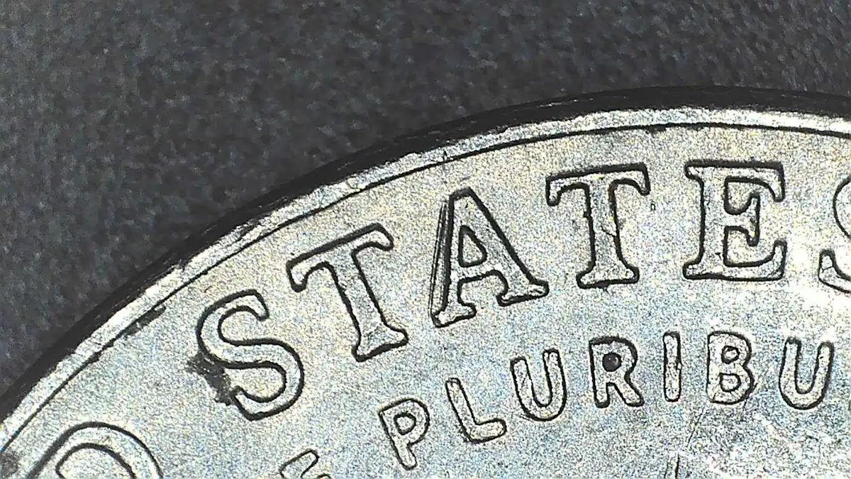
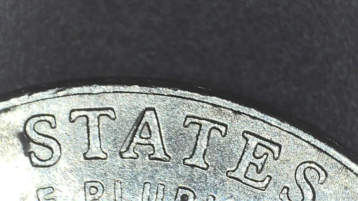
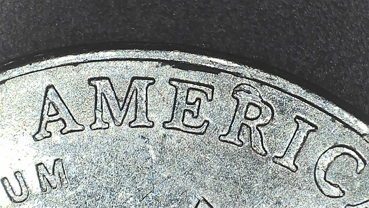


 There's a Die Chip on the R.

 Posted Today 1H 20M ago


