| Author |
 Replies: 13 / Views: 242 Replies: 13 / Views: 242 |
|
|
Pillar of the Community
United States
1313 Posts |
|
|
|
|
Moderator
 United States
15911 Posts |
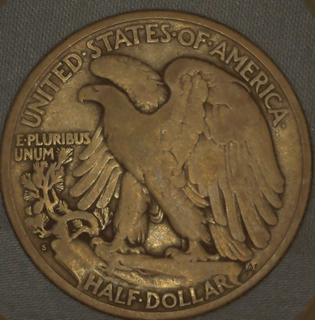
Nice key date. Is that it's real color? It has a golden tone in the image.
I say it grades in the low F range. Say F12/F15.
This assumes the odd colored surfaces are original.
|
|
Bedrock of the Community
United States
37100 Posts |
|
|
Bedrock of the Community
 United States
18917 Posts |
|
|
Pillar of the Community
 United States
1313 Posts |
That is not the true color. It is more grayish.
|
|
Bedrock of the Community
United States
18917 Posts |
watch your lighting. you want the best representation of your coin as it looks in your hand. takes some practice.
|
|
Bedrock of the Community
United States
79056 Posts |
I'll say VG.
Errers and Varietys.
|
|
Pillar of the Community
United States
1313 Posts |
Panzaldi,I will work on that it can be tricky. In know the more light I add the harder it is to see the surfaces.its a fine line but will work on it. Thanks for your thoughts. It does help.
|
|
Pillar of the Community
United States
1313 Posts |
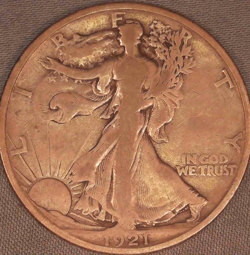 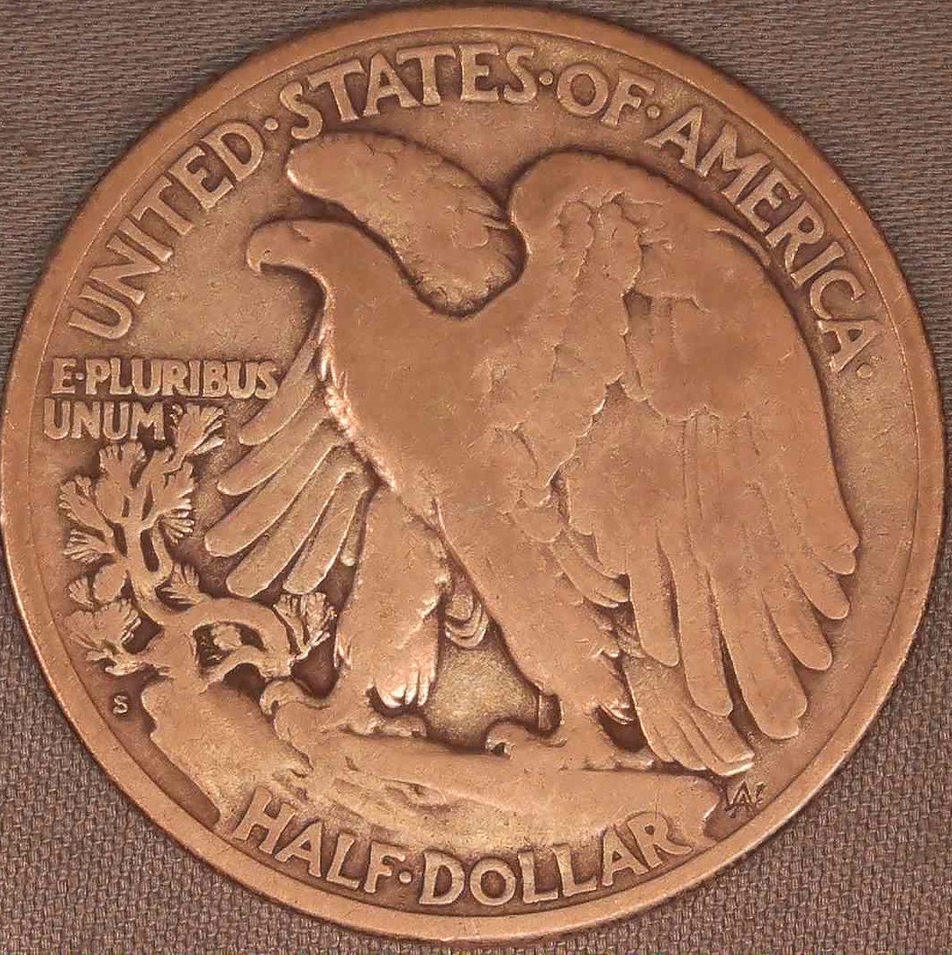 these are more accurate to the true color of this coin the other pic where not meant to decive but to show surfaces better.hope these help |
|
Valued Member
United States
160 Posts |
Strange color - with the new pictures it looks more like a high VG08 - a low VG10 at the most.
|
|
Pillar of the Community
United States
2438 Posts |
I worked on the OPs Walking Liberty coin image in Photoshop, and this is what it turned out like. The coin and fabric look a hell of a lot more normal to me now. . . . . What does the OP say? 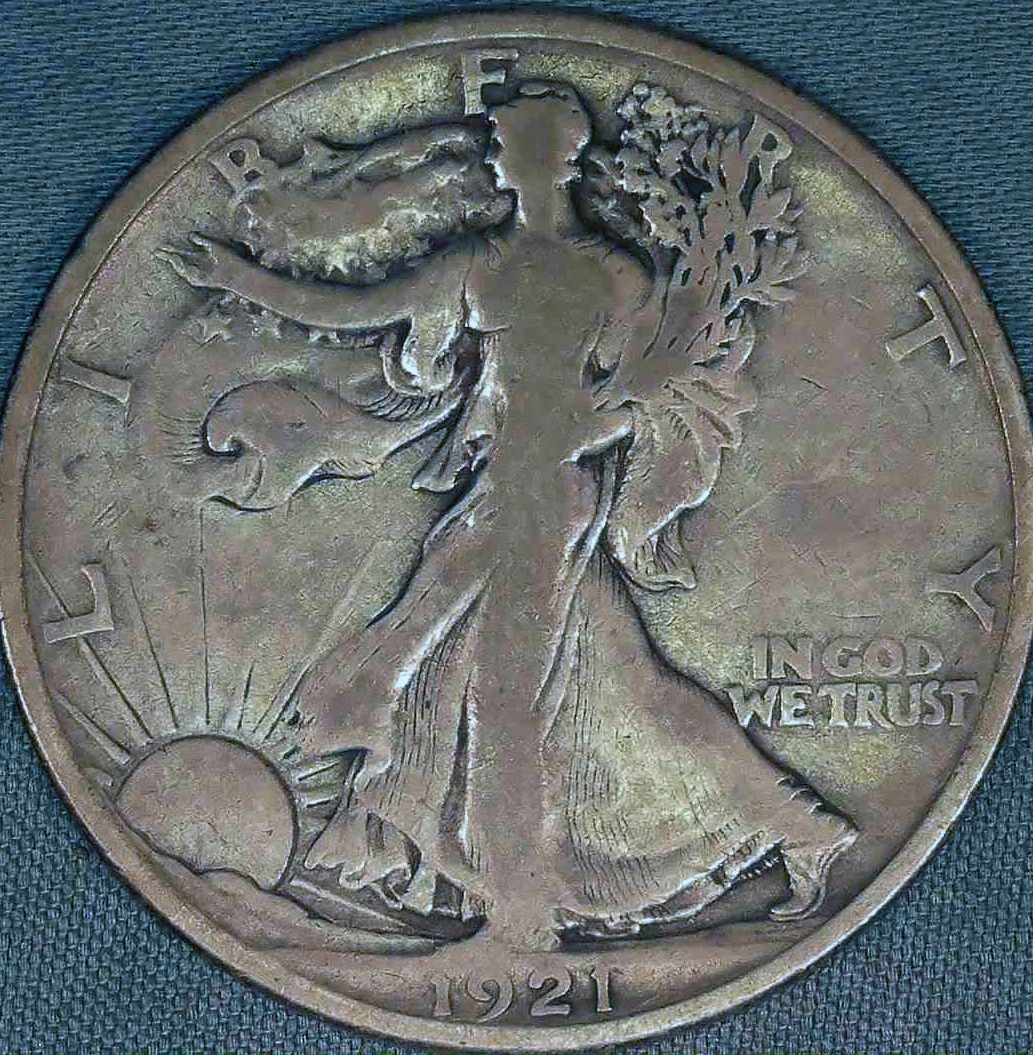 |
|
Pillar of the Community
United States
1313 Posts |
Coin for me thanks for your work on this. It is very close to true color.
|
|
Pillar of the Community
United States
1313 Posts |
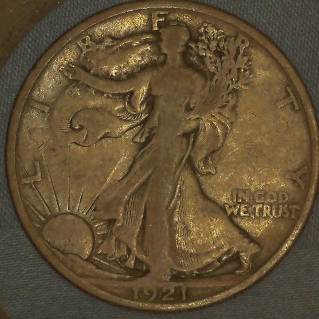
I struggle with the lighting I keep playing with different ideas to show the coins in there true state I'm just not quite there yet but will keep working on it. Again coin for me.
|
|
Bedrock of the Community
United States
18917 Posts |
theres a fine line with lighting. too much and you lose surface details with glare. too little and you have shadows and areas of the surfaces that are too dark to assess properly. I think you going in the right direction with your new photos but need just a tad more light. notice the lighting in CoinForMe's post
|
| |
Replies: 13 / Views: 242 |
|











 Posted Yesterday 08:24 am


