| Author |
 Replies: 36 / Views: 3,752 Replies: 36 / Views: 3,752 |
Page 3 of 3
|
|
|
|
Valued Member
United States
100 Posts |
14 and 17 are rockin'. Way cooler than the design the government picked.
|
|
Valued Member
United States
359 Posts |
Quote:
Guess I should answer my own question. My favorite design is 14 but I think it would have been better if they had scaled the design down slightly and spelled out "one cent" along the bottom. I agree completely. I also like that it gave a bit of a nod to the old wheat design. |
|
Moderator
 United States
14463 Posts |
Quote:
jbuck
Some comments made before the design was selected... that was before my time. That's my excuse, and I am sticking to it.  |
|
Pillar of the Community
United States
1796 Posts |
Out of all of the Capitol buildings I would have liked 8 best, but I'm not sure the Capitol building has a place on our penny.
Out of all of the flags, I'd like 9 best, but it would look best on a bigger coin. It's in many ways similar to what was on the Star Spangled Banner commem (which was gorgeous) so I think my reasoning is sound. :-)
Of the shield cents I like 14 the best. (I honestly dislike 13 which is what we ended up with. But everyone's taste is different.)
Of the eagle cents, I like 15 the best.
Overall it would be a toss-up (no pun intended) between 14 or 15 for me.
Pair it with Lady Liberty on the obverse and I'd practically squee with delight.... as far as I squee.... which I don't tend to....
... as far as you know... :-)
|
|
Valued Member
United States
98 Posts |
For nostalgia, I would have preferred going back to the original wheat design. If I had to vote on the given selection, I'd go with #6.
|
|
Pillar of the Community
United States
652 Posts |
The current shield design was my last choice. Too simple and boring for me.
|
|
Pillar of the Community
United States
655 Posts |
Meh... They all lack something. I say we should have gone back to the original flying eagle of the 1850s.
|
|
Pillar of the Community
United States
1007 Posts |
At first I wasn't sure about the new shield design, but I've gotten used to it and like it best out of the others.
However, I sure hope the mint doesn't get ideas to make a "What It Could Have Been" collector series with the other designs in P, D & S mintages with proofs, S mint business strikes and assorted packaging. They're doing a lot of stuff now to make money.
|
|
Pillar of the Community
United States
1227 Posts |
Nah, matchbox, that's Daniel Carr's territory. Complete with the correct years, of course.
|
|
Pillar of the Community
United States
2480 Posts |
I like 17 the best, then 12, and perhaps 7. Regarding 17's eagle, it's nice to see an eagle with correct proportions. Really, most of the eagles on US coins would never be able to fly-- the wings are too small in proportion to the body-- it bugs me :) The most amusing of all is the cartoonish eagle on the Half Dismes. Don't they look like a crudely illustrated dragon from the Harry Potter books? (but oh how I'd love to have one) 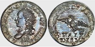 When I look at these cent designs, my first thought is "Which one would be more prone having interesting/valuable errors?" That's the one I'd want minted.  |
|
Valued Member
United States
379 Posts |
I would go with 12 or 17. They seem like more of a 'Classic' design to me.
|
|
Pillar of the Community
United States
1227 Posts |
Oh my what, ThisIsFun, it looks like Norbert. What is a Norwegian Ridgeback doing on United States currency.
. . . . . it's bad that I now want one of those to go with my Harry Potter collection, isn't it.
|
|
Pillar of the Community
United States
2480 Posts |
YES! It's Norbert! That's what I thought first time I saw it. Want want want!!
|
|
Valued Member
United States
396 Posts |
Not to put too fine a point on it, the shield is the most ugly US coin I can remember. I suppose it was easier and cheaper to produce, but I absolutely hate it. I notice that the US Mint is STILL (I just checked today Jan 30, 2013) trying to sell rolls of those ugly coins. I wonder if they ever will sell rolls of '11, '12 and '13? I'm not wild about any of the designs offered, but I'd of picked one of the flags. Probably 9. I'm from Wisconsin and looked at the five designs for the State Quarter back around 1998/99. Of the five, the one I liked least (stupid looking cow and corn) was the one chosen. At least that coin had a collectors' favorite error associated with it. |
|
Pillar of the Community
United States
1227 Posts |
BigApple, I think the problem is that the Mint is being run by a bunch of, well . . . . I can't think of an exact word. Basically a bunch of people who think things through too directly, rather than around corners. e.g. I don't like my state's (PA) quarter either--given a choice I would have gone with the Brig Flagship Niagara--the pride of West Pennsylvania--and the Liberty Bell--the pride of East Pennsylvania--connected by the thing that gave us our name, Penn's Woods. Instead they gave us some weird little statue nobody outside the Capitol had never seen before, over an outline of the state. "Well, because it's a commonwealth and it's the Statue of the Commonwealth!" I don't care. Stupid reason, stupid design. Too straightforward and as a result, too obscure. You can see the same thing in the ATB series--while most of the designs are beautiful (I don't think Chaco Culture transfers well to a quarter-sized business-strike planchet--for a long time I thought those were craters, not houses--but that's a personal preference), almost every single park that includes a mountain has the mountain smack-dab in the centre of the planchet. "LOOK AT ME! I'm A MOUNTAIN!!" C'mon--where is the beautiful vista view from the mountain, or the animal crossing a summit path? What about the feature on the mountain that makes it unique from every other mountain in every other state park (flora, fauna, intriguing rockfalls or other geographical features)? Think around the corner. Until we get some different thinkers in there, the problem will continue. *Edited because the Capitol did not give the statue to the rest of PA. I need to stop letting my verbs get ahead of my brain. Edited by ninamason
01/30/2013 5:00 pm
|
|
Page 3 of 3
|
Replies: 36 / Views: 3,752 |
Page 3 of 3
|


