| Author |
 Replies: 20 / Views: 3,483 Replies: 20 / Views: 3,483 |
Page 2 of 2
|
|
|
|
Moderator
 United States
188558 Posts |
Quote:
You know, I've been looking at a silver Ike for a few days. I think this put me over the edge to buy it. Do it.  |
|
Pillar of the Community
United States
7390 Posts |
Quote:
That's a beauty. Unless the "bright" patches are hiding something we can't see, I'd say it would make MS-66, with a tiny bit of a shot at MS-67. Nice. I think you mean PF 66 or 67  |
|
Pillar of the Community
United States
527 Posts |
 Ikes are my favorite coins ! Very nice !! |
|
Pillar of the Community
 United Kingdom
2878 Posts |
Thanks - I won't be getting it slabbed - the coin only cost me about £8 - but I quite like the reverse. Apparently there are a couple of varieties depending on the shape of the "T".
|
|
Pillar of the Community
1153 Posts |
Everyone should own an Ike
|
|
Moderator
United States
188558 Posts |
Quote:
I won't be getting it slabbed Quote:
Everyone should own an Ike |
|
Pillar of the Community
United States
1247 Posts |
reminds me, I gotta dump all my extra ikes.
|
|
Pillar of the Community
United States
1003 Posts |
|
|
Bedrock of the Community
United States
10038 Posts |
Definitely a great looking Type I coin. Here is an easy way to tell the varieties with a quick glance. There are other differences also - this is just a very quick method since the tail of the R is isolated at the end of the word with nothing around it. A close look shows the entire font is different on both. 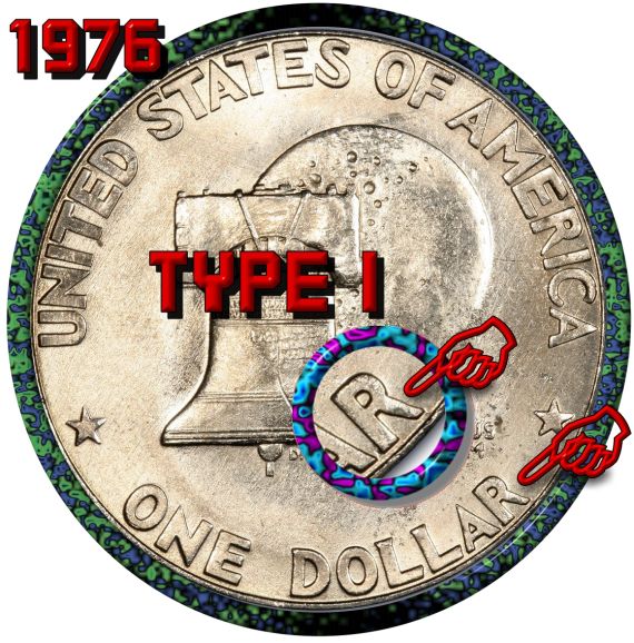  Edited by Earle42
03/25/2016 9:49 pm
|
|
Pillar of the Community
United States
7390 Posts |
Funny I look at the T in states. Never thought about the R before
|
|
Bedrock of the Community
United States
11951 Posts |
Very nice looking Ike.
Unless my old eyes are getting real bad. This one looks like a
40% uncirculated Ike. What many call a blue Ike, because it was
issued in cello, inside a blue envelope.
I do agree that from the picture, this coin could grade MS 66 maybe 67.
As for type one or type two. I think the varieties only apply to the
clad Ike's. The 40% silver Ike's are all the same design.
I am writing this from memory, if any of this is information in incorrect,
please feel free to post a correction.
|
|
Pillar of the Community
United States
4113 Posts |
Congrats, Beautiful Type 1 Ike. * Another way to tell the Bi-Cenn. reverses apart is to look at the "N" in UNUM. Type 1- the N lines up directly with the R above it from PLURBIBUS Type 2- the N lines up between the U & R of PLURIBUS. Pretty easy to spot right away. TYPE 1: N is directly under R above.  Type 2 : N is in-between U & R above. 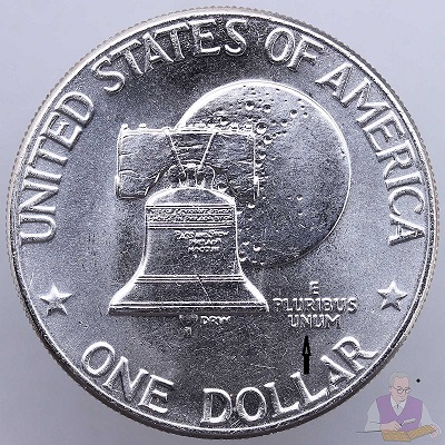 |
|
Bedrock of the Community
United States
10038 Posts |
@Chuckster
Interesting - never noticed this before.
When these first came out, I was a kid. I was just told to look at the R's leg and see if it was straight like the number 1... if so it's a Type I; and a number 2 two can have a curled tail like the Type II R does.
Maybe this is why it stuck in my head - a visual aid that parallels the type designation?
|
|
Pillar of the Community
United States
883 Posts |
Type I has flat block font letters which was part of the original winning design for Obverse. It was found that the font did not work well when the mint moved to striking the business issues which were lower relief so the font was changed to the thinner, arguably higher, Type II font. Type I can be found in the Philadelphia Copper-nickel clad, Denver Copper-nickel clad, And nearly all of the San Francisco Silver Clad versions. I am pulling the font issue from memory, but referenced a 2010 RedBook for the type Variety data. It does list a "Silver Clad Variety II" in proof but I don't think I've seen one. |
|
Moderator
United States
188558 Posts |
I have never really paid attention to the other pick-ups. I just look at the font, the difference is night and day.  |
|
Page 2 of 2
|
Replies: 20 / Views: 3,483 |
Page 2 of 2
|


