| Author |
 Replies: 41 / Views: 5,580 Replies: 41 / Views: 5,580 |
Page 3 of 3
|
|
|
|
Valued Member
 Sweden
83 Posts |
I've added a new post at the same fourum(World coins and commemoratives) just for my collection if you wish to view it. Thank you
|
|
Pillar of the Community
 United States
5029 Posts |
A bit frustrating to see someone posting coins and getting the 3rd degree. This is similar to the garbage on the other coin site. If you think it is fake say so and why. If you have some proof other than some previous posts this person is doing something wrong present it. Quote:
I get the feeling he's just being cute as he thinks playing dumb will make people more likely to help him out with answers Have you seen some of the posts people put on here? How about the really smart people on here stop judging and start asking some questions of the coin that the OP can answer? Instead of simply claiming it is fake and then dragging the person through the mud. |
|
Pillar of the Community
United States
1913 Posts |
I don't think it is ridiculous to question the OP's coins based on the photos given and the obscure comments. Take for example of this comparison of the OP's own photos. One is similar to the original old coin, but the photo of what may be the same coin in his box looks more genuine. It's not hard to think one is a copy of the other. It's too bad this forum limits photo sizes to 300kb, otherwise I'd like to do better. SO take a good look at the coin he posted and the coin in his box. 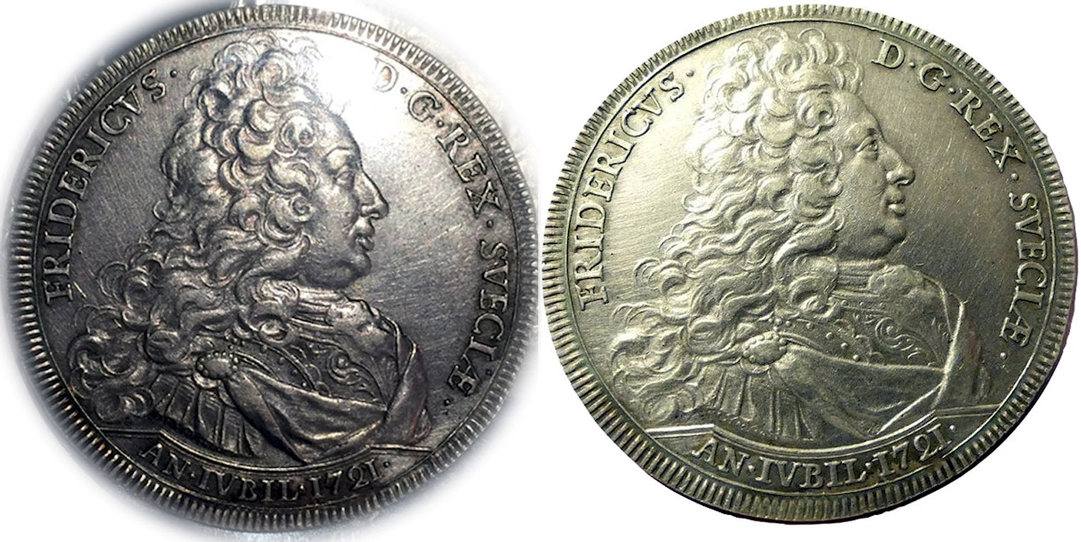 |
|
Pillar of the Community
United States
1913 Posts |
And to back up the idea of one being a copy, here's a comparison of some details. You see certain lines or dots or shapes differently. I'm more skeptical in cases like these because I have encountered so many doubtful coins in my catalogs of hundreds. I don't claim his coins are fakes, I just point out areas that cause doubt. And that is an indicator that the coin is worthy of a closer look by experts. Pictures alone don't always make me think of fakes. Although some readily do, but I've been wrong before. Sometimes lighting and tilting can make big differences in how we see a coin. I would encourage members to post quality images so we can see a coin in its best light. 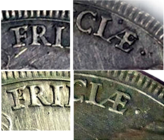 |
|
Pillar of the Community
United States
1962 Posts |
Albert, the toning spots in/adjacent to "D. G." match up TOO EXACTLY to be simple similarity from, say, receiving the same type of artificial tone. That patch down near the date, also... BTW, I think that one thingy by the AE ligature is a carbon/corrosion spot rather than a pit. The one thing that can throw you is looking at the hairlines, which don't seem to match up at... but I'm willing to chalk that up to lighting. Different angling can make a coin's surface varyingly look either pristine or like it was scrubbed with sandpaper. This is where the lesson is too always post clear photos - not doing so can often lead to irrelevant sidetracking. Anyway, the cleaning on this piece makes judgment by surfaces more difficult here... but let's be fair, almost everything in his pics from the other thread is perfectly legitimate material. I don't see anything particular damming here - especially from the new pics. 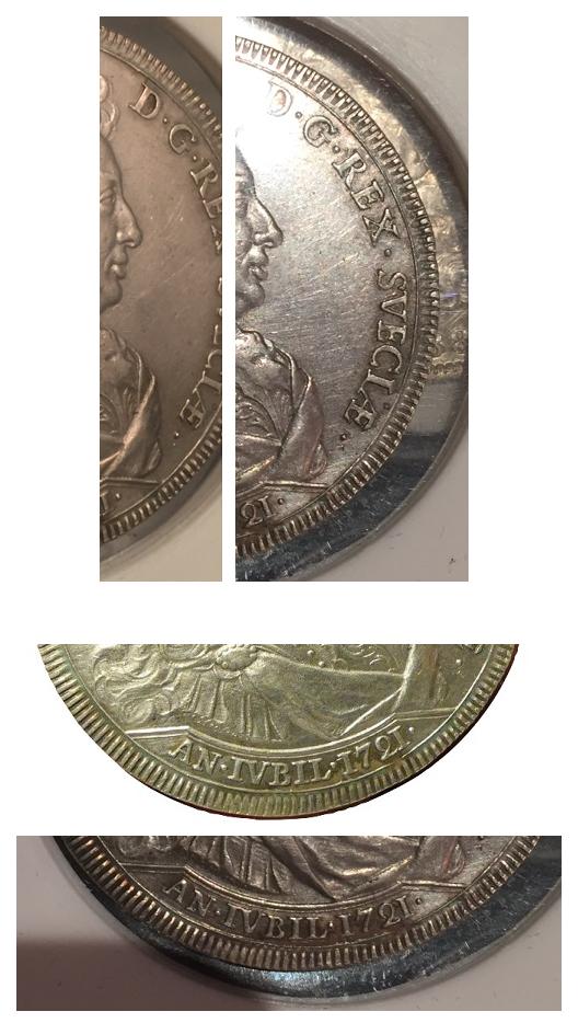 |
|
Pillar of the Community
United States
1913 Posts |
To me they look a little different in certain parts of the letters and spaces between. The OP may invite suspicion with his strange ways of making inquiring comments and posting photos that suggest doubt to a critical eye. Combine this with the fact that many Chinese made fakes have been popping up and I don't think the claims we make about some of them are ridiculous. 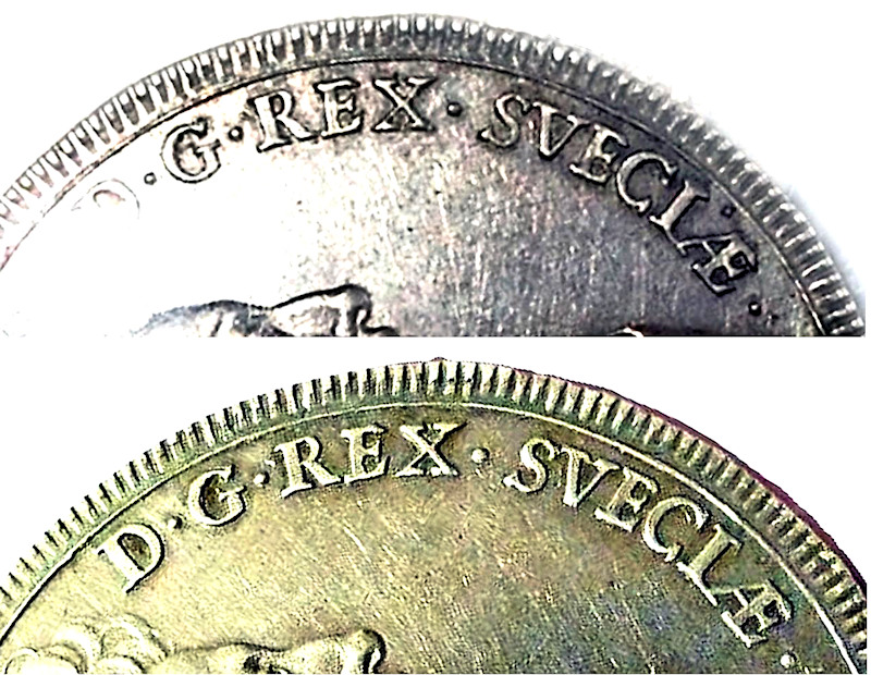 Edited by Albert
10/15/2018 11:20 pm
|
|
Pillar of the Community
United States
1962 Posts |
Again, you simply won't get toning spots that match as exactly as those two photos, blurry as they are, confirm at multiple points if you were dealing with two different pieces.
The area you highlighted with the rotation shows more of this - the spots above "S" and "I" in SVECIAE, which are tone spots rather than pits or pimples.
Whatever its nature may in fact be, those photos show one and the same piece, no question.
Also, note that blowing up a photo with not super high resolution to begin with - AND overdoing contrast or similar tweaks - is not really useful. The image gets to the point where it becomes too distorted to be reliable.
Edited by realeswatcher
10/16/2018 4:40 pm
|
|
Pillar of the Community
United States
1913 Posts |
Yeah it's been hard for me since I have to deal with the photos as given. Not having the original, and being limited to under 300kb it's hard to post some decent A-B comparisons. I had to try to capture the same space on the images and try to show them as being different. This is one example of one thing I was trying to illustrate as being different: On the OP coin photo there appears this extra item inside the letter F. But the same is not seen when taking a closer look at the other coin in the box inside the letter F. I trust my judgment in most cases, but I am not without mistakes at times. Can you do me a favor, and with your own photo editing programs, take a look at this detail on both the OP image and the box coin and conclude if it is or is not the same? 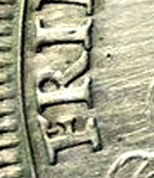 |
|
Pillar of the Community
 United States
7939 Posts |
(edit ...)
Edited by tdziemia
10/16/2018 9:21 pm
|
|
Valued Member
United States
167 Posts |
@Albert Here you go... 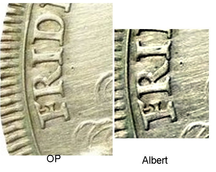 The OP is clipped from the Original Post & Albert is your image. Edited by Gallienus
10/17/2018 11:02 am
|
|
Pillar of the Community
United States
1962 Posts |
Same toning spots - SAME COIN!!!
|
|
Pillar of the Community
United States
1913 Posts |
My image (seen above this post) IS the OP image. The pair of pictures are of the same coin but not the two coin images I am asking to compare. I am talking about comparing the OP coin detail (letter F) to the coin that he shows in the box of coins. Using your own software to avoid me blowing up or altering the images. Please take a look at his coin at the top in his box in the holder with the original image he posted. This is the coin in the box and I think there are differences, and I welcome explanation so I can learn if I happen to be wrong.  Edited by Albert
10/17/2018 2:43 pm
|
|
Pillar of the Community
United States
1913 Posts |
Here is what caused me to think one coin could be a copy of the other. Perhaps lighting, angle and shadow may have fooled me. I hope it is understandable. If I was wrong about suspicions regarding the OP's initial photos and the manner in which he edit's his post titles suggesting ignorance about what he has, I hope I may be forgiven and apologize. Since it appears I could be guilty of making improper claims, I feel foolish and perhaps I have no place here and can leave this forum to more sensible heads. 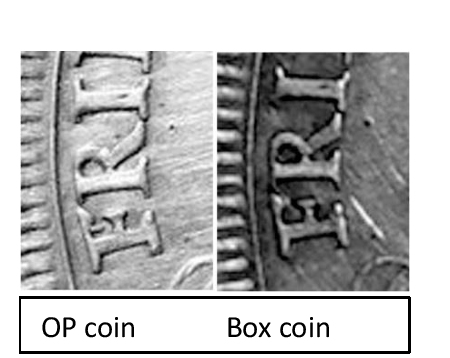 |
|
Pillar of the Community
United States
5029 Posts |
Quote:
perhaps I have no place here and can leave this forum to more sensible heads Let's not get carried away. We are all here to learn and enjoy a type of fellowship with like minds. Your posts are often enlightening and informative.  Edited by scopru
10/17/2018 4:05 pm
|
|
Pillar of the Community
United States
1962 Posts |
Quote:
the manner in which he edits his post titles suggesting ignorance about what he has He definitely HAS done that... there is game-playing with him, for whatever reason. But that doesn't necessarily HAVE TO extend to all aspects of everything... He's shown a large grouping of pieces, most of which appear genuine, some of which he's posted individually - so clearly he DOES have coins, at least that much is true. So we can't automatically apply his partial sketchiness as automatic circumstantial "proof" that these are "twin" fakes. Evaluate things at face value. You can't get past the fact that we see that vertical spit coming down out of the top of the "F" in "FRIDERICVS", apparently clearly, on the one pic in the first post but not in the pic from the second post. Said vertical spit is NOT a feature on a genuine 1721 riksdaler and a die break or similar on a genuine piece would not present like what we "see" in that first pic. I can't answer exactly WHY we're seeing that... but I see enough matching TONING SPOTS (again, NOT pores or extra metal or the like) between photos to be certain that those pics can't NOT be the same piece. That first post pic is an odd-looking photo, from too-much lighting and probably also a strange photo-edit filter... Thus, I'm assuming that the lighting caught a scratch just so and because of the positioning, it ends up doing a good job imitating extra metal on the "F". Question, btw - if you think what we see in Post 1, Obv Pic 1 and the pic have from Post 2 are different physical pieces..... which are we seeing in Post 1, Pic Obv 2? It would be most logical (unless we want to get really paranoid) to assume it is the same piece as the 1st pic from THAT post. Noting that, there are toning spots that ABSOLUTELY no doubt match up between that center crop from Post 1 and the pic in Post 2. Look, e.g., at the spot on the edge of the hair, below "S" in the king's name - that is clearly toning, and clearly there in both of those images (noting, of course, slightly different rotation of the coin in the various images). Of course, if you look carefully on Post 1, Pic 1, it's there also... just a lot more washed out. In the same area, note that we also see the another toning spot resting inside of the bottom curve of "S" in ALL THREE views. Below that, the date area clearly shows that same remnant tone/stain arc through "BIL". The other pic jives with this also (showing the deeper residue below that blackish arc).  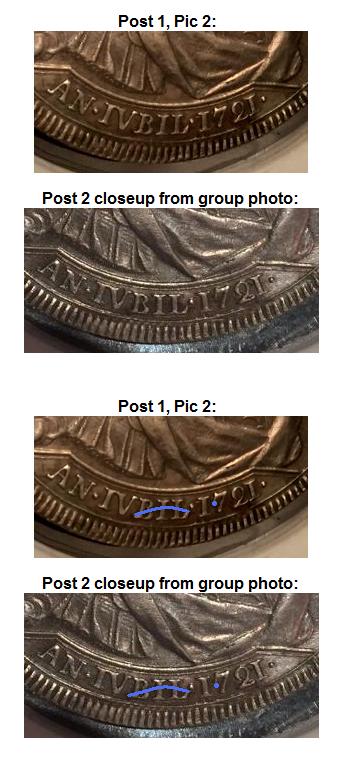 |
|
Page 3 of 3
|
Replies: 41 / Views: 5,580 |
Page 3 of 3
|


