| Author |
 Replies: 19 / Views: 485 Replies: 19 / Views: 485 |
Page 2 of 2
|
|
|
|
Pillar of the Community
 United States
6506 Posts |
There is also the possibility that the ridged pattern was caused when the edge lettering was applied.
|
|
Valued Member
 United States
342 Posts |
Thanks, I just though it was odd. Had to make sure. Appreciate it much as always!
|
|
Valued Member
United States
342 Posts |
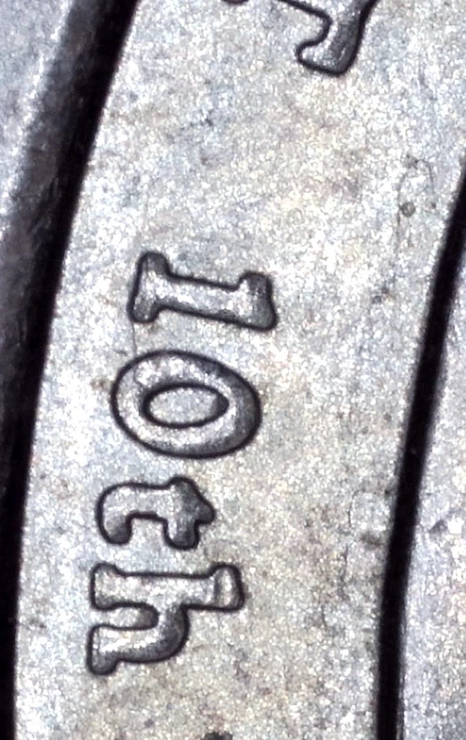
Can you look at the 10Th does the 0 look like ts doubling?
|
|
Bedrock of the Community
Canada
21610 Posts |
Not doubling, thats the way the design of the font is.
|
|
Valued Member
United States
342 Posts |
|
|
Moderator
 United States
188561 Posts |
Quote:
I think maybe it's showing the shear marks of being cut from the sheet metal. This would be my guess. |
|
Valued Member
United States
342 Posts |
Are these consider serifs? 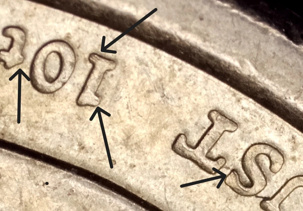 |
|
Bedrock of the Community
Canada
21610 Posts |
Yes, those are considered serifs.
|
|
Valued Member
United States
342 Posts |
So would that consider its doubling @JimmyD?
|
|
Bedrock of the Community
Canada
21610 Posts |
No, you are thinking of the serifs on a Doubled Die.
Those serifs are part of the design. Two different things.
|
|
Pillar of the Community
United States
7512 Posts |
It definitely does. Let's see a close up of JOHN TYER inscription too. |
|
Valued Member
United States
342 Posts |
here it is. So looks like to me it is. 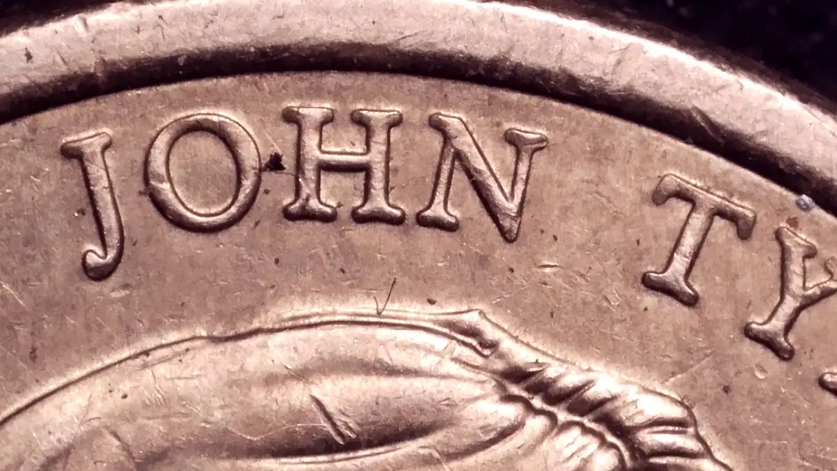 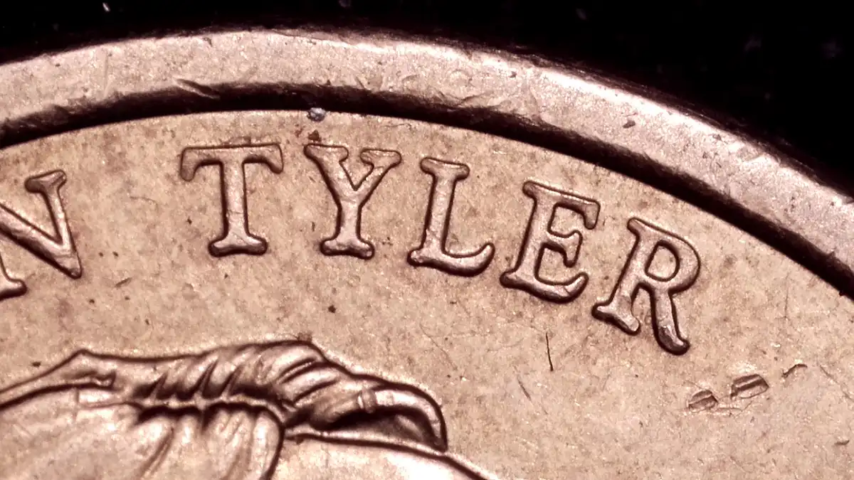 |
|
Pillar of the Community
United States
7512 Posts |
Thanks for the pics.the 1 and particularly the 0 show strongest doubling with some upper and lower serifs in the JT
|
|
Valued Member
United States
342 Posts |
@Chase007 Thank you for wanting to take a closer look for me!
|
|
Pillar of the Community
United States
6506 Posts |
To me, it looks more like circular wrapping machine scrapes and maybe some die warping due to age. But it could very well be doubling, too. The Wexler guys would know.
|
|
Page 2 of 2
|
Replies: 19 / Views: 485 |
Page 2 of 2
|