| Author |
 Replies: 26 / Views: 5,967 Replies: 26 / Views: 5,967 |
Page 2 of 2
|
|
|
|
New Member
 United States
31 Posts |
Tempting but I'll pass :) I really don't think it's a fake, why would someone go to the trouble of faking such a common date anyway?
|
|
Valued Member
United States
402 Posts |
|
|
Valued Member
United States
63 Posts |
That looks really cool. Hmm, "circulation cameo"... now I know what to search for to find one of my own  |
|
Pillar of the Community
United States
1817 Posts |
Neat term, really brings out the design, doesn't it?
|
|
Valued Member
United States
79 Posts |
Nice Coin! I've never been a fan of circulation cameo (neat term, I agree), but it does bring out the design quite nicely. I wonder what happened to the 2 in the date.
|
|
New Member
United States
31 Posts |
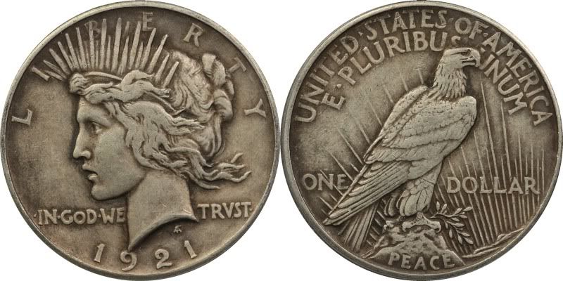
Here's a close up of the date.  |
|
Pillar of the Community
Mexico
1304 Posts |
I was wondering about the "2" as well. Glad someone asked. Almost looks like someone tried to do a crude over-punch.
|
|
Valued Member
United States
79 Posts |
That is odd. I have no idea what could have caused that. It looks like a perfect oval, so I don't think it was scratched in. I also don't know of anything that would punch an oval (or at least a backwars "C") into it either. I don't think is was stamped with it either, stamps usually happen in the feilds so that it is more obvious, and I've never seen a doubled stamp, on the curve below the 2 makes it look doubled. Huh.
I know it probably makes me a wee bit loopy, every time I see something like this I always think "Hmm, what could have caused this?"
Edited by HalfDollarDave
04/21/2011 11:49 am
|
|
Pillar of the Community
Mexico
1304 Posts |
Looks like a common oval shaped zero "0" punch was used...the shape isn't perfectly round like a typical "o".
|
|
Valued Member
United States
79 Posts |
I don't know, there seems to be a little mark at the top right of the the mark that looks like it could be the top serif of a C (type a C in the quick reply thing below and you'll see what I mean).
|
|
Pillar of the Community
Mexico
1304 Posts |
Ah, yes, the "serif" of an uppercase "C". That's a good point...looks like a likely explination as well! Good eye.
|
|
New Member
United States
31 Posts |
Here are some closer shots of it.  |
|
Pillar of the Community
Mexico
1304 Posts |
theroamer: that is some out of control photography! Great job! (now, how'd you do it?)
|
|
New Member
United States
31 Posts |
Just a little Canon Digital Elph point and shoot. I have a small desktop tripod, manual mode, macro setting, no flash, ISO 100.
Setting the ISO low is key, otherwise the pics are grainy.
|
|
Pillar of the Community
Mexico
1304 Posts |
|
|
Page 2 of 2
|
Replies: 26 / Views: 5,967 |
Page 2 of 2
|