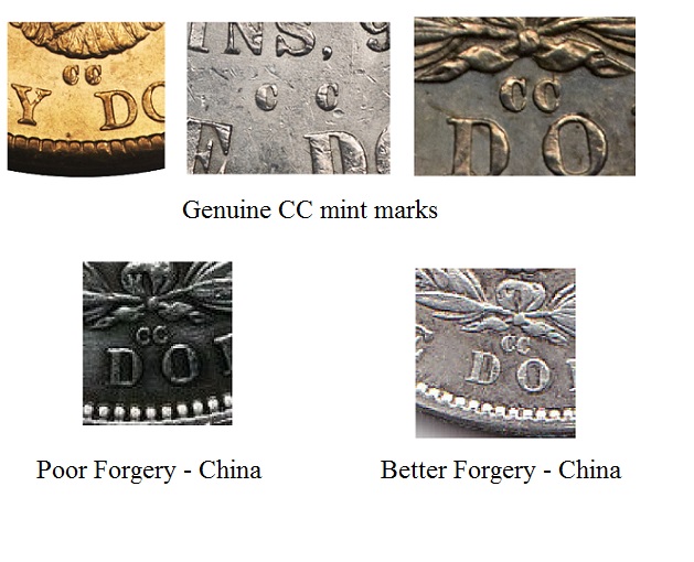
The round open C sans serif is a Chinese font normally seen on very bad dollar fakes that were common 15 years ago. The newer and better forgeries use the more correct nearly round C with clear serifs that are almost "closed".
Since the critical element is the mint mark in this case, and most others, I would expect a more polished forger to expect added scrutiny. Forgers who make careless errors are targeting a less knowledgeable audience of buyers.
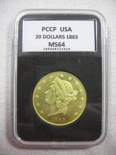
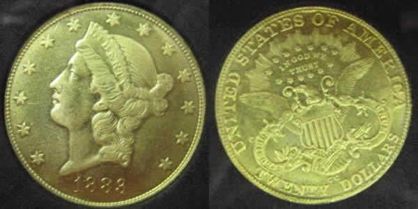
This $20 coin falls in that category - it is like some of the earlier round sans serif coins. Completely wrong.
Here is a picture of some good and bad CC fonts with the $20 coin included.
Disclaimer: While a tremendous amount of effort goes into ensuring the accuracy of the information contained in this site, Coin Community assumes no liability for errors. Copyright 2005 - 2026 Coin Community Family- all rights reserved worldwide. Use of any images or content on this website without prior written permission of Coin Community or the original lender is strictly prohibited. Contact Us | Advertise Here | Privacy Policy / Terms of Use









 Posted 02/10/2016 01:47 am