| Author |
 Replies: 74 / Views: 6,688 Replies: 74 / Views: 6,688 |
|
|
|
Pillar of the Community
Canada
5271 Posts |
It's quite a shame that these coin designers did not consult the CCF for their aesthetic advice...every one would have been a winner.
But seriously, I presume that everyone of these designs was carefully reviewed and met with the approval of some high committee. So what went wrong?
|
|
CCF Master Historian of USA Commemoratives
 United States
12369 Posts |
Quote:
I presume that everyone of these designs was carefully reviewed and met with the approval of some high committee. So what went wrong? I've always believed it is a simple matter that the general public is not aware of the design requirements and/or restrictions that an artist faces when designing a coin. Also, preferences of those involved with selecting the final design can have a big influence. For example, a number of US commemorative coins have average/OK designs even though they were created by leading artists/sculptors. Why? The artist was forced to develop his/her designs according to recommendations/desires of the coin's sponsor even though the sponsor was not qualified for such a design leadership role. Collecting history one coin or medal at a time! (c) commems. All rights reserved.
|
|
Pillar of the Community
 United States
701 Posts |
@commens, don't they have a contest or a bid on the best design, you'd think.
|
|
CCF Master Historian of USA Commemoratives
United States
12369 Posts |
Quote:
don't they have a contest or a bid on the best design, you'd think Not always. There are times when the sponsor is firm on what they want to see on their coin or medal and they are not open to suggestions that would be definite improvements. It's an unfortunate reality. Collecting history one coin or medal at a time! (c) commems. All rights reserved.
|
|
Bedrock of the Community
United States
10051 Posts |
Quote:
But seriously, I presume that everyone of these designs was carefully reviewed and met with the approval of some high committee. So what went wrong? A harsh reality of life is that artists have a different eye for "beauty" than us non-artists. Neither viewpoint is right/wrong, its just the differences in the way God designed human minds. I used to have many discussions about this at length with a good friend of mine who was an artist. I was interested in how such a different human than mine thought. He pointed to the sunset and asked what I saw. I described the pretty purples and reds blending into the horizon. He said I missed most of what was there. The rest of the sky which was full of other colors leading down to the horizon and also blended in with the eye candy area. He said the artists' eye automatically and naturally sees those other colors, which actually dominate the sky, as well as the eye candy. |
|
Pillar of the Community
United States
701 Posts |
@EARLE42...great illustration, and funny how we can see things that others dont.
|
|
Bedrock of the Community
United Kingdom
18069 Posts |
Some designs are simply boring! Released 50 years ago today, The Royal Mint weren't very imaginative when it came to the reverse of the new Guernsey halfpenny! 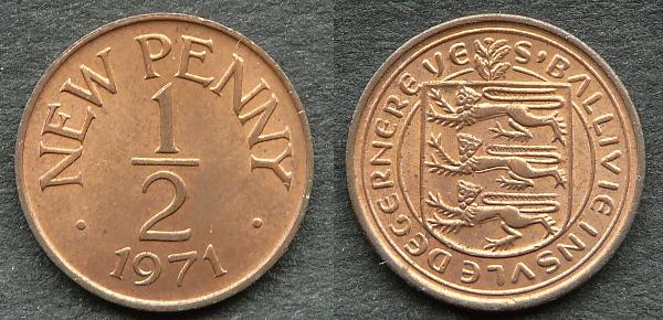 The FAO 'Food For All' coin program has been responsible for numerous designs, good and bad, but surely Belize could have done better than this for their 25-cent coin: 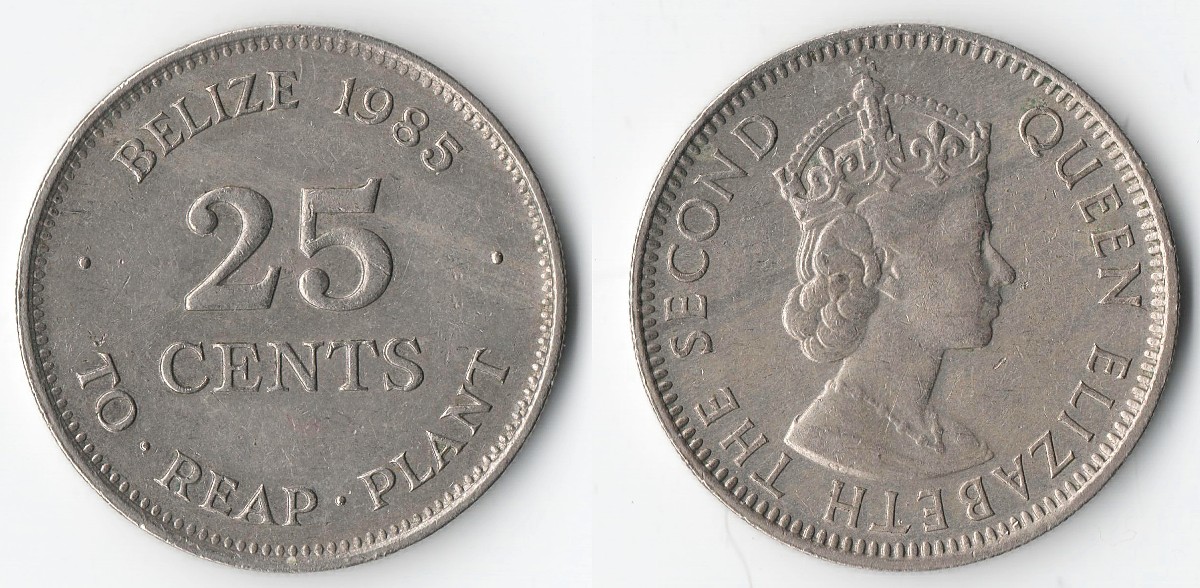 And among all the Euro coin designs, I think those from Estonia are the most dull. It's not so much that it's just a map of the country, but why have the same design on all eight denominations? 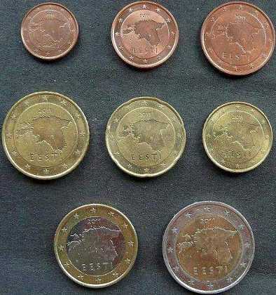 |
|
Pillar of the Community
United States
701 Posts |
@NUMISROB...No joke, someone just got lazy.
|
|
Pillar of the Community
Sweden
1078 Posts |
Quote:
No offence to my friend X2an in Sweden, but this is one of my less favourite designs. Your opinion is shared - this is one of my least if not the least pretty of Swedish coin designs issued. The only real contestant is the backside of 1-2-5 Öre coins issued 1952-1971, but I think they have the upper hand:  Otherwise, I wouldn't be true to my country without taking a swipe at Denmark, but for good reasons. Now, one would ideally like to portray their monarch as royally as possible but Denmark decided not once, but twice to put mummified depictions of the Queen on the 10 and 20 Kroner coins which you can find in circulation today.   |
|
Moderator
United States
191303 Posts |
Quote:
Now, one would ideally like to portray their monarch as royally as possible but Denmark decided not once, but twice to put mummified depictions of the Queen on the 10 and 20 Kroner coins which you can find in circulation today.
 |
|
New Member
Bulgaria
27 Posts |
This thing.  It's a 1 denar from my west neighbor- N. Macedonia. The only good thing in this coin is the dog.  The design is dumb, but I love the cute dog in the reverse. 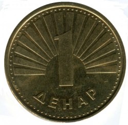  |
|
Moderator
United States
191303 Posts |
Quote:
The design is dumb, but I love the cute dog in the reverse. So, not a total failure. Just keep the dog side up. |
|
New Member
Bulgaria
27 Posts |
Yep! |
|
Pillar of the Community
United States
701 Posts |
@X2AN...Yeah, an older image of her, permanently on a coin...not too attractive.
|
|
Pillar of the Community
United States
701 Posts |
@MICHAELSH...Heads or tails, the dog should have been heads.
|
| |
Replies: 74 / Views: 6,688 |


