| Author |
 Replies: 10 / Views: 1,199 Replies: 10 / Views: 1,199 |
|
|
CCF Master Historian of USA Commemoratives
 United States
12352 Posts |
Introductory Note: I have posted about many different aspects of the history of US commemorative coins here in the US Commemoratives area of CCF, most with "Commems Collection" in their title to enable automatic inclusion on the "Commems Collection" list created by Bobby. In addition, however, I have also posted about the design elements found on many of the coins over in the "Post Your..." galleries area, as well as within posts here under non-coin-specific titles. I've decided to collect these multiple design discussions for each coin of the series in one place for quick access, I present...1936 Columbia, SC Sesquicentennial - Design Element Discussion Threads- 1936 Columbia, SC Sesquicentennial - Coins Depicting Places- 1936 Columbia, SC Sesquicentennial - Coins Depicting Mythology- 1936 Columbia, SC Sesquicentennial - Coins with Hands- 1936 Columbia, SC Sesquicentennial - Coins with Stars- 1936 Columbia, SC Sesquicentennial - Coins with Flora- 1936 Columbia, SC Sesquicentennial - Coins with Trees1936 Columbia, SC Sesquicentennial Half Dollar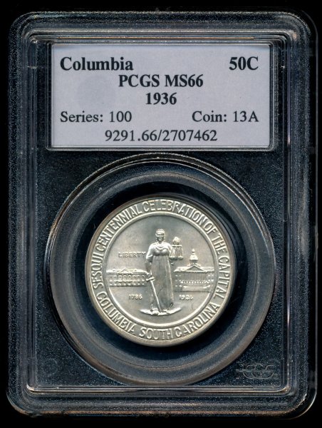 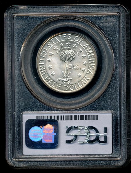 For other of my posts about commemorative coins and medals, including more on the history of the Columbia, SC half dollar and other Design Discussion Index posts, see: Commems Collection. Collecting history one coin or medal at a time! (c) commems. All rights reserved.
|
|
|
|
Bedrock of the Community
United States
94367 Posts |
Not the most appealing designs on this one.
|
|
Moderator
United States
190888 Posts |
Fantastic!  I still want to get one of these someday just to have it.  |
|
Moderator
United States
15614 Posts |
I really enjoy the links to your other research on these coins commems - they are simply filled with fascinating information that otherwise we (the collective CCF we) would never get to enjoy.
For example, I enjoyed your description of the allegorical Lady Justice shown on the coins obverse (Coins Depicting Mythology) and the linkage to the modern Justice wearing a blindfold.
Since I generally do not read the 'Coins Depicting' subform - without your index I would be missing such fabulous information.
|
|
Moderator
United States
15614 Posts |
Quote:
I still want to get one of these someday @ jbuck - Look how beautiful the coin is in honestly circulated XF40 state! 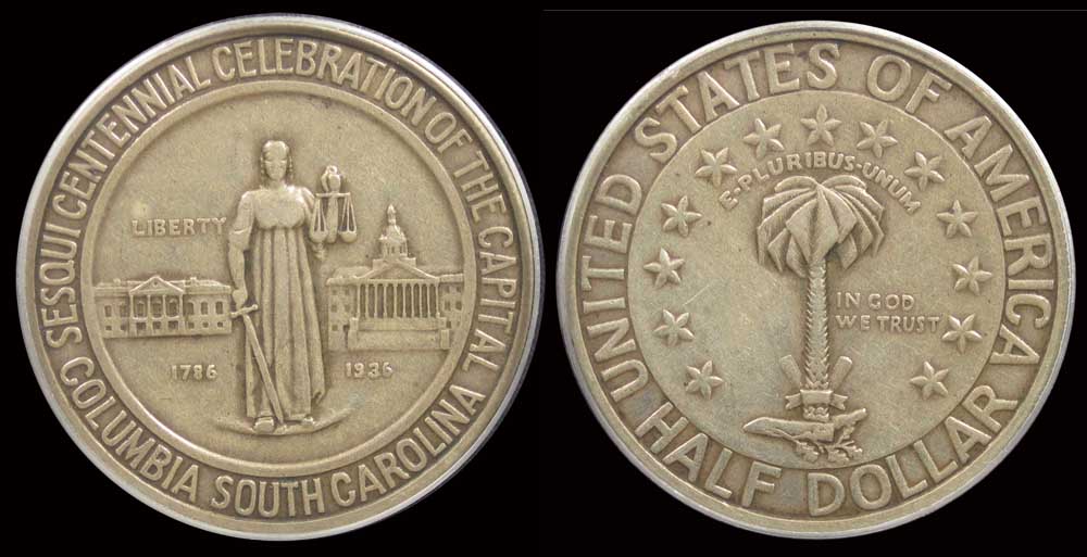 Take a look at my other hobby ... http://www.jk-dk.art |
|
Moderator
United States
190888 Posts |
Quote:
@ jbuck - Look how beautiful the coin is in honestly circulated XF40 state! Indeed! I believe that light circulation cameo enhances the design! |
|
Pillar of the Community
United States
5841 Posts |
The text used on the obverse are so compress, it leave no space to adjust or add some element to differentiate between Columbia SC and sesqui centennial celebration of the capital, other details are also needlessly added.
|
|
CCF Master Historian of USA Commemoratives
 United States
12352 Posts |
@macmercury: I believe the lack of physical separators was a stylistic choice vs. poor planning that led to a compressed layout.
If you look closely at the words on each side, you'll notice that they use two different orientations. The layout of the words that are meant to be grouped/read together all share the same orientation: the words "SESQUICENTENNIAL CELEBRATION OF THE CAPITAL" (obverse) and "UNITED STATES OF AMERICA" (reverse) are oriented with the bottom of each letter positioned toward the interior/center of the coin, while "COLUMBIA SOUTH CAROLINA" (obverse) and "HALF DOLLAR" (reverse) have the bottom of each letter facing out at the coin's rim. Each facilitates easier reading when the coin is oriented properly.
The orientation of each phrase was the artist's choice for separation between them vs. including physical separators.
Collecting history one coin or medal at a time! (c) commems. All rights reserved.
|
|
Moderator
United States
190888 Posts |
 I think it is an effective design and I find it rather appealing.  |
|
Pillar of the Community
United States
5841 Posts |
I would think adding some form of separator would visually help on the obverse with the type less tall, the reverse with the stars already busy so I wouldn't add any separator to US of America and half dollar, but word spacing should have done better, just my design choice.
One thing that bother me is the plate Liberty standing on doesn't seem to be necessary, but all these are my own perspective as the artist has their own interpretation.
I thank again to commems for all the fascinating facts and history and I enjoy reading them.
|
|
Bedrock of the Community
United States
94367 Posts |
Indeed, commems is a giant on this forum.
|
| |
Replies: 10 / Views: 1,199 |
|


