| Author |
 Replies: 5 / Views: 79 Replies: 5 / Views: 79 |
|
|
Press Manager
 United States
1420 Posts |
|
|
|
|
Pillar of the Community
United States
6900 Posts |
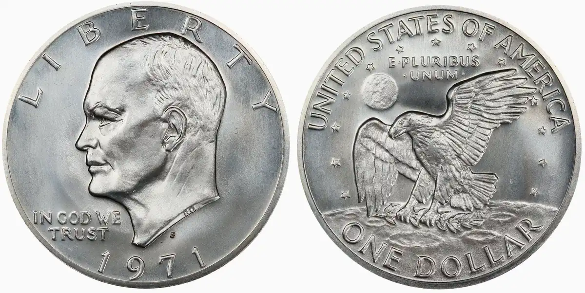
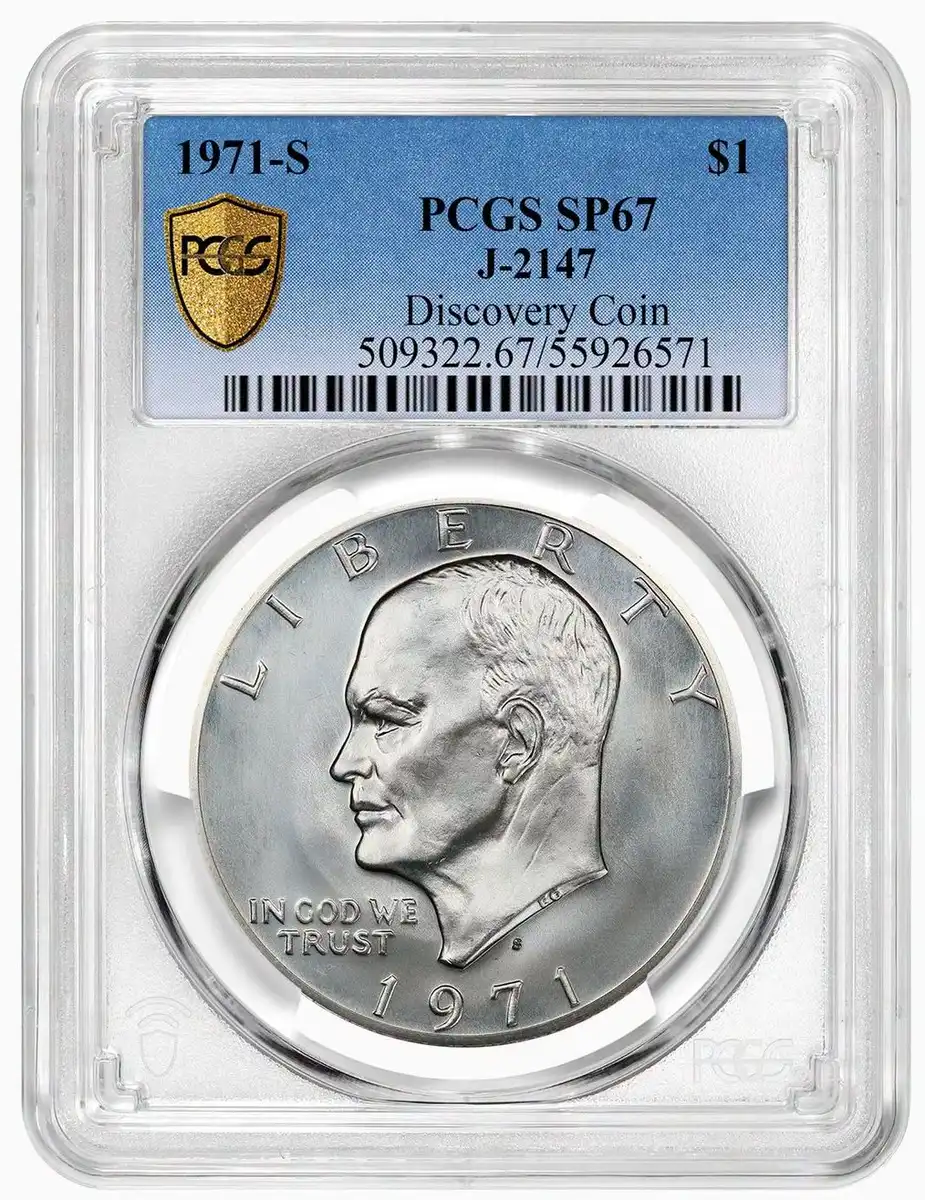
The obverse looks mostly the same to me, except that the L and R (and maybe I) have weak or nonexistent serifs.
The reverse looks different. First, Australia on Earth (although I knew that Earth was different on the prototypes). The USoA and EPU lettering is much thinner. The stars are more delicate. Also, the business strike crater outlines have been strengthened. The finish is also different—very glossy compared to a pebbly business strike finish.
|
|
Moderator
United States
195737 Posts |
Hello, beautiful!  |
|
Bedrock of the Community
United States
79151 Posts |
Wow! A beauty!  Errers and Varietys.
|
|
Moderator
United States
195737 Posts |
Quote:
Australia on Earth  Africa? |
|
Pillar of the Community
United States
2810 Posts |
Weak moon design and silver composition?
That would be an amazing roll find!
|
| |
Replies: 5 / Views: 79 |
|













 Posted Today 31M ago


