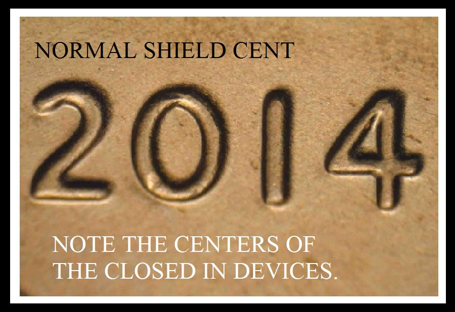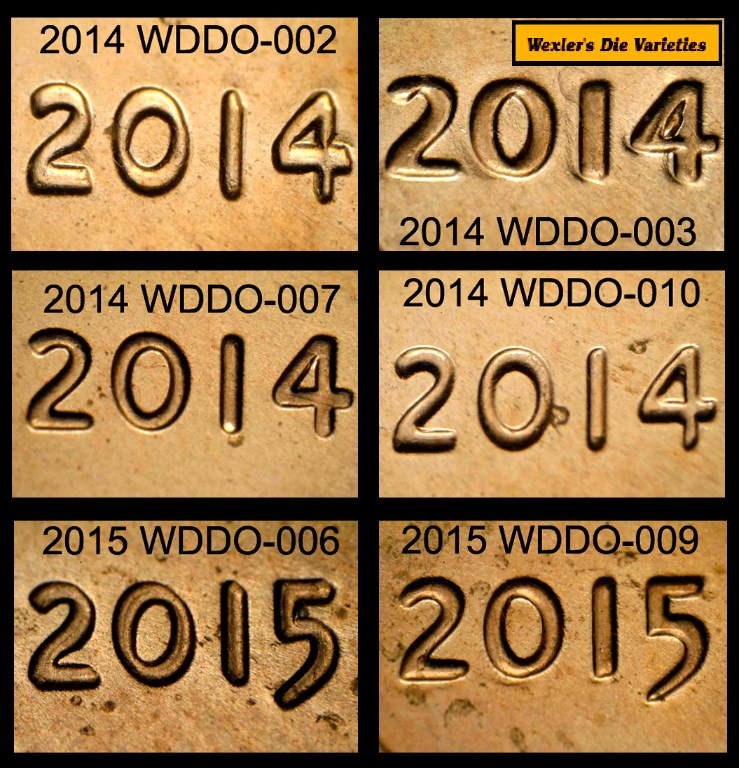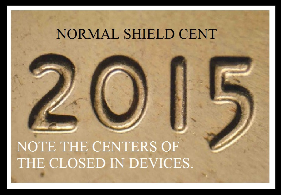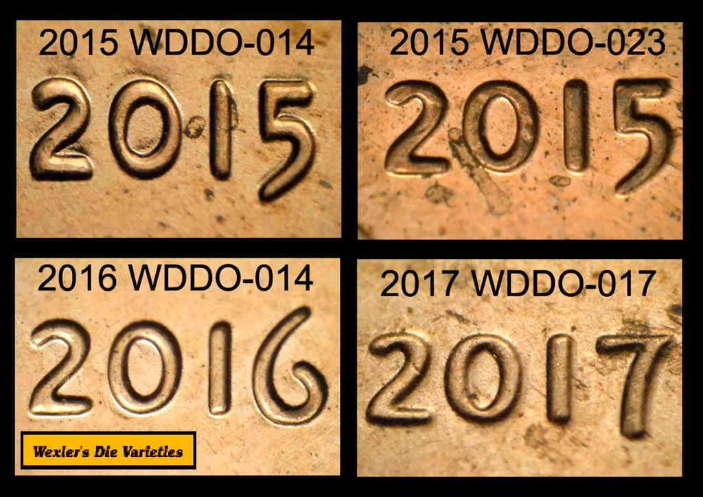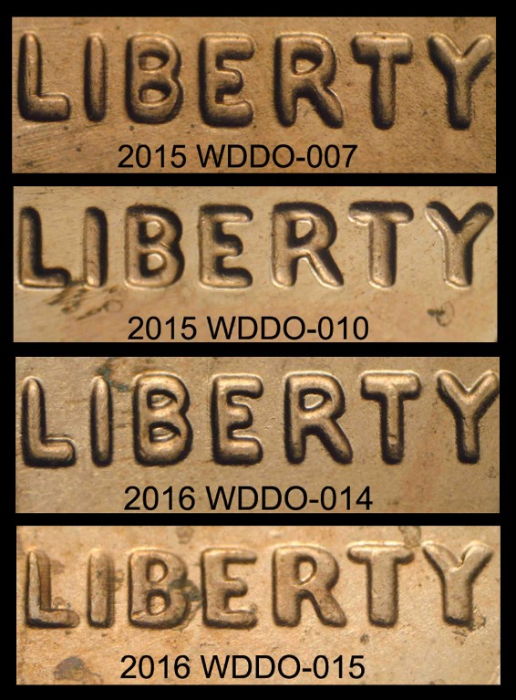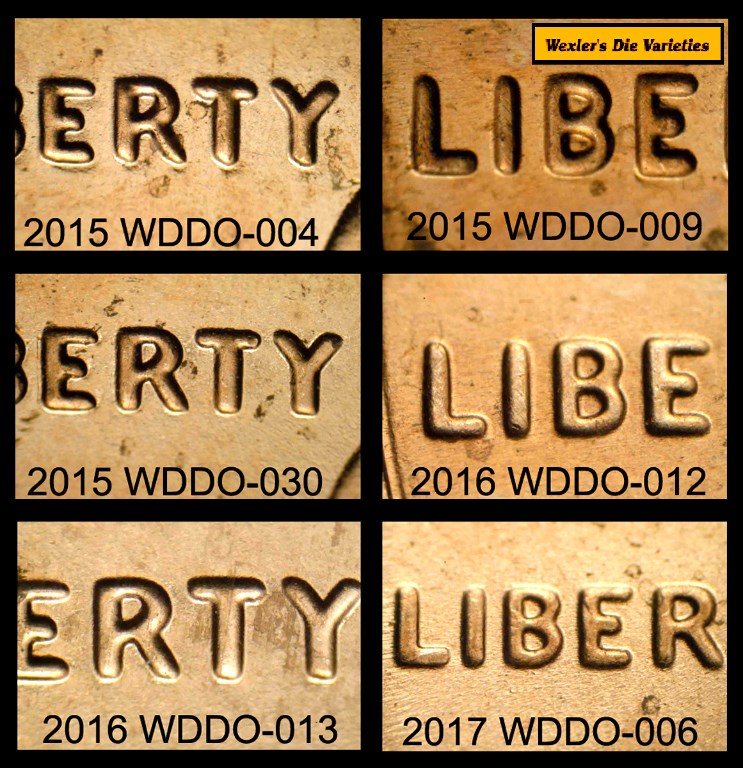


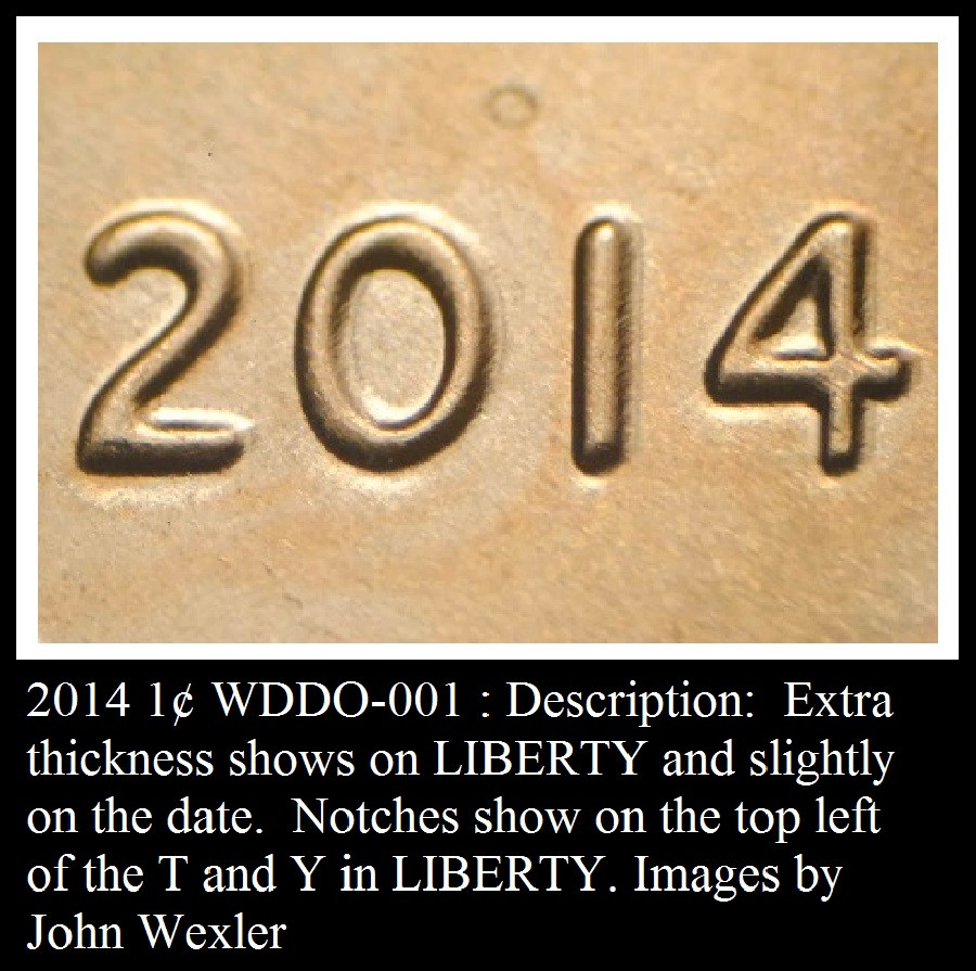
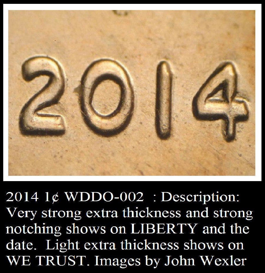
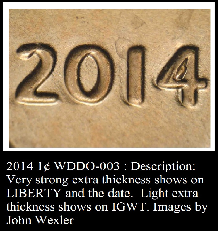

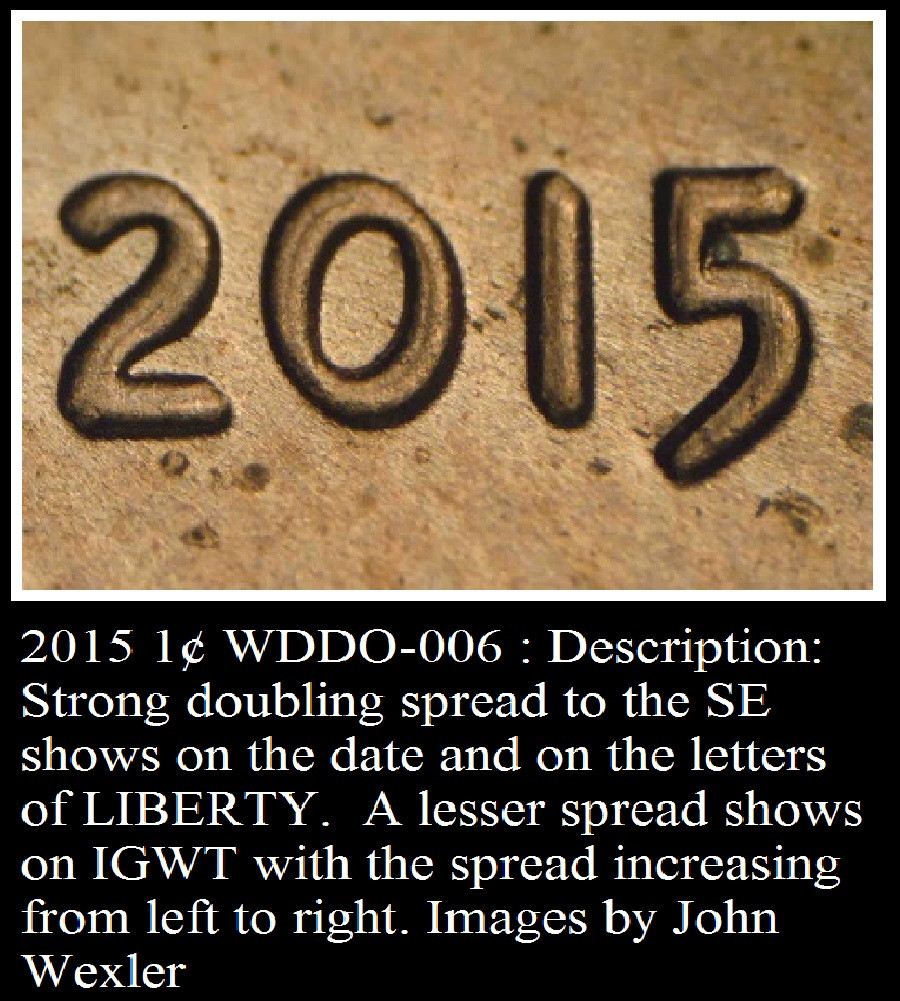


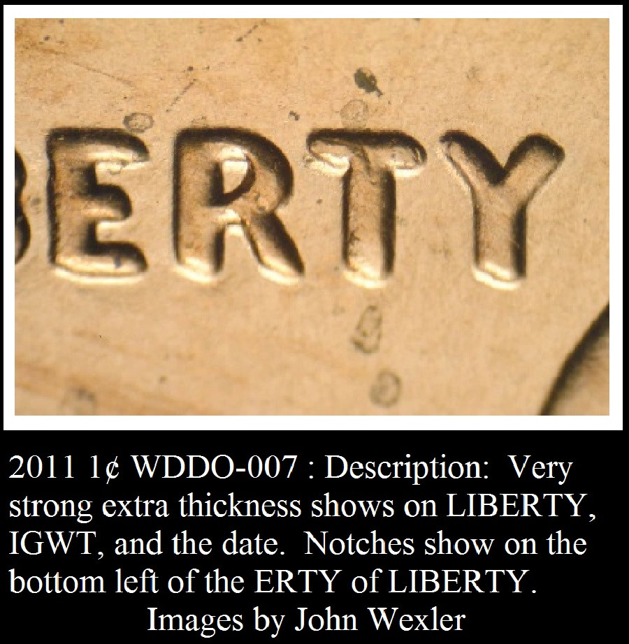

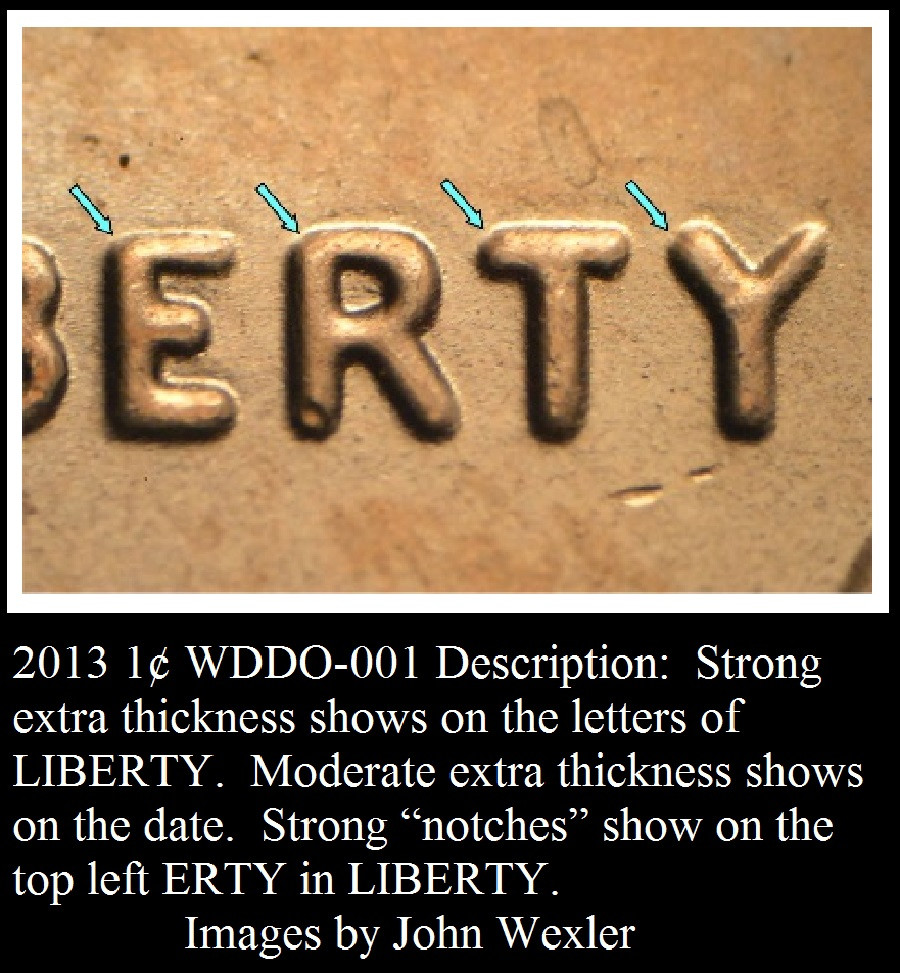
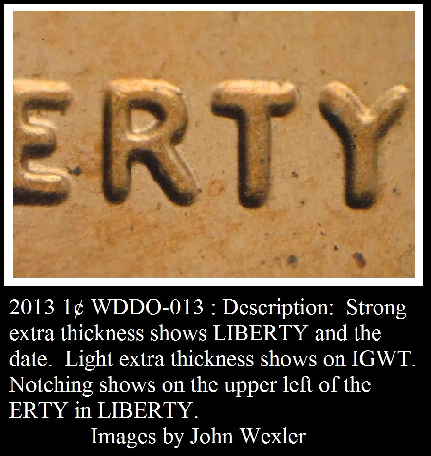
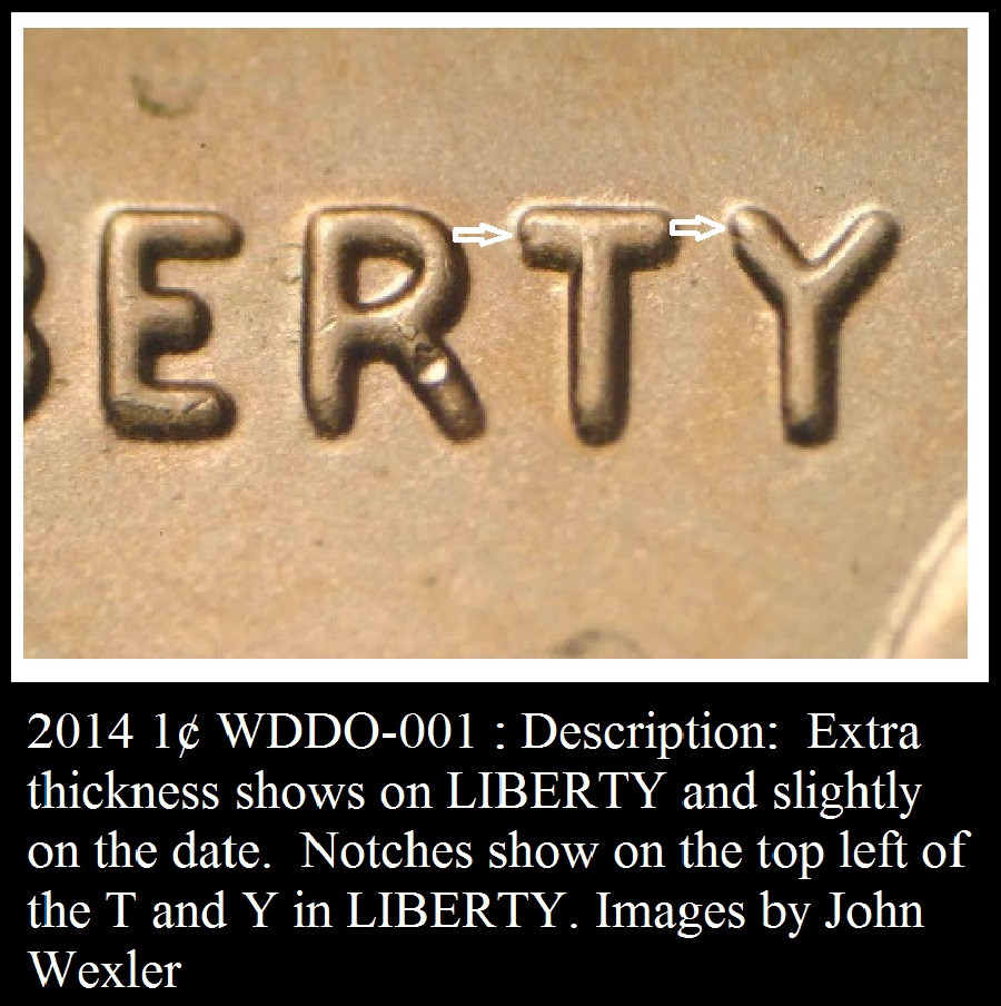
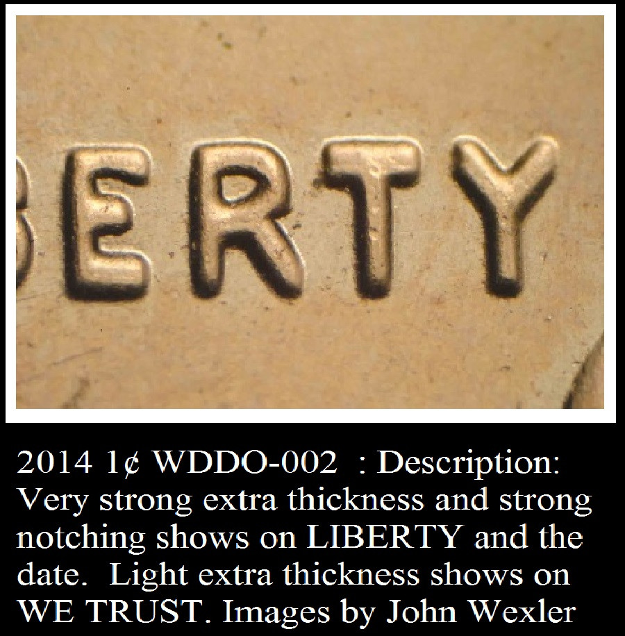
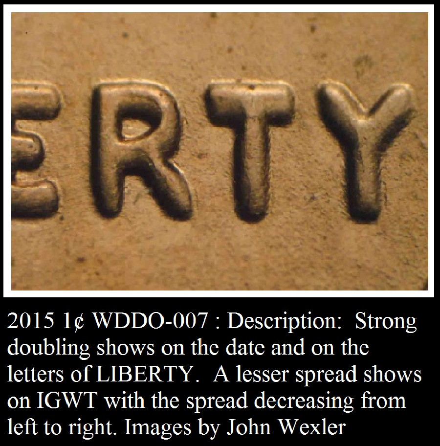
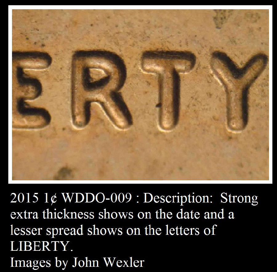
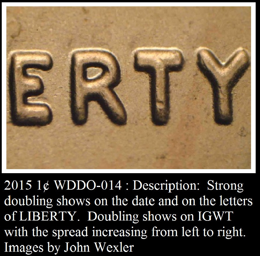
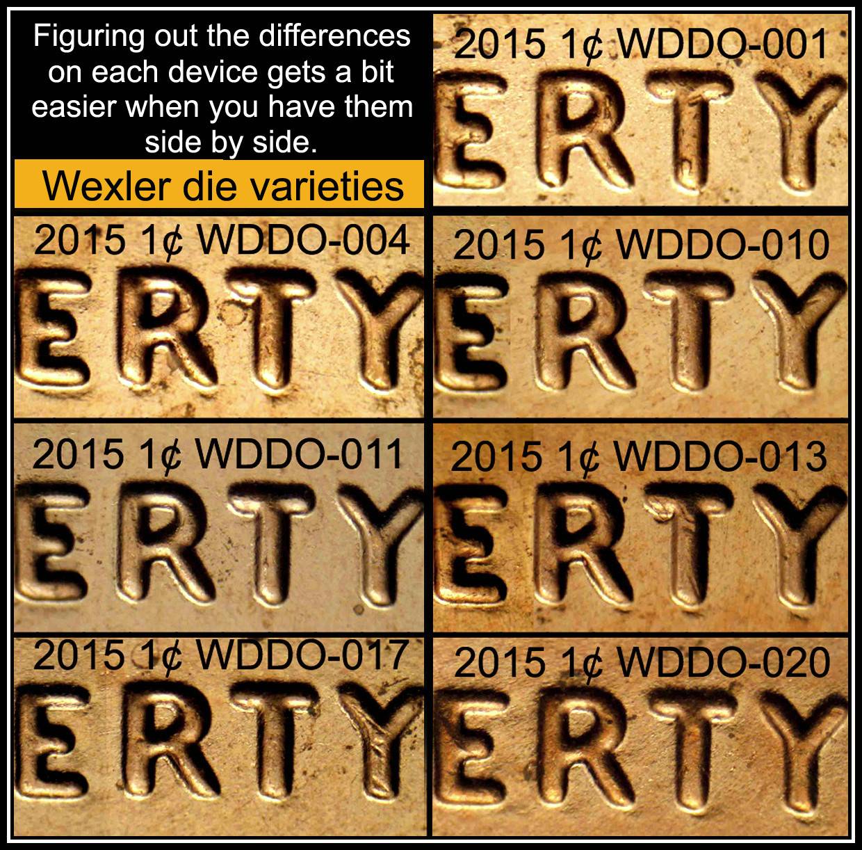


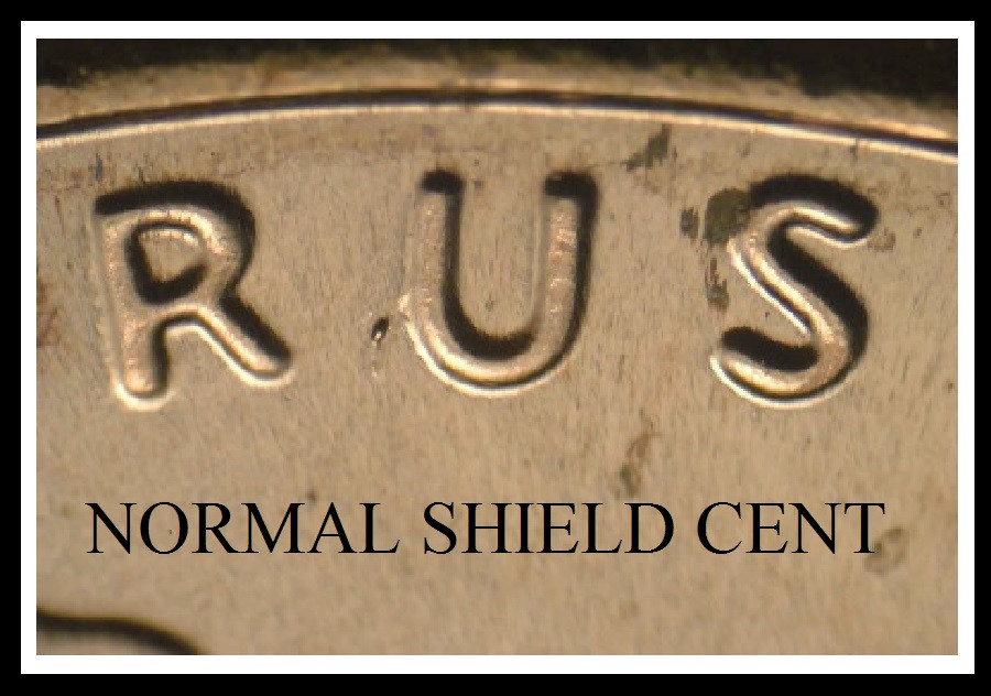


Awesome to the max Coop! They're hard to miss when you put them like that.  Thank you.


Search CCF Members
eBay Tools
eBay Coin Search Engine
eBay Coin Categories
All eBay Categories
eBay / CCF Member List
eBay / CCF Member Sales
Popular Items
Error Coins
US Error Coins
US Cheap Coins
US Hot Coins
US Most Watched Coins
Aussie Cheap Coins
Aussie Hot Coins
Aussie Most Watched Coins
Canadian Cheap Coins
Canadian Hot Coins
Canadian Most Watched Coins
Ancient Cheap Coins
Ancient Hot Coins
Ancient Most Watched Coins
World Cheap Coins
World Hot Coins
World Most Watched Coins
eBay Coins By Type
eBay Coins By Year

|
|
This page may contain links that result in small commissions to keep this free site up and running.

Welcome Guest! Registering and/or logging in will remove the anchor (bottom) ads. It's Free!
To participate in the forum you must log in or register.
| ||||||||||||||||||||||||||||||||||||||||||||||||||||||||||||||