| Author |
 Replies: 15 / Views: 523 Replies: 15 / Views: 523 |
|
|
Pillar of the Community
United States
1272 Posts |
|
|
|
|
Pillar of the Community
United States
2887 Posts |
|
|
Pillar of the Community
United States
6433 Posts |
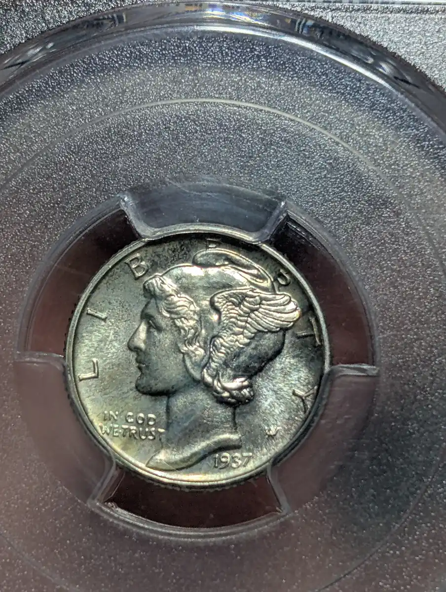
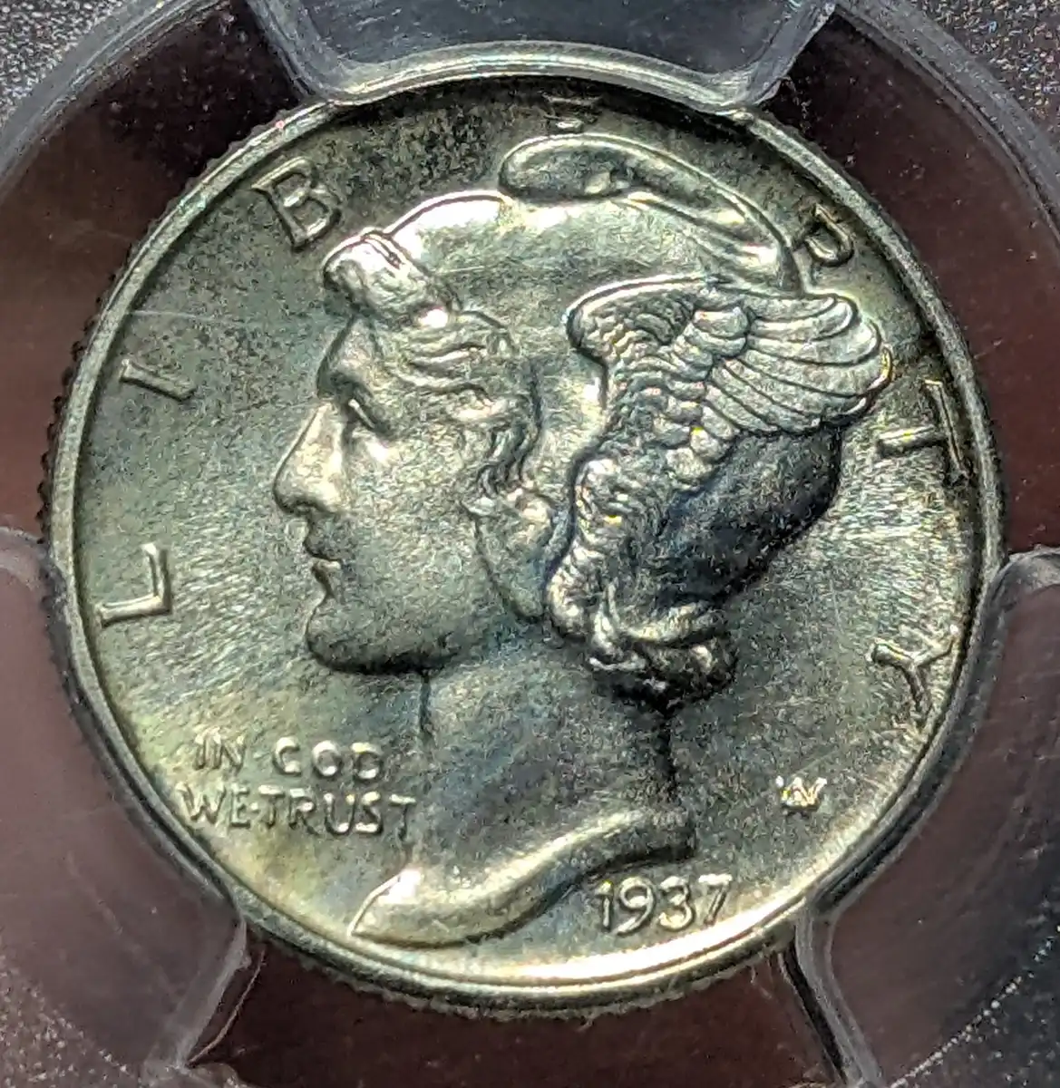
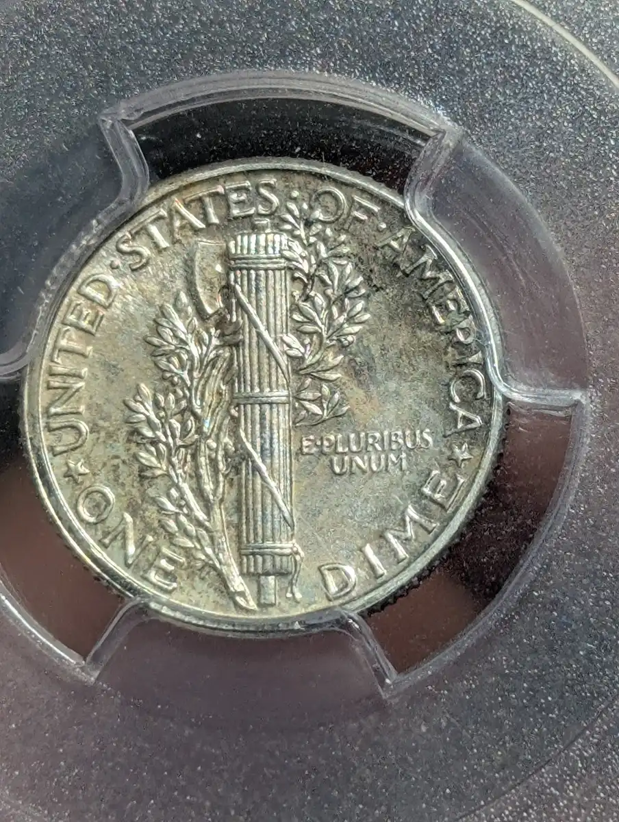
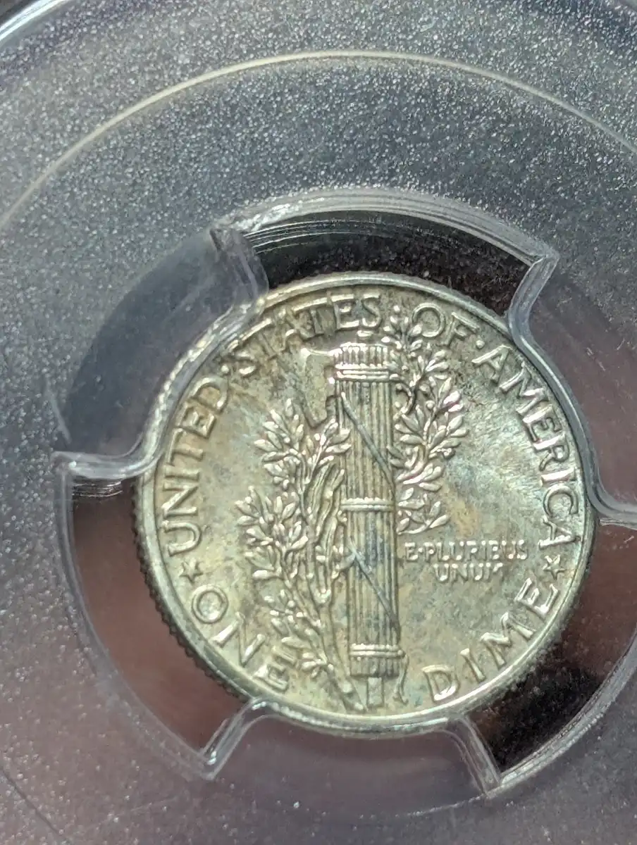
Proof Mercury dimes usually have fairly clear mirrored fields and light frost on the devices. Cameo contrast is usually weak or completely absent. This dime doesn't have many contact marks or other surface defects and there are no obvious signs of cleaning. As expected there is no cameo contrast. The fields look very dull and hazy. As a result eye appeal seems well below normal. I'll throw out PR-64. |
|
Pillar of the Community
United States
1101 Posts |
|
|
Valued Member
United States
146 Posts |
I'm gonna agree with a PF64 - not a very attractive example.
|
|
Bedrock of the Community
United States
78857 Posts |
I'll say PR-64 as well.
Errers and Varietys.
|
|
Pillar of the Community
United States
7314 Posts |
Never got into Merc. dimes (shame on me) Wondering is that a scratch on the holder or coin (obverse)? Not seeing any hits,  So If the luster isn't coming through with the photos I'll say 65 |
|
Bedrock of the Community
 United States
18903 Posts |
the only thing that says proof is the strike, the surfaces are not exhibiting what a typical proof would look like unless it was improperly stored. as JennyCents stated, "not a very attractive example"
I'm a little lower due to the eye appeal. PR63
|
|
Pillar of the Community
 United States
1272 Posts |
I've got to jump in early here since no one is even close. Either my pics aren't very good or we have wildly different ideas of what makes a nice coin. . I've looked at a lot of Mercury proofs and many have nasty white milk spots or a very "hazed" over look, this one doesn't. This is a pr66+. I found the eye appeal to be good as the toning indicates original skin. There some light rainbow toning near "in God we trust" on the obverse. There also a bit of rainbow above "E pluribus unum" on the reverse. Here's a few more pics. The "scratch" on the obverse is on the holder. Coin surfaces are very clean. 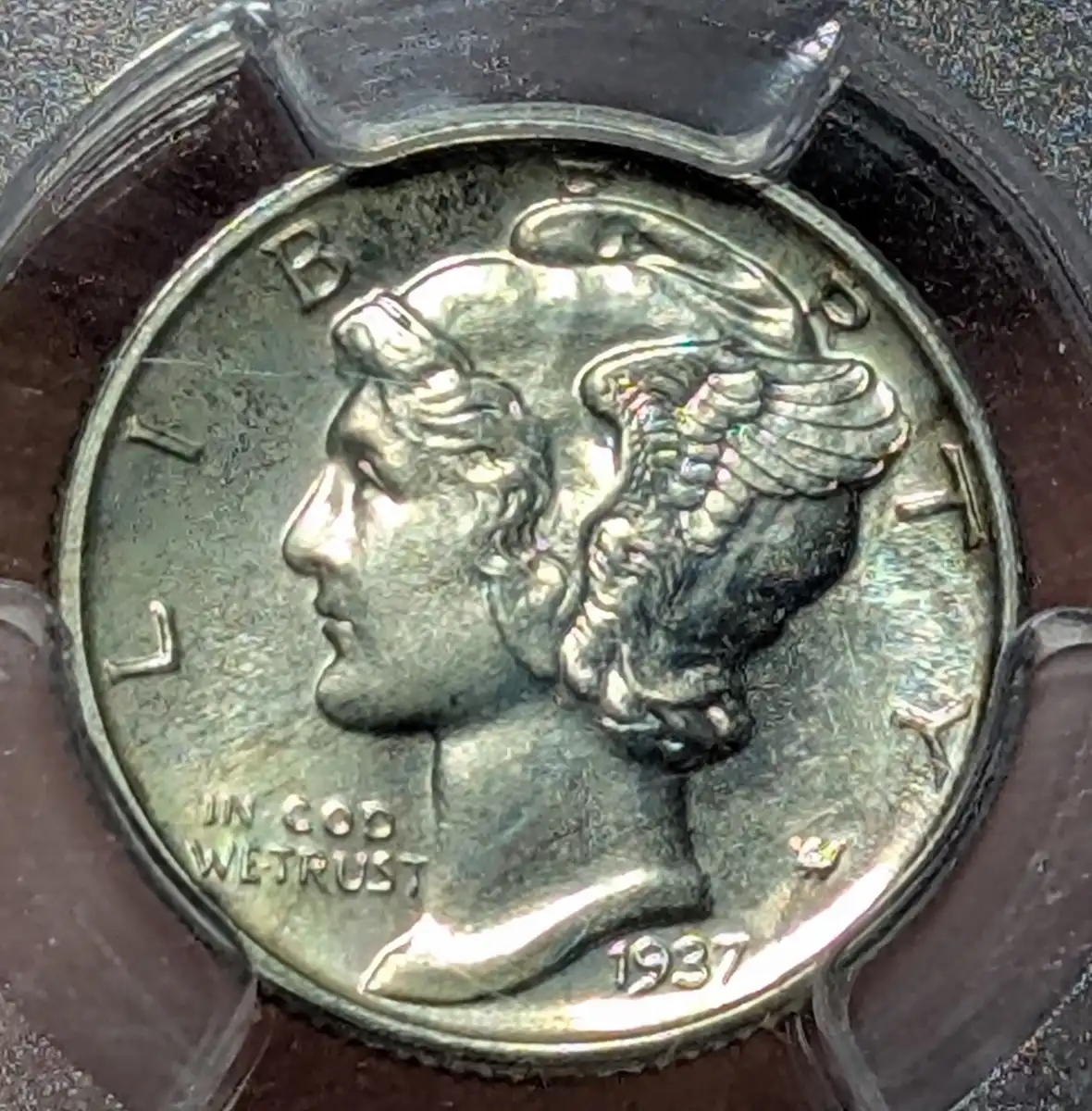 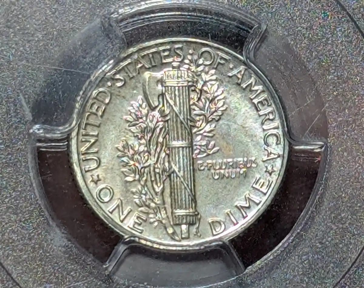 Here's an example of a "bad" 1937. Here's an example in a green ogh pcgs pr65. Huge difference IMO. 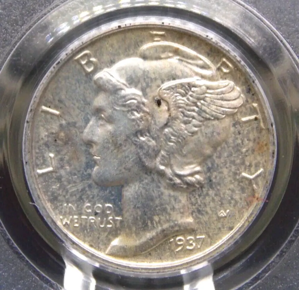 This one's a ngc pr65 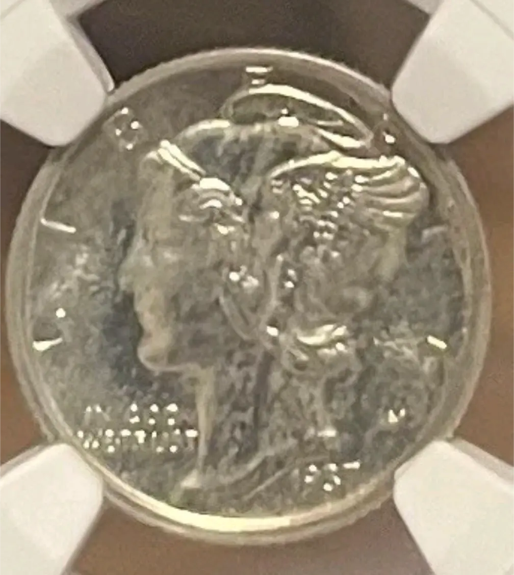 And another pcgs 65.. 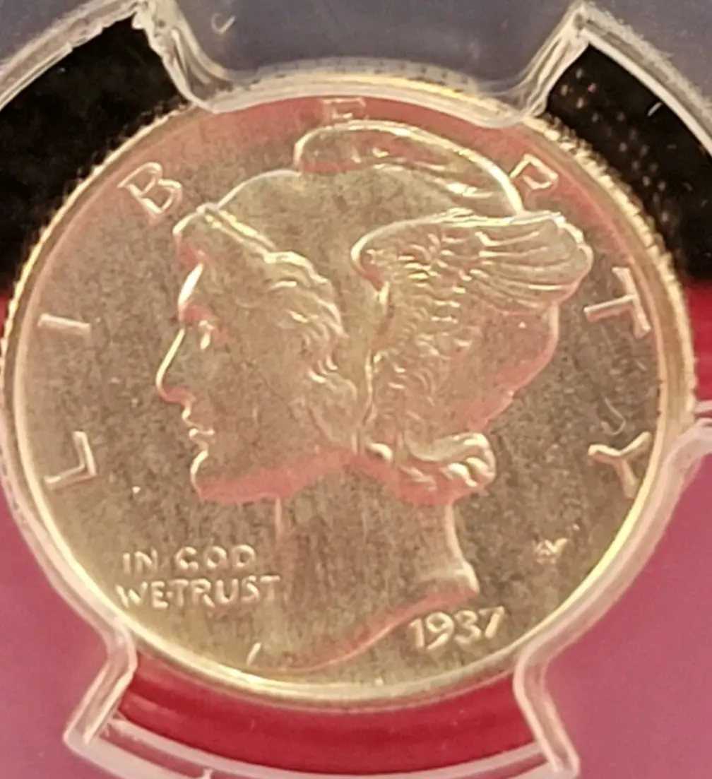 Perhaps you all are applying modern proof grading standards to the 1937? These simply aren't going to look like a modern proof. Go out on ebay and look at other 1937 proofs for sale, I think you may change your opinion on this one. Edited by LibertyEagle20
09/19/2026 10:01 am
|
|
Bedrock of the Community
United States
18903 Posts |
i agree that many 37's do have this look. a lot of them that look similar to yours are graded 64 and 65. for 66+ thats a huge stretch for me. I think your photos are showing exactly what the coin looks like in hand. the eye appeal could be throwing everyone off.
|
|
Pillar of the Community
United States
2317 Posts |
I also agree the eye appeal just isn't there. Highly doubt this would green bean.
You realize when you know how to think, it empowers you far beyond those who know only what to think.
-Neil deGrasse Tyson
|
|
Pillar of the Community
United States
5897 Posts |
Not the best images, I agree with other assessment.
|
|
Pillar of the Community
United States
1272 Posts |
I'm certainly not saying people have to like the coin and everyone can have their own opinion, but I would really like to better understand the disconnect. I understand TPG's get it wrong but I highly doubt PCGS graded a 63/64 coin a 66+ by accident, stranger things have happened but that would be a huge miss. It's my understanding the "+" actually usually indicates above average eye appeal so that is in direct contrast with all the comments in this thread saying this coin is a poor example. You've seen the 3 other "65s" I posted. Now THOSE are cloudy with bad eye appeal. It looks like you are viewing the coin through a foggy window. What is actually causing people to think my coin looks so bad? There are really very few surface marks so I assumed that's why it hit a 66. Then with the rainbow toning and clear detail (vs the very washed out lifeless zombie look of the 3 PR65's I posted) that bumped it to a plus. Or maybe my pictures are just that bad... truthfully I'm just very confused on what you all are seeing that I'm not. The coin looks great in hand. I'm serious - go to ebay and look up the 1937 proof Mercury dime. If you think mine has "bad eye appeal" you are in for a real shock when you see what others are offering. The mintage is under 6k and most look terrible based on my research, so I'm still happy with my example even if it's not for everyone! |
|
Pillar of the Community
United States
965 Posts |
LibertyEagle, no one in this forum can see what you see with it in hand twirling it around under a light.
As long as you are happy with the price paid for what you have in hand, I wouldn't worry about it.
|
|
Pillar of the Community
United States
2317 Posts |
Send it to Cac.
You realize when you know how to think, it empowers you far beyond those who know only what to think.
-Neil deGrasse Tyson
|
|
Moderator
 United States
195350 Posts |
Photos are always going to be a factor. I far from being the best at taking photos, so no disrespect intended.  |
| |
Replies: 15 / Views: 523 |
|











 Posted 09/18/2026 4:00 pm


