| Author |
 Replies: 25 / Views: 3,947 Replies: 25 / Views: 3,947 |
|
Bedrock of the Community
United States
62064 Posts |
|
|
|
|
Moderator
 United States
188560 Posts |
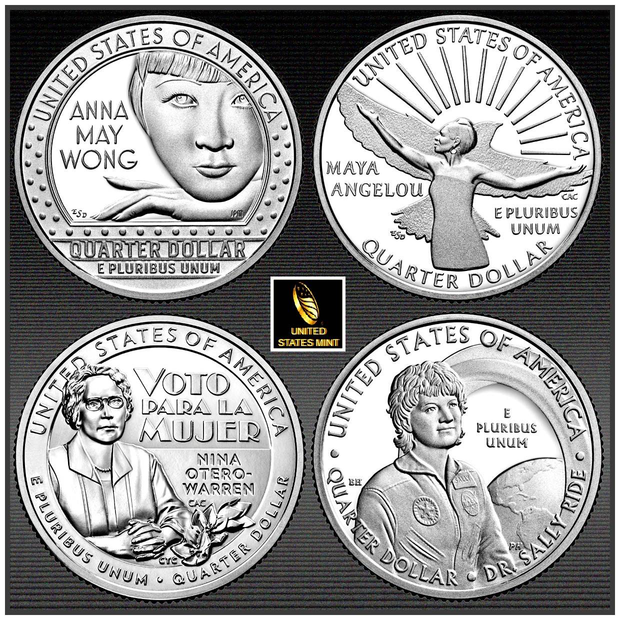
Looking good!  I am fond of that Kentucky Innovation dollar design.  |
|
Pillar of the Community
 United States
6514 Posts |
Cool. Thanks coop!
Check out my counterstamped Lincoln Cent collection: http://goccf.com/t/303507 |
|
Pillar of the Community
United States
1086 Posts |
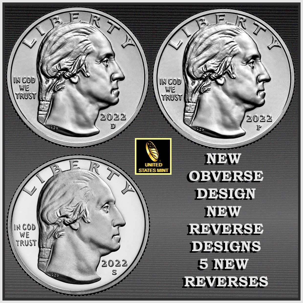
I love the look of the date as "2022"
Thanks for the images coop!
|
|
Pillar of the Community
United States
6559 Posts |
Im liking the Tennessee dollar
|
|
Pillar of the Community
United States
743 Posts |
Thanks for sharing. I like the quarter obverse a lot. Nice to have a change after almost a hundred years.
Regarding the innovation dollars, the Kentucky and Tennessee dollars are great. I like how the mint has incorporated circular designs on those dollars, ie....the Massachusetts and to a lesser extent, New Hampshire.
|
|
Pillar of the Community
United States
735 Posts |
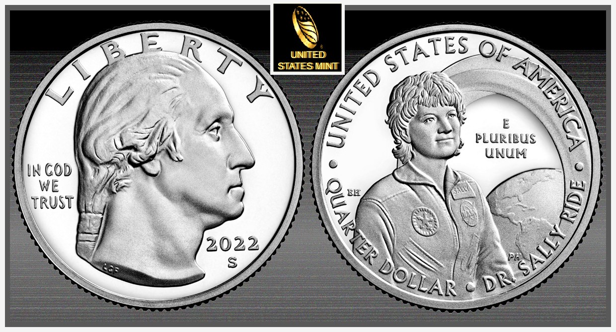
The innovation dollars look nice. The 2022 quarters obverse is going to take some time to get used to though.
I've been collecting for a couple years... Favorite Coin's are Standing Liberty quarters, Working on my type set | Coffee, Corvettes, Coins & the CCF what could be better? Edited by Jakes Coins
01/18/2022 6:01 pm
|
|
Pillar of the Community
United States
5185 Posts |
Oh my, what happened to Washington?! He looks mean and his neck seems stretched to the breaking point!
|
|
Valued Member
United States
292 Posts |
The new obverse design of Washington is the one originally planned back in 1932 until the Secretary of the Treasury intervened. It portrays Washington about 20 years younger than the Washington on the 1932 - 2021 quarter.
Edited by EDM
01/18/2022 8:46 pm
|
|
Pillar of the Community
United States
2003 Posts |
With the exception of the Silver Eagles, I'm done with this modern junk after 2021. Going back to finish my Indian cents and Peace dollar series. At least the old stuff still has some class. |
|
Pillar of the Community
United States
5830 Posts |
The Washington quarter portrait was also used in the 1999 gold $5 commemorative, but I would like the motto IGWT design in a better position, it almost was force into place. Edited by macmercury
01/18/2022 11:18 pm
|
|
Moderator
United States
188560 Posts |
Quote:
I love the look of the date as "2022" Try to remember that this year is 2022, not "2020 too!"  |
|
Pillar of the Community
United States
5185 Posts |
Another observation: why does the 2022-S obverse look weakly struck compared to the 2022-P and 2022-D?
|
|
Pillar of the Community
United States
7512 Posts |
Quote:
Oh my, what happened to Washington?! He looks mean and his neck seems stretched to the breaking point! No kidding !!! I am not fond of this new design. I like the Sac $ reverse design. |
|
Moderator
United States
188560 Posts |
Quote:
I am not fond of this new design. Now that Jefferson and Washington have had a makeover, they need to tackle the rest.  |
|
Pillar of the Community
United States
4868 Posts |
The sac dollars look like Chuckie Cheese tokens w/o the date on the obverse.
|
| |
Replies: 25 / Views: 3,947 |