| Author |
 Replies: 11 / Views: 1,831 Replies: 11 / Views: 1,831 |
|
|
Valued Member
United States
359 Posts |
All- The final obverse and reverse for the CCF Token have been confirmed by nohope. Each winning side noted the date of establishment so we should come up with something else for one of them. Since the Obverse design had an overwhelming majority of votes, I think we should leave that one alone. This means removing "Established 2005" from the bottom of the Reverse and putting something else there. One idea I had: We could put the "What's In YOUR Pocket?" tagline there (see pic below). Or, we could put other text, space out the eight stars further with no text, or something else... Thoughts? Ideas? Once the design is finalized I'll send high-res images to nohope. Thanks! -Steve 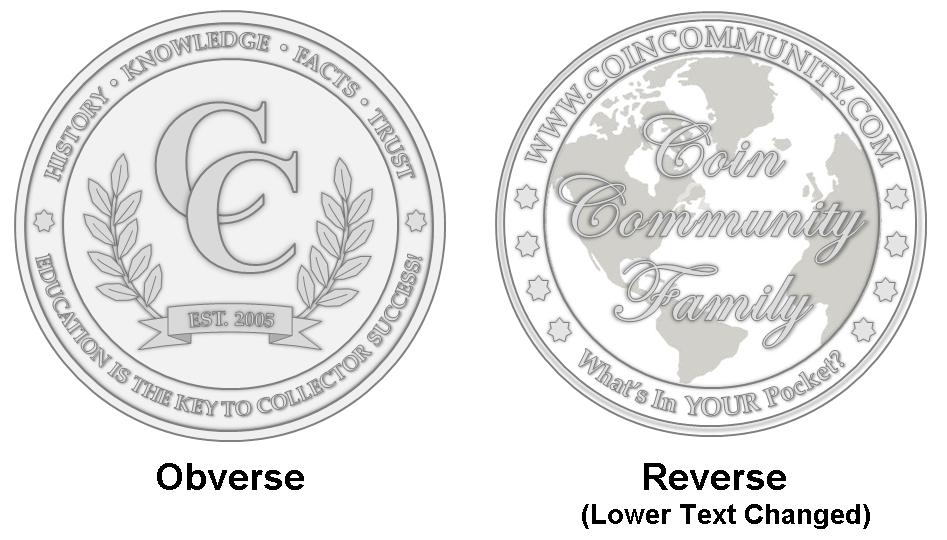 |
|
|
|
Valued Member
Canada
83 Posts |
First off - congrats on the beautiful designs! They are simple and elegant and something I would happily add to my bullion collection.
I agree that we don't need the date on both sides, however instead of "What's in your pocket?" (which is obviously another nice nod to the site), I personally would LOVE to simply have the metallic content information. Eg. 1oz. 9999 Silver
I think having that right on the coin is very valuable for any collector.
Cheers!
|
|
Forum Dad
 United States
24205 Posts |
Quote:
I personally would LOVE to simply have the metallic content information. Eg. 1oz. 9999 Silver Then we can't use the die on anything but silver. Sure would be nice if the CC on the obverse was Edwardian Script ITC like on the site.... http://www.coincommunity.com/ITCEdscr.TTF |
|
Moderator
United States
23522 Posts |
Depending on final size, this is going to be a tough strike. Even at the size depicted here, those serifs will be darn near impossible.
|
|
Pillar of the Community
United States
3453 Posts |
Correct me if I am wrong but I believe that when they create the dies they will need to adjust the design to address real-world striking issues. I trust that nohope will be able to guide us through the next steps since he was been down this road before.  |
|
Moderator
United States
23522 Posts |
Quote:
I believe that when they create the dies they will need to adjust the design to address real-world striking issues. It'll be imperative, and the result will be a coin which doesn't resemble the design. It is, quite frankly, something which should have been better-integrated into the design process from the start so the final coin more closely resembled the chosen design. I cannot see a serif typeface making it into production in that size - heck, I'm not particularly confident with the script, either - and that could cause disappointment. I certainly hope I'm wrong, though. |
|
Valued Member
 United States
359 Posts |
Quote:
Sure would be nice if the CC on the obverse was Edwardian Script ITC like on the site.... Bobby, I did use Edwardian Script ITC for the reverse, but I mimicked the font of the "CC" on the obverse that we see at the top of the web browsers (see the parts outlined with red boxes in the image below; Chrome, then Internet Explorer, then Firefox). 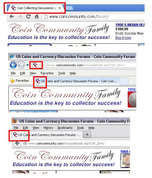 |
|
Pillar of the Community
United States
3453 Posts |
Nohope will be able to guide the rest of the process. I look forward to hearing about the next steps from him  . |
|
Forum Dad
United States
24205 Posts |
The only reason I didn't use the correct font in the favicon is that it didn't look good at all that small.
|
|
Valued Member
United States
130 Posts |
It's not often I visit this area of the forum but I'm glad I did as I've become acquainted with this creative endeavor. I'm writing today to offer my perspective on the final design for what I'm sure will be a fine coin.
Beginning with the obverse, I'd like to talk first about the emblematic words at the top: History, Knowledge, Facts, Trust. History is an excellent choice as it reminds us of the cultural relevance that compels so many of us to study numismatics. Trust is also a good one as the exchange of coins, paper and information about these and other collectibles is built on a foundation of integrity. To talk about the two words I skipped, I'm going to turn to the dictionary:
Fact:
1) something that actually exists; reality; truth
2) something known to exist
3) a truth known by actual experience or observation
Knowledge:
1) acquaintance with facts, truths or principles
2) the perception of fact or truth
Aren't these words two ways of saying the same thing? Though they are synonymous I like the concept so I would recommend dropping Fact in favor of Knowledge. This would also create a pleasant aesthetic balance by having a longer word flanked by two shorter words. More importantly I think the added brevity would augment the message. I'll move now to the phrase at the bottom.
Education is the key to collector success! This phrase is relevant and has a satisfying rhythm. My only concern is with the exclamation point: is it necessary? Any words placed in the design of a coin are probably important enough on their own not to require a raised voice - otherwise the designer(s) wouldn't have bothered. We certainly don't have 'E pluribus unum!' or 'Elizabeth D.G. Regina!'. These sentiments carry their own weight. On to the reverse.
The world map is a wise inclusion as we have collectors from all corners visiting this site to exchange information. Could we experiment with ways to get all the continents in frame? The script for the forum name is sized well and adds class. I'm not fond of the phrase 'What's in YOUR pocket?' but I appreciate the creative effort. If it were up to me I would leave that part of the coin blank; the reverse has plenty of interesting design elements and we already have a charming phrase on the obverse.
Thanks for taking time to read my thoughts on your design. I wish those involved success in commemorating this site which has been so helpful to myself and many others.
|
|
Pillar of the Community
 Canada
9878 Posts |
Instead of "What's in your pocket".
Why not the year of issue,2013.
"Dipping" is not considered cleaning...
-from PCGS website
|
|
Pillar of the Community
United Kingdom
4208 Posts |
America is just not a good continent for mapping off of. Centralise on america and half of the map is empty. The advantage of being central with London/Paris is that the pacific (AKA the huge body of water with basically no one in it) is split at the sides. However, the peters projection which It seems is being used here, is hardly ideal for the job of showing all continents. I personally dont mind the current one - it looks nice and most numismatists live in the US anyway, but in the interest of equality... I present to you the Lambert Azimuthal Projection:  It accurately displays area and relative positions on a disk - and, it even has stuff right on the other side of the globe. |
| |
Replies: 11 / Views: 1,831 |
|


