| Author |
 Replies: 12 / Views: 1,175 Replies: 12 / Views: 1,175 |
|
|
CCF Master Historian of USA Commemoratives
 United States
12250 Posts |
Here's a medal that follows in the footsteps of the the 1934 Maryland Tercentenary (sort of) in that it was designed by the same artist that created the designs for the associated commemorative half dollar. Presented here is the Official Connecticut Tercentenary Medal designed by Henry Kreiss. The medal's obverse features a group of men and women symbolizing the founders of Connecticut; Thomas Hooker, lead founder, is at the center. The medal's reverse depicts three grapevines (as seen on the Colony/State Seal) that originally symbolized the three initial settlements of Connecticut (i.e., Windsor, Wethersfield and Hartford). On the medal, however, they appear to represent the principles of Religion, Law and Education. Official Connecticut Tercentenary Medal  Two hundred medals had a serial number added, and were sold at $5.00 each. The balance of the medals were unnumbered and were sold for $1.00 each. An inital order for 2,000 medals was placed with the Medallic Art Company; a second order for 500 medals was placed after strong initial sales. Here's a promotional piece about the medal that was printed in the Connecticut Tercentenary Bulletin of November 1934; the Connecticut Tercentenary Bulletin was published by the Connecticut Tercentenary Commission, the sponsor of the State's commemorative coin and medal. 1935 Connecticut Tercentenary Bulletin - November 1934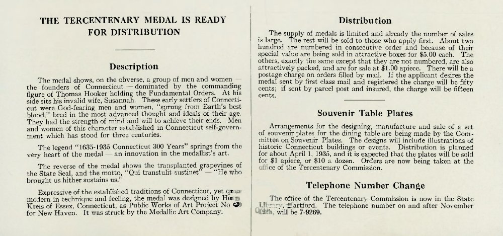 1935 Connecticut Tercentenary Half Dollar 1935 Connecticut Tercentenary Half Dollar  For other posts about the Connecticut half dollar, see: - 1935 Connecticut Tercentenary - 1935 Connecticut Tercentenary - Ephemera - Includes image of Connecticut Seal - 1935 Connecticut Tercentenary - Ephemera II- 1935 Connecticut Tercentenary - Philatelic Tie-In- 1935 Connecticut Tercentenary - Commission BulletinsOther of my posts on commemorative coins and medals can be found here: Read More: Commems Collection. Collecting history one coin or medal at a time! (c) commems. All rights reserved.
Edited by commems
11/01/2021 07:14 am
|
|
|
|
Bedrock of the Community
United States
94367 Posts |
Interesting medal, but not patch on the half, surely among the most beautiful of our commemoratives.
|
|
CCF Master Historian of USA Commemoratives
 United States
12250 Posts |
@Coinfrog: From your previous responses to my Connecticut-related posts, I anticipated your favorable comments re: the design of the Connecticut half dollar, but I am not sure what you mean by "but not patch on the half." Can I trouble you for a clarification please? Thanks!
Collecting history one coin or medal at a time! (c) commems. All rights reserved.
|
|
Bedrock of the Community
United States
94367 Posts |
"Not a patch on" is slang for "Doesn't compare to", or at least it does in the UK, where I have spent a lot of my life.  Edited by Coinfrog
11/01/2021 09:42 am
|
|
CCF Master Historian of USA Commemoratives
United States
12250 Posts |
Quote:
"Not a patch on" is slang for "Doesn't compare to", or at least in does in the UK Thanks! I've never heard the expression before. I learned something new today! Collecting history one coin or medal at a time! (c) commems. All rights reserved.
|
|
Moderator
United States
187446 Posts |
In my opinion, it is an impressive medal design that gives the coin a good run for the money. I generally dislike seeing people (groups), but I really like how this one was executed.  |
|
Bedrock of the Community
United States
94367 Posts |
Beauty is indeed in the eye.
|
|
Moderator
United States
187446 Posts |
It certainly is. If it were not, the world would be a very boring place.
|
|
Moderator
United States
15383 Posts |
I'm in favor of the medal design, it appeals to my eye.
One of my first thoughts after observing the figures on the obverse was the classic 1930 painting "American Gothic' executed by Grant Wood. The similarity of employing a visual effect of 'elongated' standing figures is striking. I wonder if Henry Kreiss in 1935 was influenced by the prior work?
Take a look at my other hobby ... http://www.jk-dk.art |
|
CCF Master Historian of USA Commemoratives
United States
12250 Posts |
@nickelsearcher: I don't know if Grant Wood's "American Gothic" was a design influence behind Kreiss' work.
I do know that the "long and lean" style seen on the Connecticut Tercentenary medal is also to be found on other of Kreiss' medals of the same general time. His 1947 "Wise/Foolish Virgins" medal for the Society of Medalists series and his 1952 Hartford CT Art School medal are two examples of artworks that feature tall and thin figures.
Collecting history one coin or medal at a time! (c) commems. All rights reserved.
|
|
Moderator
United States
187446 Posts |
Quote:
I'm in favor of the medal design, it appeals to my eye. Quote:
I do know that the "long and lean" style seen on the Connecticut Tercentenary medal is also to be found on other of Kreiss' medals of the same general time. That is very interesting. If you have a style that works for you, go for it.  |
|
CCF Master Historian of USA Commemoratives
United States
12250 Posts |
I meant to include this information card (it came with the medal) in my original post, but accidentally left it off. It wasn't trimmed all that well by the printer (i.e., lacking square corners and uniform margins), but it does provide a good description of the medal!  Collecting history one coin or medal at a time! (c) commems. All rights reserved.
|
|
Moderator
United States
187446 Posts |
Excellent! |
| |
Replies: 12 / Views: 1,175 |
|


