| Author |
 Replies: 40 / Views: 5,371 Replies: 40 / Views: 5,371 |
Page 3 of 3
|
|
|
|
Valued Member
 Spain
134 Posts |
Quote:
The new UK designs are pretty nice too - I might prefer it, if only Britannia was put back on to something. You still have Britannia on the 50p, don't you? :)  Thought IMO that's one of the worst Britannia designs ever minted; nothing to do with the Edwardian Florins up there, that's a real beauty. But I find interesting the fact that even though that 50p coin is a sexagon, it has the same diameter in all its points; making it a virtual circle when measured. I like the Spanish coins up until Franco's time... even the regular peseta looked sort of cool. 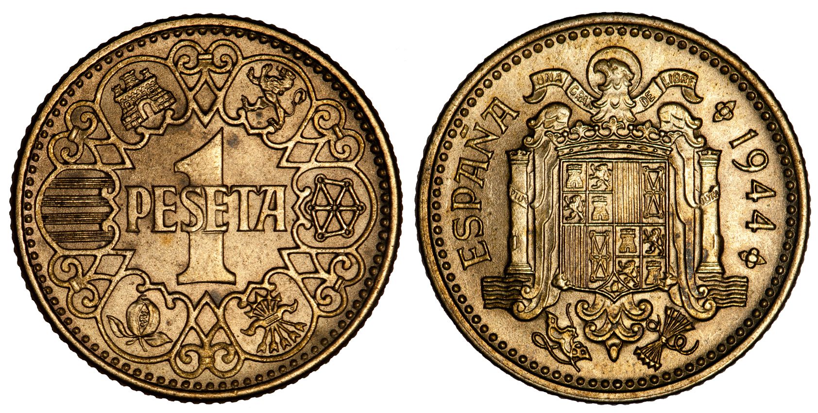 And the large 50 pesetas were really nice...  Edited by silvermaniac
06/08/2013 1:41 pm
|
|
Pillar of the Community
Canada
2805 Posts |
After reading this thread, I decided to go through my mixed world coin bag and pick out my favorite modern coins.  The results were surprising - turns out I just like big, clear numbers. But I think all of these are examples of what you can do with coinage nowadays. The problem coins seem to all come from a spirit of "modernization" - we get sterile designs because the prevailing spirit of the time is towards that minimalist style. The Euro is supposed to be cutting-edge, so it's a bit... austere (ha ha get it). The gulden from the reign of Beatrix are essentially meaningless, just a grid and some numbers. The problem is that minting is deeply rooted in tradition, and it doesn't mix well with excessive minimalism (if only because the big, blank fields will look funny!). I still think that you should put subjects on coins that are at least vaguely national - the orange blossoms on the Netherlands Antilles 25c, the various arms and crests that are on the sides that I didn't photograph, etc... - because you're trying to make your country look good. Here are the Canadian half designs used from 1937 to now. They're just our coat of arms with a date and denomination, but I think our coat of arms looks pretty good so I don't mind it. But then, all of our Canadian coinage features national icons, with the possible exception of the loonie (not really strongly associated with Canada) - but then it became a national icon...  Edited by nalaberong
06/08/2013 3:26 pm
|
|
Pillar of the Community
Russian Federation
5174 Posts |
I finally remembered a post-2000 (well mostly - technically started 1997) lovely coin design... Moldova 50 bani (mid-2000s, might be still minted).
I think I have three of these now; there had probably been another one that I sent away on Secret Santa last year.
|
|
Pillar of the Community
Australia
2180 Posts |
Quote:
Mt.T, that is one beautiful coin Not mine unfortunately. Quote:
we get sterile designs because the prevailing spirit of the time is towards that minimalist style Yeah, I really feel that's the case too. Lots of older coins have such busy, full designs but they do look good. |
|
Bedrock of the Community
United States
10038 Posts |
Most post silver US coins are not appealing to me. The designs I do like are the Ike REV (and later SBA), the 2013 Sac REV, the JFK Half REV, the new shield on the cent (makes me think of classic designs I guess), and some of the State Quarters such as the Utah (Trains touching noses - b/c I have a glass insulator like was used on this line!). The ASEs OBV, being classic and one of the most beautiful, I love. Its REV is nice, but I think it could have been more ornate. I actually stopped being serious about Canadian coins when I saw how - IMHO - terrible the album page of the "everyone's grandma effigy" of The Queen looks when compared to former effigies. And also since they started to mint a new design on a coin for every day the sun comes up, I have felt they have done a poorer and poorer job - with an occasional - hey cool!). But I love the designs from approx. 2000 and before. The beautiful design of their coins is what made me want to collect them. |
|
Pillar of the Community
Australia
2180 Posts |
Quote:
I actually stopped being serious about Canadian coins when I saw how - IMHO - terrible the album page of the "everyone's grandma effigy" of The Queen looks when compared to former effigies. Yeah, what happened there? |
|
Valued Member
Spain
134 Posts |
Another thing I most dislike about modern coins, which some well described as cheap and minimalistic, is the total lack of fine details on the designs; making it quite difficult to properly judge the right grade (not that it matters anyway, at least for now). Take this example: one of the last designs from the Netherlands before the Euro...   How can you tell if it's F or VF, or even EF, if it has no fine details that you can look for? |
|
Pillar of the Community
United States
500 Posts |
I loathe the current coin looks. They are cheesy and gimmicky and look like garbage IMO. Even coins I didn't like much anyway ( Jeffersons, Lincolns, Washington quarters ) all now look worse and more like game tokens than coins. JMHO |
|
Valued Member
United States
211 Posts |
I actually think the shield on the reverse of the cent is better than the Lincoln Memorial. Who needs the memorial AND the president? Why do we need Jefferson AND monticello? Let's mix it up a little. I like the Roosevelt dime and the Kennedy half dollar though. They are much better. I agree. Most modern coinage is pretty weak. The trend that seemed to start in the last 40 years that was displayed on that Netherlands coin is a lack of symmetry. People feel much more comfortable doing it. They do it with the statue of liberty on the reverse of the dollar coins now. If anything, mints should know that coin collectors are borderline autistic and OCD, and a lack of symmetry makes us insane with rage (or fearful of imminent death). |
|
Pillar of the Community
United Kingdom
2885 Posts |
Quote:
coin collectors are borderline autistic and OCD I don't really think there is any such thing as OCD - though I prefer to call it CDO - to get all the letters in their proper order. |
|
Valued Member
Spain
134 Posts |
I like hammered coins -though for now I only own a few- but for me the golden age of coin design was between the last half of the 19th century and the first half of the 20th century -around the 1900-. I think it was an age that had it all: the will to make beautiful designs for every single coin produced, and the means to do it properly; while earlier times had the will but not the means, and in later times they had the means, but not the will.
|
|
Valued Member
United States
293 Posts |
Look at how the modern coins themselves tend to lose detail. Take the Kennedy half dollar. The design was actually changed right before production to reflect more of the "style" of President Kennedy's hair at the request of his widow. Yes the 1964 coin that's what Mrs. Kennedy wanted. I don't think she'd like what is being made today. |
|
Pillar of the Community
United States
3345 Posts |
Ok see this is where you guys are wrong. YOU may not like the new coin designs, but some people do, or they wouldn't be selling collectible versions of them. The same thing is with cars. Look at all the cars today. So boring, bland, they all look the same. Well take a look at the cars 50 years ago, 60 years ago, or whenever. There was a style, a pattern people followed based on what everyone else was doing, and today thats what they're doing again. You look at a brand new toyota camry. Bleh. looks like everything else. OH yeah? Take a chevy monte carlo, nova and malibu and try to tell them apart if they're 30-40-50 years old. Easier if you lived back then, which I didnt. Now take coins. Barber designs were laughed at and ridiculed when they came out. Ok let's be honest, the Barber design is cool, but it's not amazing. Its a liberty head, something that is not new, with a wreath on the back. both old ideas. Yet nowadays people have a whole flippin society dedicated to them. Nothing wrong with that! But back then people woulda been all "Liberty's overused, we don't want some nonexistent woman on our coins!" Well today things have turned around, and collectors want liberty back. Why? Because they like the old coins. I'm not going to explain why we like old coins. If you're reading this you probably already know. In the future your kids and grand kids will collect with pride and earnest what you consider "dull" and "uniform". Look at Seated Liberty coinage. Dollar, half, quarter, dime, Half Dime. Uniform? The definition. Some of my favorite designs are the big European coppers with little artwork on them. So next time you say that our coins are "losing detail" or "cheesy and gimmicky", think about how you would react if the coin was 70 years old. Thank you. |
|
Valued Member
United States
127 Posts |
I don't believe it's always the design of the newer coins but the way they are stuck. If you look at newer Lincoln cents there just isn't much relief to them. They appear flat. The same can be said for US nickels as well. I actually like some of the designs just not the flat appearance. I don't collect any modern coins besides US so I can't speak for foreign coinage. I do love the pre decimal British coins.
|
|
Valued Member
Spain
134 Posts |
I think US coins from the XX century are quite unique in terms of relief; compared to other countries in the same period. From the top of my head I can't think of any other country that had designs with so much depth of field. And in my opinion: you are right, the old Washington quarter, for example, is far nicer than the new flat design. Said that, I guess flat designs age much better when it comes to the lifetime of the coins; since the wear tends to be more even and slower in flat coins, and these retain most of the legends until very low grades. Edited by silvermaniac
07/04/2013 5:08 pm
|
|
Page 3 of 3
|
Replies: 40 / Views: 5,371 |
Page 3 of 3
|