| Author |
 Replies: 22 / Views: 2,094 Replies: 22 / Views: 2,094 |
Page 2 of 2
|
|
|
|
Valued Member
United States
127 Posts |
Further proof that Coop is the man!  |
|
Pillar of the Community
United States
900 Posts |
I have Photoshop CS6. I bought the Adobe Digital Classroom Training Package. Whenever I try to adjust contrast, brightness, color , etc., my images come out looking horrible.
|
|
Bedrock of the Community
 United States
62064 Posts |
The editing for contast need to be done slowly. You might try watching the image closely to see how it changes. It should make the image clearer when adjusted, but not too much as it can overboard quickly. As for color; what are you editing? Silver coins you might try the program with the original image to go through the process. Note the area of removing unwanted color. It may be different than you think. Try the steps I suggested. (Note how the image was gold colored-adjusted to silver.) If you are editing cents that is an entirely different process. You might post an image of one you are having problems with and I can show you how to edit it. I may start a new thread for that discussion?
|
|
Moderator
 United States
23522 Posts |
Quote:
Nice coop,but should this be in the photo section? It's a good opportunity to get the word out to people who might not otherwise know. First, how an average person goes about creating these images and second, that we have a pretty cool forum here where we'll help you learn how to do it.  |
|
Pillar of the Community
United States
4809 Posts |
Good information Coop. I really enjoy the effort many here take to get an image right.
|
|
Pillar of the Community
United States
900 Posts |
I start with this  and end up with this  Thanks for your help. |
|
Bedrock of the Community
United States
62064 Posts |
Scurry64: Does you program have this vertical tool box on your program? 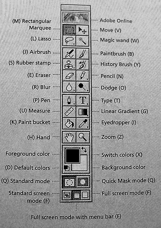 Just trying to see how your program compares with the one I have? |
|
Pillar of the Community
United States
900 Posts |
|
|
Bedrock of the Community
United States
62064 Posts |
I tried to open your image but getting a message that it can't open it.  But you image is real close. There is an issue with glare when you take the image. You might try diffusing it with a plastic grocery back to remove the glare. If the light is too bight, you may have to diffuse it with bond paper or use a lower wattage bulb. I use a 14 watt bulb on my microscope. 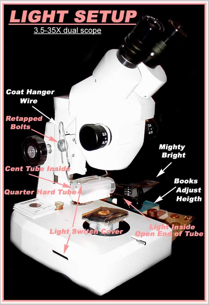 A florescent 23 Watt bulb for full images of coins. (With 2 sheets of bond paper to diffuse it.) 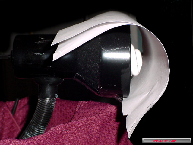 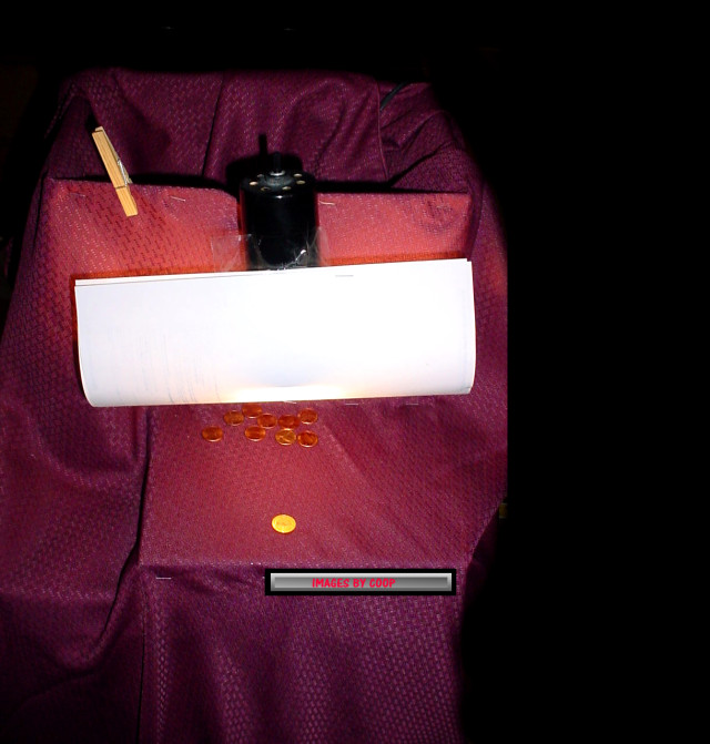 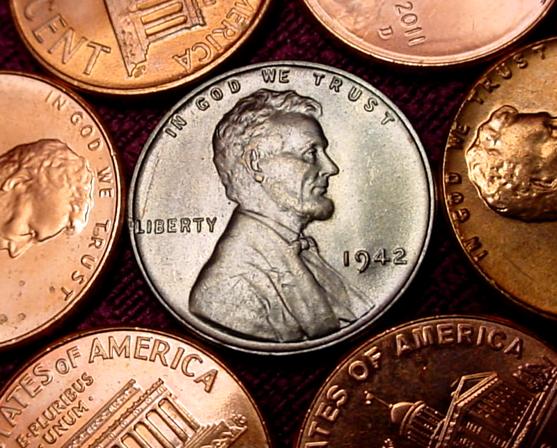 |
|
Bedrock of the Community
United States
62064 Posts |
Scurry64: Color looks real close. I edit it first removing too much orange on cents if they are to gold colored. After reducing with the "Hue/Saturation" choice, then I remove some of the hue by reducing the color to brown the coin a bit (instead of gold colored). Then I add color with the "color balance" starting with red, magenta and then yellow to get the final color. If a coin is too dark, I use the "hue/saturation" on the top line to adjust it with a bit of yellow to enhance the darken color, then contrast it to get the desired color. (Looks like I need to make up a thread for this?)
|
|
Pillar of the Community
United States
900 Posts |
I use 2 40 watt bulbs. I'll try defusing the light.
|
|
Bedrock of the Community
United States
62064 Posts |
Why two bulbs? When you use two light sources, you create light on both sides of the devices and sometimes makes things appear that aren't really there. On a scope or a full image setup? Too much light is a disadvantage as it prevents light and shadow. Too much light/darkness hides varieties we really want to see the separation. I experimented with a ring light for taking images under a microscope and the multiple light sources enhanced to much of the fields. 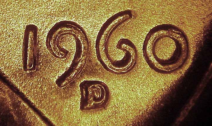 Note there is darkness around the devices, but not real helpful. Lowering the light and reducing the number of light sources helps the fields stay in the background: 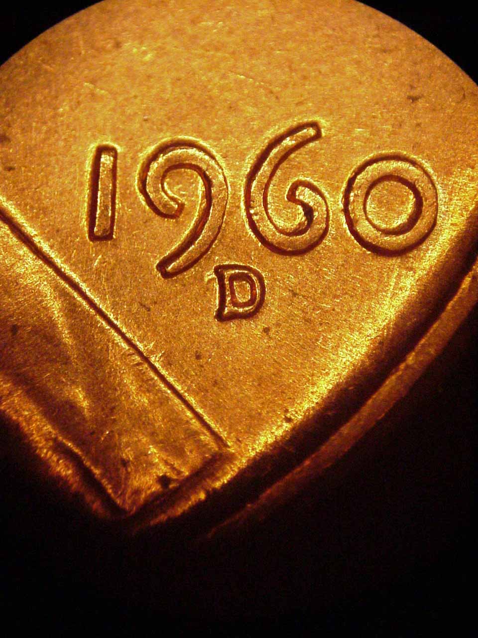 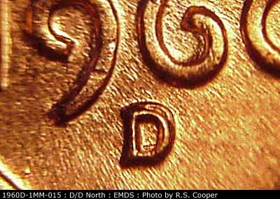 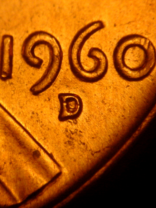 Edited by coop
01/23/2015 9:29 pm
|
|
Pillar of the Community
United States
900 Posts |
I've read so much about people placing their lights at 10:00 zand 2:00. Their images looked better than mine, so I tried it. I'll keep experimenting.
|
|
Valued Member
United States
432 Posts |
|
|
Bedrock of the Community
United States
62064 Posts |
I prefer 12:00 with just one light source. Also in the image of my scope you can see a ramp I use to angle the light correctly into the microscope. Which I sometimes add a coin or two to make the light even over the hold coin. 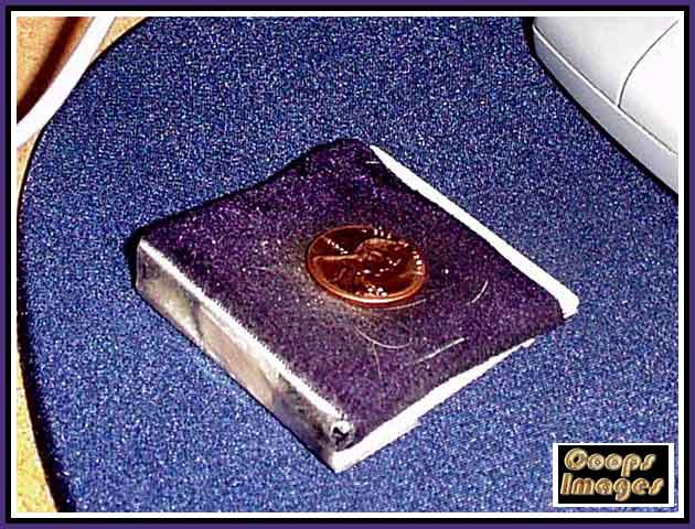 Just a 2X2 with a piece of cardboard on the open end, taped and covered with darker material to reduce glare. The indentations for the coins in the 2X2 adds also a bit more angle to get the light just right into the eyepiece. |
|
Page 2 of 2
|
Replies: 22 / Views: 2,094 |
Page 2 of 2
|






 First Page


 Posted 01/23/2015 8:33 pm





