In my previous post regarding the 1936 Norfolk commemorative half-dollar
http://goccf.com/t/116267), I discussed the coin's final designs as prepared by artists/sculptors William Marks Simpson and his wife Marjorie Emory Simpson. These designs, however, incorporated several noticeable changes to the original models prepared by the husband and wife team; the changes resulted from feedback received from the Fine Arts Commission.
As part of Norfolk's Bi-centennial / Tri-centennial commemoration, the Norfolk Advertising Board, the sponsor of the celebrations as well as the commemorative half-dollar, published a book titled Through the Years in Norfolk. The book traced Norfolk's history from 1636 to 1936, as well as its growth and development as a port city and commercial/industrial city.
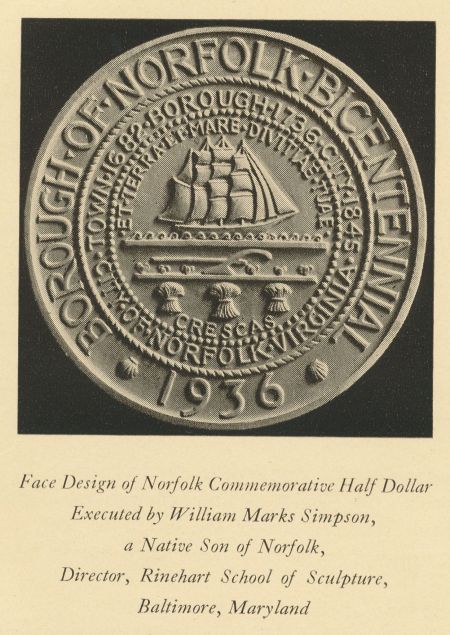
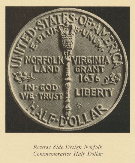
The book did not discuss or promote the Norfolk half-dollar, however, other than to include illustrations of the original plaster models for the coin. It showed the proposed obverse of the coin on the first page of the book and the proposed reverse on its last page - bookends within the book, if you like. The choice of presenting the models vs. illustrations of the actual coin likely had to do with the book's publication deadline - I'm guessing the final coins were not available prior to the book going to press.
As noted above, these initial plaster models would undergo multiple changes before dies were created by the US Mint to strike the coins. The changes to the obverse are mostly subtle. Comparing the images below, you'll notice that the words along the outer ring are separated by small diamonds on the coin vs. the triangles used on the model; there are two fewer waves beneath the ship and they form more of a continuous flow on the coin than they do on the model; and the periods that were placed at the start and end of the Latin inscription just above the ship have been moved to before and after the Latin word ‘Crescas' at the bottom of the inner circle. The Latin inscriptions are translated as follows: "Et Terra Et Mare Divitiae Tuae" - "Both land and sea are your riches" and "Crescas" - "May you prosper."
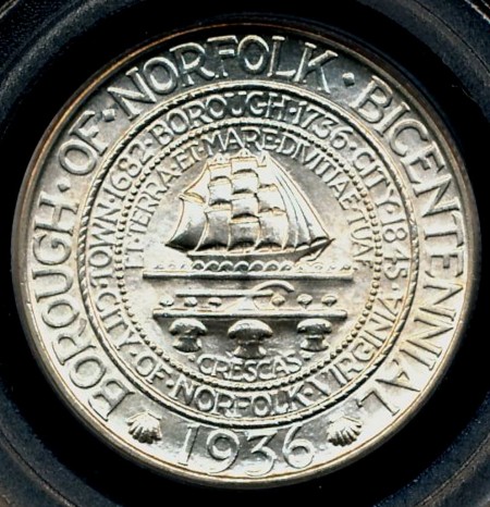
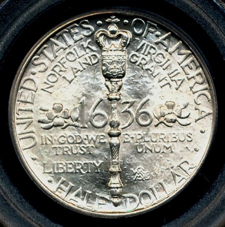
The reverse of the coin features the more prominent/noticeable changes. The mace has been made larger and now separates the inscriptions at the top and bottom of the coin vs. encroaching into their space. You'll also notice that the all of the inscriptions within the center area of the coin have been moved, with some being resized as well. The flowering dogwood twigs have also been moved to a more central and prominent position. Lastly, the number and positioning of the separator dots along the coin's rim have been revised.
Both the original and final reverse designs are very text/inscription heavy and, to my eye, both designs are a bit unbalanced because of it.
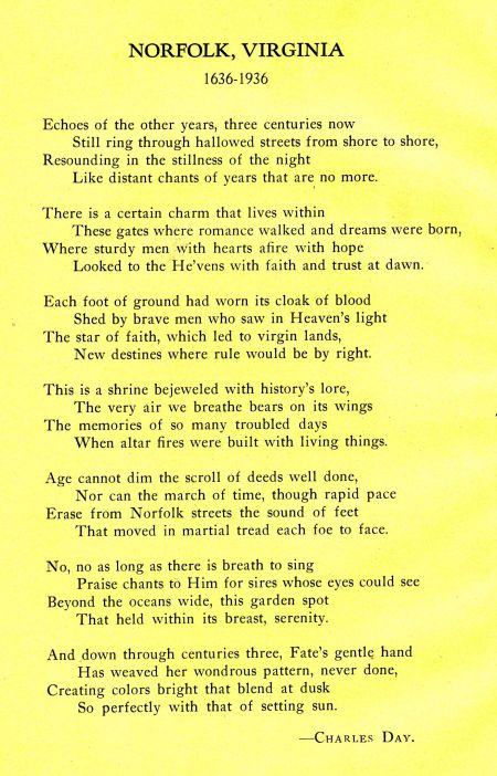
My original post featured a poem about Norfolk by Charles Day; it was printed on the original mailing card for the coins. The souvenir book features a different ode to Norfolk by Charles Gray - I couldn't resist...