| Author |
 Replies: 195 / Views: 33,781 Replies: 195 / Views: 33,781 |
|
|
|
Pillar of the Community
United States
1291 Posts |
Did you ever take a "critical" look at the "3" on the 1931 coins? It's really sort of ugly compared to the earlier 3's in 1913 and 1923.... Even the 3 in 1930 looks much better, and that's a better comparison because it's the same font style. It's like they "skinnied" up the 1931's 3 to make the date fit, which makes no sense because the 0 in 1930 took up more room than the last 1 in 1931...
Edited by weerdsteev
03/08/2012 09:32 am
|
|
Valued Member
United States
182 Posts |
you're right, the 3 is kinda ugly on these 1931s  |
|
Pillar of the Community
 United States
8904 Posts |
Another ugly 3! 1931 S Buffalo Nickel  |
|
Bedrock of the Community
United States
10284 Posts |
|
|
Pillar of the Community
United States
4132 Posts |
Catching up again! 1928:  1928-D:  1928-S:  1929:  1929-D:  1929-S:  1930:  1930-S:  1931-S:  |
|
Pillar of the Community
United States
1291 Posts |
1933 obverse S 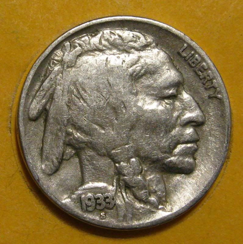 |
|
Pillar of the Community
United States
4132 Posts |
1934:  1934-D:  |
|
Moderator
 United States
14463 Posts |
|
|
Moderator
United States
14463 Posts |
|
|
Pillar of the Community
United States
2936 Posts |
|
|
Valued Member
United States
182 Posts |
1934  1934-d  |
|
Pillar of the Community
United States
4132 Posts |
|
|
Pillar of the Community
United States
8904 Posts |
|
|
Rest in Peace
United States
1501 Posts |
1934-D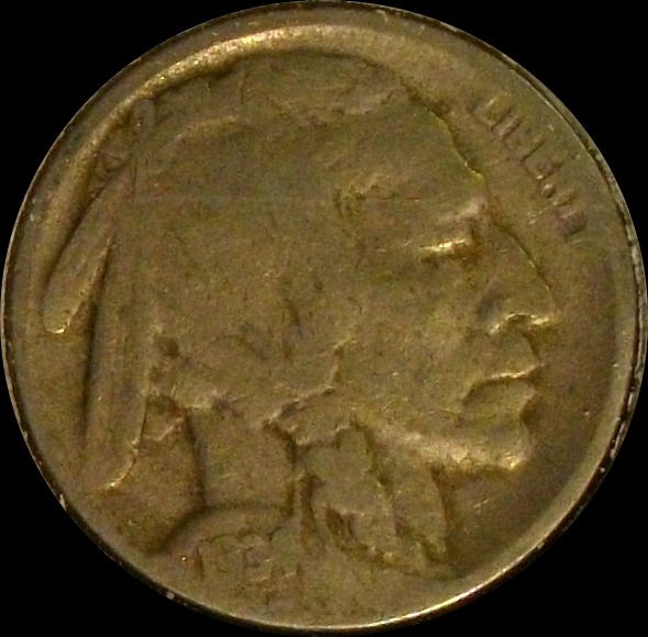 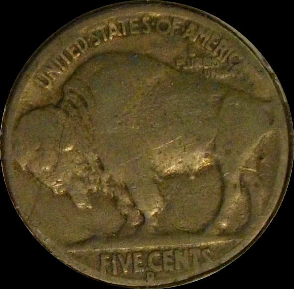
|
|
Pillar of the Community
United States
1291 Posts |
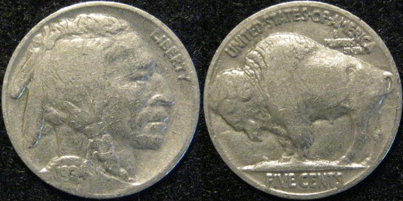
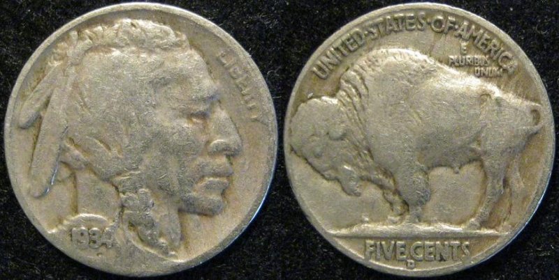
Jeez....I see you guys were impatient and skipped ahead again... Tsk, tsk! 1934-P 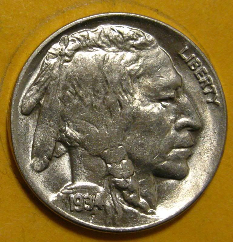 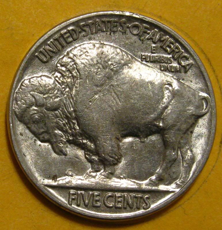 1934-D 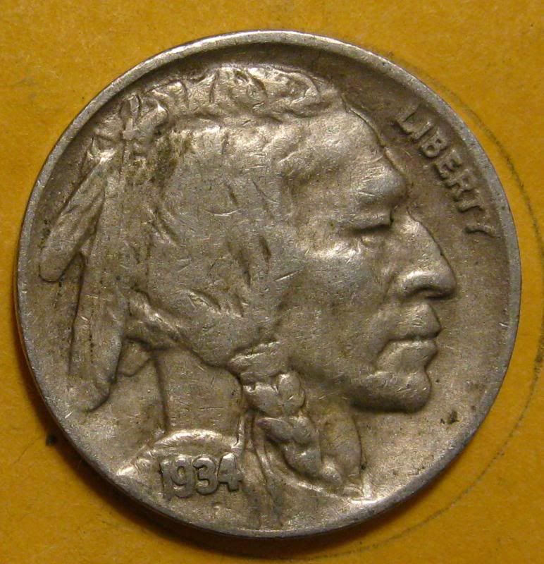 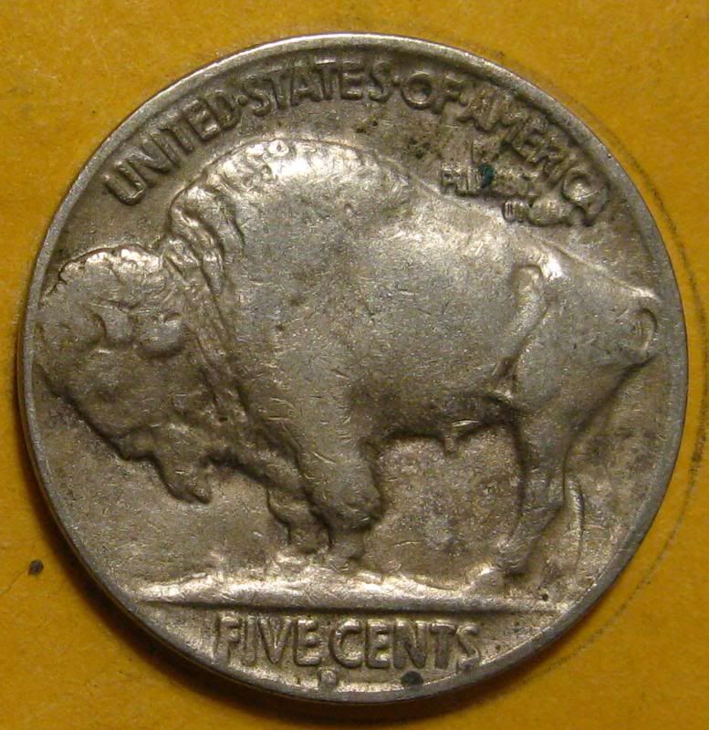 So now I'll do a little skipping ahead of my own...! 1935-P 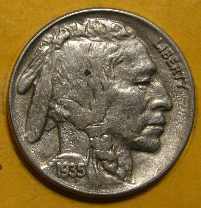 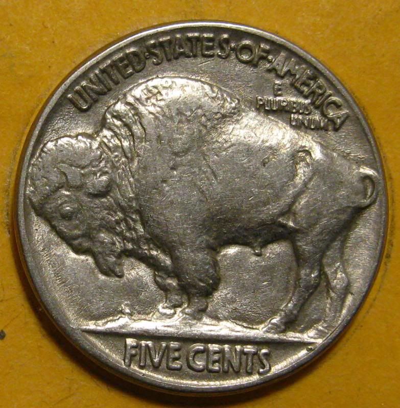 1935-D 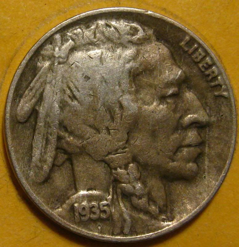 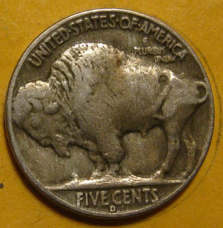 1935-S 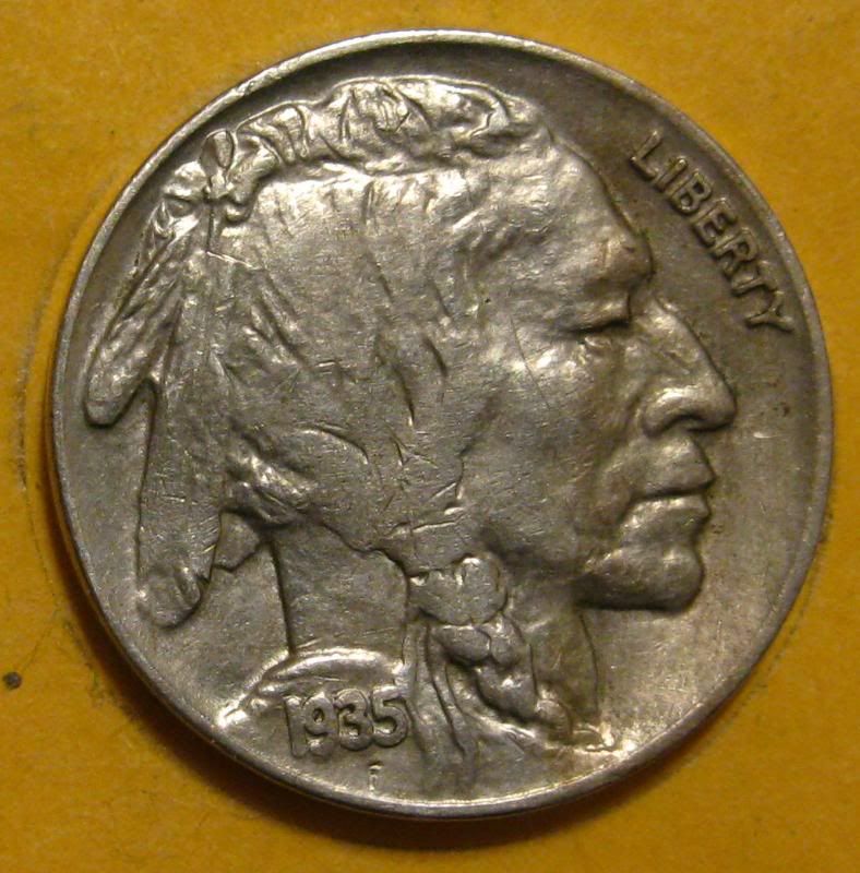 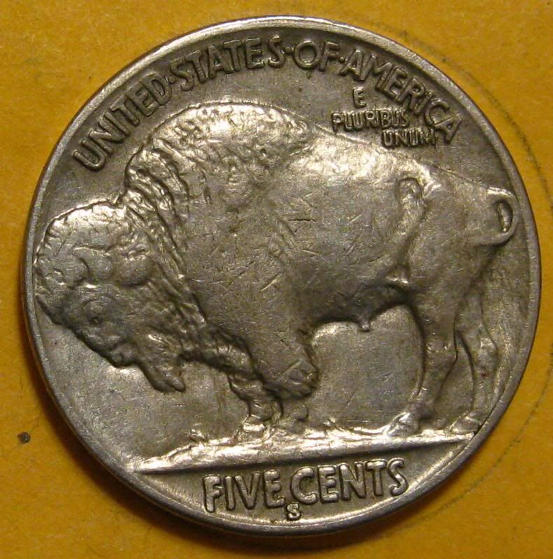 |
| |
Replies: 195 / Views: 33,781 |








 First Page
 Previous Page


 Posted 03/08/2012 09:52 am


 Did they actually make a 1933-S