| Author |
 Replies: 55 / Views: 13,914 Replies: 55 / Views: 13,914 |
|
|
|
Valued Member
Australia
318 Posts |
I'll play devil's advocate.
I hate them.
I should be a grumpy old man, but I believe they're too bright, will feel very much like playing with children's play notes.
The good thing that I can see is, surely these notes will fade very quickly, making it easier to tell if the notes are circulated or not, like with current dull notes, the dull gets duller, but with bright notes, the brightness would sure fade.
|
|
Pillar of the Community
Australia
4411 Posts |
I know I've already said it but... I really am revolted  |
|
Valued Member
Australia
124 Posts |
Wow, these designs cost the Aussie taxpayer $9.3 million over 7 years, the Reserve Bank and NPA has to be joking.
The reply to "The Australian" from the Reserve Bank about NPA has me wondering what the heck is going on when it states "The Bank also engaged NPA to develop a concept design, but due to resource constraints, NPA outsourced the work to a reputable and experienced banknote designer located overseas". It seems that NPA's project management is as unprofessional as is indicated in recent times with the "kick back" scandal presently before our courts.
I'm looking forward to our new notes but not if they look as poorly designed as these. They are shockers. I don't like several of the features especially the way Australia is written vertically and the security measure behind the lettering. It looks like a child has designed this feature. All the faces look like they have had a big Friday night out on the sauce and are recovering.
The $5 portrait reminds me of a Native American, the $10 like it's a real bad hair day, the $20 looks like Flynn has the parasitic worm on its security feature, the $50 makes Edith Cowan look even worse than she does on our present 50 with the colour, the florescent yellow, being better suited to a road workers jacket than a note while the $100 Monash military themed note has a security feature with a flower that isn't a Poppy?
I think they should go back to the drawing board and reconsider. Here's a thought, how about putting people on our notes that we actually recognise like Fred Hollows or Victor Chang. And who says it has to be a person? What about iconic natural Australian landmarks like the GBR or Uluru? And what's the story with all the vertical writing. All this for $9.3 million, oh please RBA have another go.
I'd love to read the brief that these notes were designed to. I wonder if they were told to make the portraits look as washed out and ill as possible?
Needless to say I'm not impressed at all.
|
|
Pillar of the Community
Australia
4411 Posts |
Surely this had to go through some community testing whereby they gauge public reaction with small scale surveys, focus groups etc. If they did I wonder where the heck they found the people who gave positive indications.
|
|
Pillar of the Community
 Australia
507 Posts |
@enworb You are supposed to be one of the demographics to whom these notes would have more appeal. Please also note, that the names of the individuals are also in a larger font. What is wrong with you? ;p
|
|
Pillar of the Community
Australia
4411 Posts |
I dont know which one is the worst  theyre all sooooo bad  My biggest question is why has Queen Elizabeth II been removed? She should remain on the $5 note IMO. Has there been a time in which Australia has had banknotes of which none featured the reigning monarch? Even a remodelled portrait couldn't look worse than the native American, whoops I mean C.H.Spence. I think the local banks are going to have to start ordering a lot more $2 coins because thats what i'll be using if these disgraces eventuate. ....Rant over... I think..... |
|
Valued Member
Australia
176 Posts |
Maybe the "gentle" release of information on the proposed changes is NPA's way of gauging public opinion/reaction ie by looking at the feedback of collectors on CCF (just a wacko theory!)  Pedro |
|
Pillar of the Community
Australia
2180 Posts |
|
|
Pillar of the Community
Australia
4411 Posts |
Edited by enworb
09/27/2012 9:10 pm
|
|
Pillar of the Community
Australia
507 Posts |
It would appear that they have decided to emphasise colour variations to assist with ready recognition of the various denominations. What would be interesting to hear, is some opinions on how these designs compare to the current polymers of our trans-Tasman neighbours: 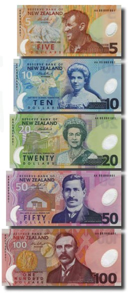 |
|
Pillar of the Community
Australia
2180 Posts |
I like the New Zealand stuff, but it's quite different to our new designs.
Also, aren't New Zealand getting updated designs in a couple of years?
|
|
Pillar of the Community
Australia
4411 Posts |
The only New Zeland note I like is the $20
|
|
Pillar of the Community
Australia
762 Posts |
I like the NZ notes, they dont look like cartoons. It's actually quite embarrassing how much better they are in designing their currency. They've upgraded their coinage, the $2 coin is bigger than the $1 coin and their notes don't look like cartoons. If they really want to appeal to "Gen Y" then they should put Hollywood movie stars on the notes and the denominations should be "like $5", "like $10" etc  |
|
Valued Member
Australia
112 Posts |
I've also noticed in the designs for the new notes by looking at the front and reverse of the notes, that when the note is flipped sideways, so turning it over from right to left, the reverse will be upside down..., so the new notes will flip top to bottom when turning them over.
This is shown from the placement of the window on the notes...
I hope they wont be made like this, imagine them in an album and flipping it around to view them the right way up!
|
|
Formerly nancyc
Australia
5385 Posts |
life is a mystery to be lived not a problem to be solved
|
| |
Replies: 55 / Views: 13,914 |


