| Author |
 Replies: 108 / Views: 21,231 Replies: 108 / Views: 21,231 |
|
|
|
Pillar of the Community
Poland
3201 Posts |
Quote:
Communist countries were really good at putting out simple designs. You can't get much more boring that this...
[DDR, 50 pfennig]
Actually, you can....  Edited by DL20K
05/16/2017 11:38 am
|
|
Moderator
 United States
189767 Posts |
Quote:
Communist countries were really good at putting out simple designs. You can't get much more boring that this...  |
|
Pillar of the Community
Sweden
1078 Posts |
|
|
Bedrock of the Community
United Kingdom
18000 Posts |
One of the least inspired British commemorative coins was the 38mm cupro-nickel £5 piece issued in 2003 for the 50th anniversary of the Coronation (a rather lame excuse for a coin anyway, as they had commemorated the Golden Jubilee, the 50th anniversary of the accession, the year before). I think the design may have been done by schoolkids to fill in ten minutes at the end of an art class, or possibly the designer had seen the Dutch regular issue coins of 1982-2001 and admired them - the portrait is remarkably similar! 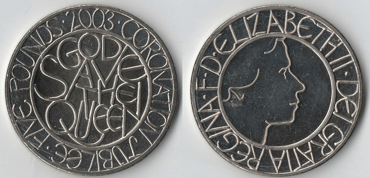 |
|
Pillar of the Community
Russian Federation
5178 Posts |
Quote:
I think the design may have been done by schoolkids to fill in ten minutes at the end of an art class IMHO, the design, as such, is pretty nice, but the lettering does look like a schoolkid doodled it in (especially on the obverse). There are, IIRC, several coin types that were literally designed by (often preschool) children - notably the Latvian 1 lac  and yes, this 5 pounds type looks quite similar (though not that ridiculous). |
|
Pillar of the Community
Norway
1358 Posts |
Quote:
Communist countries were really good at putting out simple designs. Of course they were. Money represents capitalism and capitalism is the root of all evil, according to them. So why make evil attractive? Quote:
Furthermore, some smart guy at the Norwegian mint decided to rid themselves of the beatiful coins series portraying animals to these [...]
Kind of basic, utilitarian designs. Agreed. The animal coins still went down as one of the most popular series in Norwegian coin history. And don't forget that Norway is perhaps the most communist-like country without having been officially communistic. We had to show it at some point... Quote:
or possibly the designer had seen the Dutch regular issue coins The Dutch and Brits have a long history together since William III. Glad we could help this time again. Anyway, the obverse reminds me most of these Dutch ones: https://en.numista.com/catalogue/pieces7957.htmlhttps://en.numista.com/catalogue/pieces7960.htmlhttps://en.numista.com/catalogue/pieces1284.htmlDon't worry. I'm happy that you found it so inspiring that you borrowed the design.  ps. The latter coin is also designed by a child. Edited by UltraRant
05/17/2017 4:36 pm
|
|
Bedrock of the Community
Canada
11922 Posts |
I think this 5 sentimo coin from the Philippines belongs in this thread: 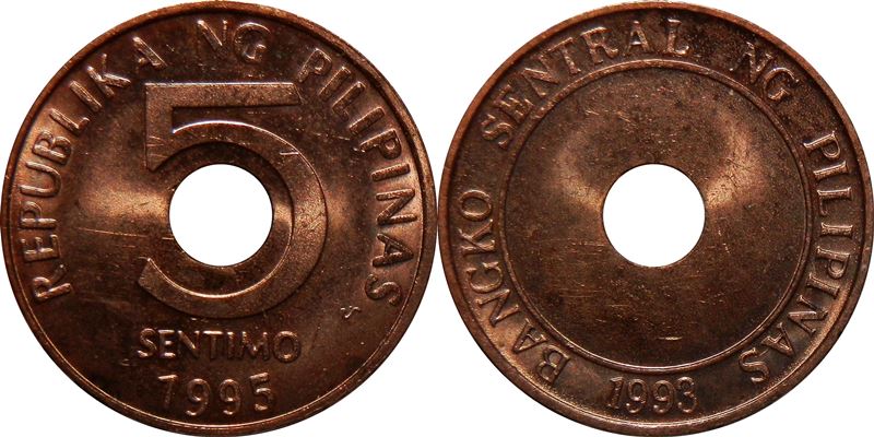 *No coins of this type were struck in 1993, so this one was made in 1995. |
|
Moderator
Canada
10463 Posts |
Chute72 - I would disagree with your choice: The 1, 2 and 5 Ore coins from that series are fascinating, as the dies must have looked like coins, and the resultant coins looked like dies... They are hard to grade in better conditions, as the rim and fields are the highest points on the coins. I cannot think of very many coin series with the devices being all in negative relief.   "Discovery follows discovery, each both raising and answering questions, each ending a long search, and each providing the new instruments for a new search." -- J. Robert OppenheimerContent of this post is licensed under a Creative Commons Attribution-NonCommercial 3.0 Unported License. See: http://creativecommons.org/licenses...0/deed.en_USMy eBay store
|
|
New Member
United States
49 Posts |
Had a good laugh at some of these, especially the 2010 penny. Here's one of mine.   |
|
Pillar of the Community
United States
634 Posts |
I still can't believe they choose THIS for the cent. 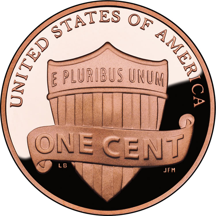 As boring and uninspired as they come. |
|
Moderator
United States
189767 Posts |
Quote:
I still can't believe they choose THIS for the cent. I actually like it.  |
|
Pillar of the Community
Russian Federation
5178 Posts |
Quote:
I still can't believe they choose THIS for the cent. I've seen the list of (twenty or so) designs they were choosing from. Most of the alternatives were worse - this was pretty much the best of a particularly bad bunch! |
|
Bedrock of the Community
United Kingdom
18000 Posts |
Quote:I actually like it.  For me it brightened things up after never having known anything but Lincoln Memorial cents on my numerous visits to the States (apart from the single 1942D Wheatie that I got in change in a fast food restaurant in Oklahoma)... Edited by NumisRob
05/21/2017 12:11 pm
|
|
Pillar of the Community
United States
634 Posts |
Design 17 was pretty nice, as were a lot of the designs depicting the capital. Design 15 was good as well, but I'm  |
|
Moderator
United States
189767 Posts |
Quote:
I've seen the list of (twenty or so) designs they were choosing from. Most of the alternatives were worse - this was pretty much the best of a particularly bad bunch! True.  |
| |
Replies: 108 / Views: 21,231 |


