| Author |
 Replies: 195 / Views: 19,036 Replies: 195 / Views: 19,036 |
|
|
|
Pillar of the Community
 United States
4038 Posts |
Yes, just once is usually sufficient. But did you double-check that it accurately balanced colors? I find that Auto White Balance, or using eyedropper, results in a good white balance only 25% of the time. I usually have to do it 3-4 times to get it right. And even then, I end up skewing the WB a little to dial it in.
|
|
Pillar of the Community
 Canada
9163 Posts |
Can you please explain that a bit more Ray, I did have a hard time when I did the WB.
|
|
Pillar of the Community
United States
4038 Posts |
Process is:
Set up lights and background
View in Live View
Defocus a bit
use eyedropper
snap shot
check to make sure background is equal RGB
iterate until RGB values are within a couple %
OR adjust the WB compensation to get equal RGB values
You can also adjust each image after the fact using the eyedropper. Just hit eyedropper on the background, and it will adjust RGB
|
|
Pillar of the Community
Canada
9163 Posts |
Thanks Ray will try later today.
|
|
Pillar of the Community
Canada
9163 Posts |
This is what I got, all # are close, coin is not that good Quote: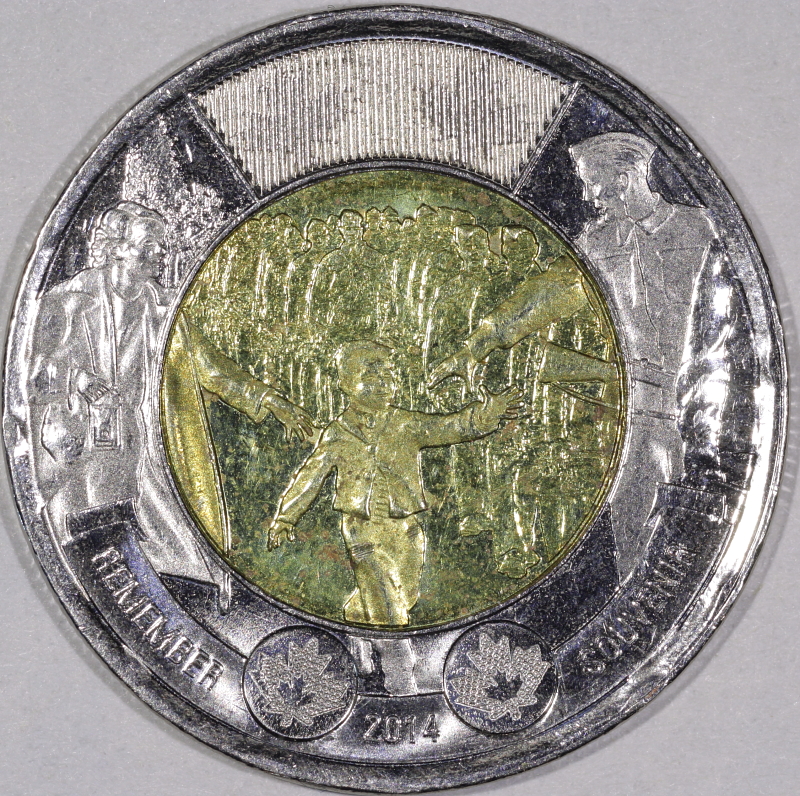 Would it be better if the background was darker? Edited by mcshilling
12/03/2015 2:53 pm
|
|
Pillar of the Community
United States
4038 Posts |
Still overexposing in a lot of areas. A darker background may help to make the coin look better. Did you try adjusting the EV by -1/3 or -2/3? Also, reduce your in-camera contrast a couple notches.
Contact me for photographic equipment or visit my home page at: http://macrocoins.com |
|
Pillar of the Community
Canada
9163 Posts |
No I did not try to adjust the EV will try again. Thanks Ray
|
|
Pillar of the Community
Canada
9163 Posts |
OK Ray, this is what I found, the 'exposure comp.' on all my last pics was at +1 it's now at -1/3 Quote: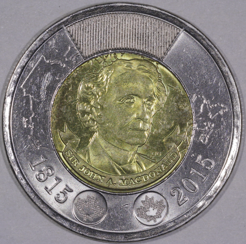 Quote: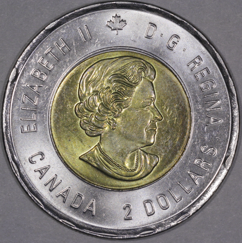 Quote:
Also, reduce your in-camera contrast a couple notches Couldn't find out how to do this, help please or did I  |
|
Pillar of the Community
United States
4038 Posts |
In the main shooting window, you'll see "Picture Style" which is something like Standard or Neutral. Below this it says "Detail Set". Hit the Detail Set box and it will open up the Sharpness, Contrast, etc settings.
The new pics look much better! You might even consider going -2/3 to eliminate the few blown out highlights that are left.
Edited by rmpsrpms
12/04/2015 12:36 pm
|
|
Pillar of the Community
Canada
9163 Posts |
OK Ray will change for the next one. What about these? Which one is better? Quote:[  /quote] [quote]  |
|
Pillar of the Community
United States
717 Posts |
I had a few Toonies that I hadn't tried to photograph, so this thread got me to give it a whirl. The two different metals make it a bit tricky to get a good pic, for sure. I will do some resizing and post up what I came up with.
|
|
Pillar of the Community
United States
4038 Posts |
I prefer the second one, it has better overall contrast, but is a bit dark. A small amount of levels adjustment would make it better. I will post something later, but which one matches the coin best? We can talk about the "better image" but the real best image is the one that matches the coin AND has best photographic qualities.
Contact me for photographic equipment or visit my home page at: http://macrocoins.comEdited by rmpsrpms
12/04/2015 2:17 pm
|
|
Pillar of the Community
United States
717 Posts |
OK, first pic is with 2 jansjo's, and I still have over exposure on the rims especially. Second was taken with natural light from the window.   |
|
Pillar of the Community
Canada
9163 Posts |
Ray the first one I did 'tone curve asst.' on it and it's closer to the coin, other than that they are the same.
|
|
Pillar of the Community
Canada
9163 Posts |
gymcoachdon, I like the second one but if you have been reading this tread you know I've been wrong before.
|
| |
Replies: 195 / Views: 19,036 |


