| Author |
 Replies: 195 / Views: 19,041 Replies: 195 / Views: 19,041 |
|
|
|
Pillar of the Community
 United States
4038 Posts |
I still think you're just slightly out of focus, just enough to give it a tiny bit of blur. I have to ask again...how are you critically focusing?
|
|
Pillar of the Community
 Canada
9164 Posts |
In live view , in zoom mode using the table up and down along with the camera up and down, I hope this what you are asking?
|
|
Pillar of the Community
United States
4038 Posts |
Yes. When you focus, does it look sharp and clear? And when you zoom into the same spot on the image after shooting, does it look the same? These shots should not look this un-sharp at this size. When zoomed-in, they must look extremely fuzzy.
If you don't mind, please email me a full-size, un-processed shot so I can see what it looks like. Maybe the one you just posted, but without downsizing or processing?
|
|
Pillar of the Community
Canada
9164 Posts |
This is just cropped and resized nothing else. Got to get this right first. 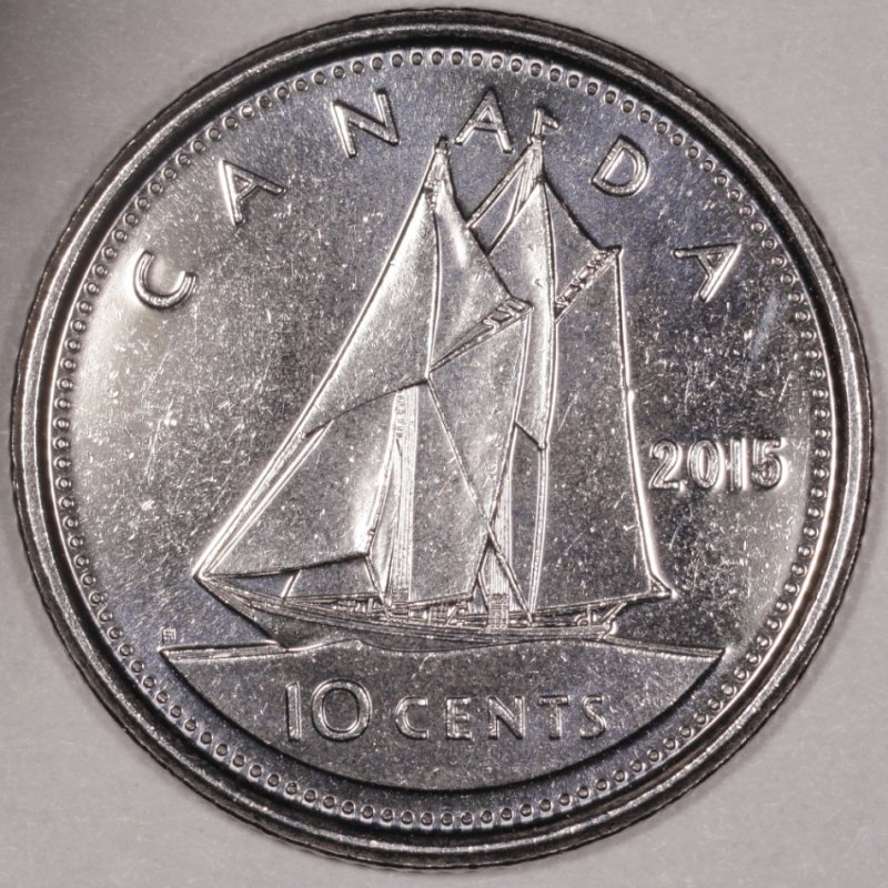 |
|
Pillar of the Community
Canada
9164 Posts |
This one finished, 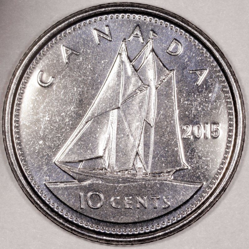 |
|
Pillar of the Community
United States
4038 Posts |
Good focus on that one. Can you move the lights around so you are not getting direct reflection off the fields? Or add a little more diffusion (tissue paper or such)? You're nearly there.
Contact me for photographic equipment or visit my home page at: http://macrocoins.com |
|
Pillar of the Community
Canada
9164 Posts |
I think you are right I need a little more diffusion, will work on it.
|
|
Pillar of the Community
Canada
9164 Posts |
How does this one look, still a bit bright in the center. 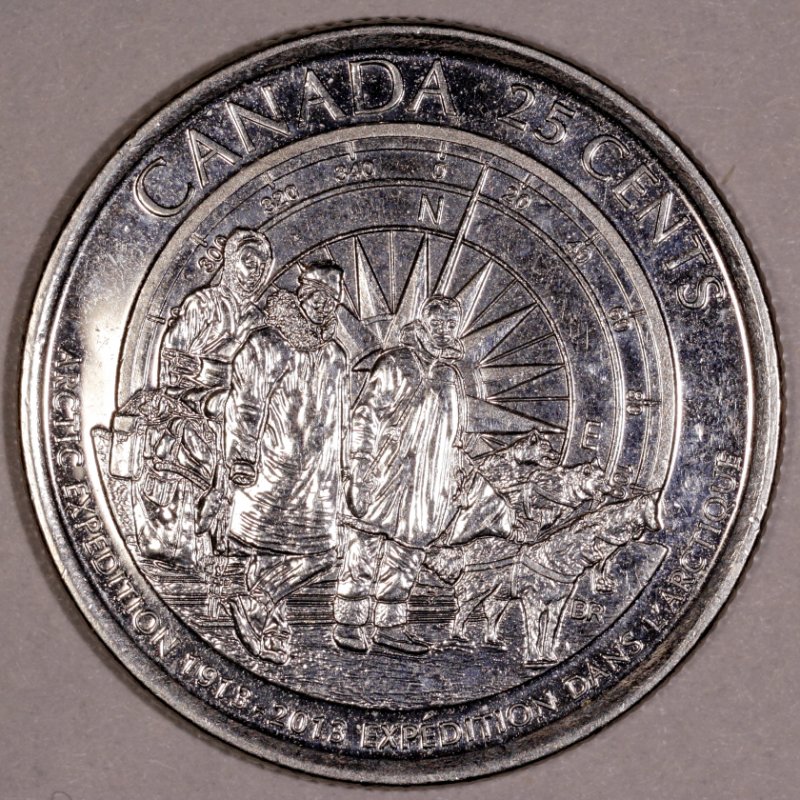 |
|
Pillar of the Community
United States
4038 Posts |
Overall your dynamic range is decent. This image has a good-looking histogram, though as you note you're still blowing-out highlights. So I see 3 things this image needs:
1) Rotate the coin a few degrees CCW, unless this coin was intended to portray the folks heading downhill. This coin, probably more than any other, has a definitive orientation...North should point straight up!
2) Fix the white balance. You're significantly "in the red"
3) Add more diffusion. This will spread the light more, brightening the darks and reducing highlights
|
|
Pillar of the Community
Canada
9164 Posts |
Quote:
North should point straight up! I didn't see that till I had posted Quote:
Fix the white balance How is this done? Edit: have been reading and if you have to do the White balance in the DPP on the Raw tab that window is always gray and I can't open it, any help? Quote:
Add more diffusion I'm having a bit of trouble doing this, my fingers on my one hand do not want to co-operate, I keep ripping the Kleenex. Waiting for the opalux paper to come in. Edited by mcshilling
06/21/2015 12:02 pm
|
|
Pillar of the Community
United States
4038 Posts |
For white balance, my process is:
Start Live View
Put reference card where coin goes. Can be white index card, "18% gray" card, or any piece of paper or object that looks "white" in mid-day sunlight
Focus on the card, then defocus high so that you can't see any details of the card surface at all
Press the white balance "eyedropper" and touch the eydropper to the center of the Live View screen
Press the eyedropper again to turn off the function
Shoot an image
Review the image in DPP. Move your cursor around and note the RGB numbers on the bottom left of the DPP window. You'll see something like 86,88,87 or similar depending on your exposure settings. You're trying to make all the numbers the same, no matter what they are.
If you see big differences (>5% between any pair of colors) for instance 95,100,105 then you can either try using the eyedropper again (YMMV), or adjust it using WB shift. To do WB shift, hit the WB shift button and a box comes up with a multi-color display. Touch your cursor on a point on the color display and it will shift your white balance in that direction. I prefer to think of the shift adjustment as "reducing" a color channel. So if you have 95,100,105, you need to reduce Blue (the colors are ordered R,G,B). So in this case blue is way too high, and green is a bit too high, so touch your cursor a bit into the lower right corner, away from blue and green and toward red. Shoot the same image of the WB reference again, and check to see if the RGB is balanced. Repeat until you see almost the same levels in R, G, and B.
|
|
Pillar of the Community
Canada
9164 Posts |
Resurrecting my old thread to continue, got camera back up and running after summer, Quote: This is 99.9% match on the colour |
|
Pillar of the Community
Canada
9164 Posts |
How does this one look, Quote: Quote: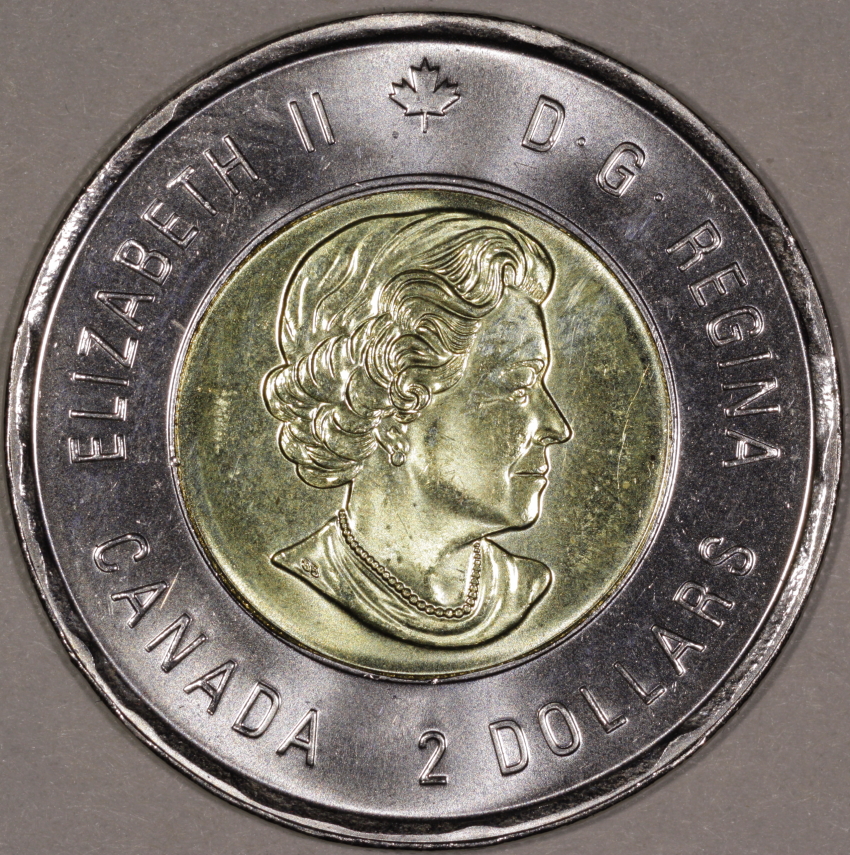 |
|
Pillar of the Community
United States
4038 Posts |
Both are a little over exposed, but they look sharp. You could set Ev another 1/3 or 2/3 stop less and eliminate the hotspots.
Is your background white/gray? The images are bit reddish. You can use the eyedropper in DPP to do a white balance if you're using a white or gray background.
Contact me for photographic equipment or visit my home page at: http://macrocoins.com |
|
Pillar of the Community
Canada
9164 Posts |
I did the eyedropper in DPP using a white/gray paper. You should only have to do this once?
|
| |
Replies: 195 / Views: 19,041 |


