| Author |
 Replies: 36 / Views: 2,402 Replies: 36 / Views: 2,402 |
|
Valued Member
United States
203 Posts |
|
|
|
|
Moderator
 United States
34468 Posts |
Stunning pictures--don't change a thing!
"If you climb a good tree, you get a push."
-----Ghanaian proverb
"The danger we all now face is distinguishing between what is authentic and what is performed."
-----King Adz
|
|
Pillar of the Community
United States
2249 Posts |
I also love them lucidfind they are almost a perfect picture...  We all know nothing is perfect.  |
|
Pillar of the Community
 United States
6655 Posts |
If you feel the color is accurate to the coins, I would say that the resolution and eye appeal are excellent. What's your setup?
|
|
Bedrock of the Community
United States
10601 Posts |
The pictures look great. Now if they match what the coins look like in-hand then you're all set!
|
|
Valued Member
 United States
203 Posts |
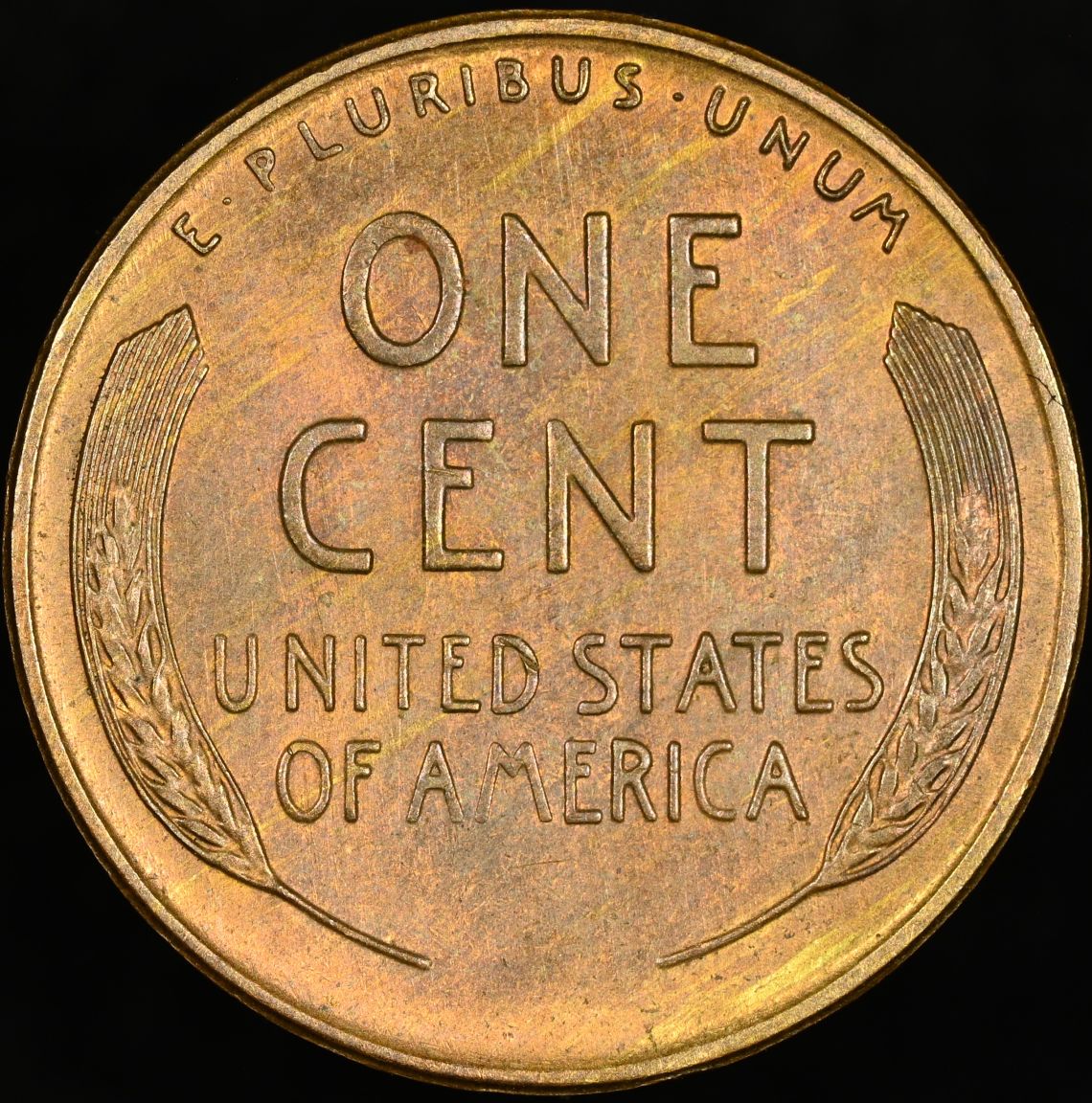
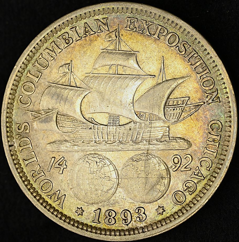
Thank you all for the kind comments! I do feel colors to be accurate, and the images closely resemble the coins in hand. The silver commemorative is closer than the Wheat cent. The Wheat cent has the correct color, but I am finding it more difficult to capture the iridescence of the toning, specifically on the reverse. When held in hand, the coin has a more intense iridescent purple. My image seems a bit flat. My current setup consists of a Nikon Z5 paired with a Nikkor Z MC 105mm f/2.8 VR S mounted on a tripod with a boom arm. I am using a homemade foam core black box or a foam core axial lighting box. I use a ring light and a vintage 150-watt "MINISPOT" studio light made by The Photogenic Machine Co. These images were taken using the black box. |
|
Valued Member
Italy
290 Posts |
lucidfind, great pics! I love the cent! Regarding the half I feel the temperature is too high. The coin might have toning but is it "so yellow" in your hands? Lowering temp will also make it more iridescent. Also, slightly out of focus for the second coin as the lens was not probably parallel to the coin. I struggle with this as well a lot and boom arms are a pain! Usual tips applies: raising fs or increasing distance from the coin. Or you could build some contraption to have the lens parallel to the surface where you place the coin. As your lens is a prime you are probably constantly changing its position to fully take advantage of all the pixels ..thus every time resetting the work to place it parallel. I was thinking to buy one of these to solve the issue so that the lens stays fixed but the coin can go up & down depending on its size: https://www.google.com/search?q=Z+A...tical+LifterCheers |
|
Valued Member
Italy
290 Posts |
Tried playing with the half .. which version does everyone prefer? lucidfind which one is closer to reality in natural light? 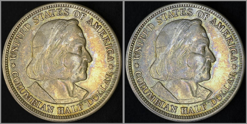 PS: the compression of the forum images is killing much of the visual!  |
|
Moderator
United States
191235 Posts |
Quote:
Feedback and criticism are greatly appreciated. Thanks for looking! Looking good! |
|
Moderator
United States
191235 Posts |
Quote:
PS: the compression of the forum images is killing much of the visual! [citation needed] |
|
Valued Member
United States
203 Posts |
joe_77, Thanks for the input. The slight out-of-focus is due to the angle of the macro lens and the coin; this was done purposefully to try and catch the in-hand look. I use small bubble levels when I want the camera squared at 90 degrees. This commemorative half has a lot of golden/yellow toning. In-hand, I can get the perfect angle, and all the colors pop. I may get a better image of the toning by experimenting with axial lighting.
|
|
Valued Member
United States
203 Posts |
Quote:
Regarding the half I feel the temperature is too high. The coin might have toning but is it "so yellow" in your hands? Lowering temp will also make it more iridescent.
Also, slightly out of focus for the second coin as the lens was not probably parallel to the coin. Here is the same commemorative half with an accurate 90-degree angle and leveled parallel to the coin. A lighter background is the only thing different. 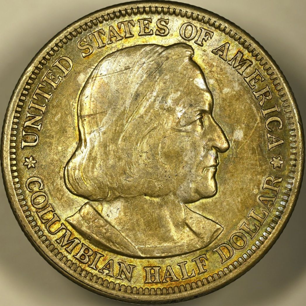 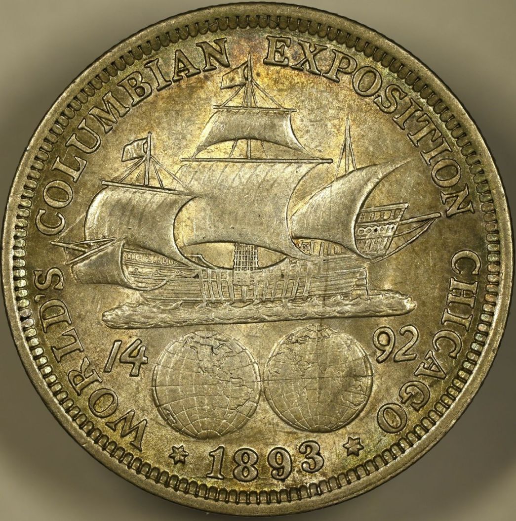 |
|
Pillar of the Community
United States
2249 Posts |
Holy Smoke lucidfind, that is lovely !  |
|
Moderator
United States
191235 Posts |
Very nice! |
|
Valued Member
Italy
290 Posts |
Quote:
A lighter background is the only thing different This might be my own "color taste" but I still think it's too yellow (temp too high, white balance needs adjusting). All this can be done in post too. Have you tried taking reference shots with a white reference? The previous pic was showing better iridescence. Would be very cool to try an axial setup. Good luck! Edited by joe_77
07/15/2025 09:22 am
|
|
Valued Member
United States
203 Posts |
Quote:
This might be my own "color taste" but I still think it's too yellow (temp too high, white balance needs adjusting). All this can be done in post too.
Have you tried taking reference shots with a white reference?
The color of the coin cannot be changed; it's simply a result of the coin's toning. Quote:
The previous pic was showing better iridescence By tilting the coin and adjusting the camera angle, I was able to capture other toning colors; however, this method sacrifices focus. |
| |
Replies: 36 / Views: 2,402 |