| Author |
 Replies: 21 / Views: 2,739 Replies: 21 / Views: 2,739 |
Page 2 of 2
|
|
|
|
Pillar of the Community
United States
675 Posts |
I actually prefer coin 1, but don't think you can go wrong with either one!
|
|
Pillar of the Community
United States
1704 Posts |
You bought one you liked. Do like the look of the one you have the opportunity to buy more than the one you already have? Is it an upgrade? If so, then buy it. If you can afford the second coin as a duplicate then buy it and have two nicely toned proof dimes.
|
|
Pillar of the Community
Canada
5417 Posts |
Personally I like Coin #2 but I dont think the difference between the two is great enough to actually switch one out for the other.
|
|
Valued Member
United States
374 Posts |
I prefer the more even toning of coin #1
|
|
Bedrock of the Community
Canada
11922 Posts |
I like them both a lot, but I think I like coin number two slightly more  |
|
Pillar of the Community
 United States
1839 Posts |
Thank you all for the comments and votes so far.
|
|
Pillar of the Community
United States
8137 Posts |
Both coins are great, and I wouldn't mind having either one in my collection, but I prefer the toning patters on coin #2. The votes are pretty interesting too. When I voted, it was about half and half.
|
|
Pillar of the Community
 United States
5828 Posts |
NUMBER 2! I love the toning, its quite beautiful but you should only get what you want to. Looks like the voting is almost indesicive at this point, 13 votes for 1 and 12 votes for 2.
|
|
Moderator
 United States
23522 Posts |
I prefer you don't give me such difficult choices. For me, the top coin. I prefer the subtlety of the toning to the splotchy garishness of the second. |
|
Bedrock of the Community
United States
20753 Posts |
I hate toning so my choice is #1.
|
|
Pillar of the Community
United States
1432 Posts |
Quote:
For me, the top coin. I prefer the subtlety of the toning to the splotchy garishness of the second.  Splotchy was my immediate thought when I voted. Quote:
I'd go with #2, it's a sister pattern of toning to your avatar! If there was a smilie for "I Disagree" I would have opened with that. I feel the smooth toning on #1 is very similar to your avatar. |
|
Pillar of the Community
United States
1839 Posts |
Quote:
If there was a smilie for "I Disagree" I would have opened with that. I feel the smooth toning on #1 is very similar to your avatar. In all fairness to Cascade I should mention that I changed my avatar image since that comment was posted. Here's the avatar I had up at the time (I rotate my avatars every week or two). 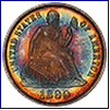 |
|
Pillar of the Community
United States
1839 Posts |
Ok, to wrap this up. Disclosure.
Coin #1 is already in my collection. Coin #2 is available and I was toying with the idea of getting it. It's a slight numerical upgrade so I was kind of on the fence. Sometimes an exercise like this can help me find clarity and I think this time it did.
It looks like the coin I already own won out 21 to 15 on the voting with lots of helpful comments as well.
I was leaning that way already but getting the groups opinion makes me feel better about my choice to stand pat on my current coin.
It's kind of like the numismatic version of a woman asking her friend "Do you think these pants make me look fat?" You pretty much already know the answer but are seeking validation. Maybe that's a terrible analogy, I don't know.
Thanks everyone.
Edited by Tbone
05/04/2015 11:52 pm
|
|
Pillar of the Community
United States
9792 Posts |
I like your coin better, but an upgrade is always good, especially if it doesn't cost much to do so, I assume you'd sell or trade #1 away for #2 than. I think the toning will get better with age on #1, while # stands a good chance of becoming too dark down the road.
"Buy the Book Before You Buy the Coin" - Aaron R. Feldman - "And read it" - Me 2013! ANA Life Member #3288 in good standing since 1981, ANS, Early American Coppers Member (EAC), Colonial Coin Collectors Club member (C4), Conder Token Collector Club member (CTCC), Civil War Token Society (CWTS) member, Liberty Seated Collectors Club (LSCC) & Numismatic Bibliomania Society member (NBS), USMex, Member in good standing, 2¢ variety collector. See my want page: http://goccf.com/t/140440 |
|
Pillar of the Community
United States
5208 Posts |
Both look awesome when you catch the toning
BUT
What do they look like when you don't catch the color?
Some toned coins look dark or almost black until you catch the right angle.
|
|
Page 2 of 2
|
Replies: 21 / Views: 2,739 |
Page 2 of 2
|


