Coin Community Family of Web Sites Join Thousands of Coin, Bullion, & Money Collectors
Join Thousands of Coin, Bullion, & Money Collectors 300,000 items to help build your collection! Royal Canadian Mint products, Canadian, Polish, American, and world coins and banknotes. Vancouvers #1 Coin and Paper Money Dealer Royal Estate Auctions - $1 Coin AuctionsCoin, Banknote and Medal Collectors's Online Mall Specializing in Modern Numismatics


Username:
Password:
Save Password
Forgot your Password?


This page may contain links that result in small commissions to keep this free site up and running.

Welcome Guest! Registering and/or logging in will remove the anchor (bottom) ads. It's Free!

1947 Far Leaf 1947 Near Leaf With Different Font Style

To participate in the forum you must log in or register.
Author Previous TopicReplies: 6 / Views: 2,348Next Topic  
Valued Member

Canada
112 Posts
 Posted 01/29/2012  11:59 am Show Profile   Bookmark this topic Add countryboy to your friends list Get a Link to this Message Number of Subscribers


What do you think am I right .

1947-Far-Leaf--1947-Near-Leaf-With-Different-Font-Style

1947-Far-Leaf--1947-Near-Leaf-With-Different-Font-Style

1947-Far-Leaf--1947-Near-Leaf-With-Different-Font-Style


blunt 7 far leaf - pointed 7 near leaf different font style
Pillar of the Community
Learn More...
Canada
9865 Posts
 Posted 01/29/2012  12:25 pm  Show Profile   Bookmark this reply Add DBM to your friends list Get a Link to this Reply
Different position of leaf? definitely
Different font style? worn die more likely IMHO
Pillar of the Community
Ugly's Avatar
Canada
1733 Posts
 Posted 01/29/2012  1:05 pm  Show Profile   Bookmark this reply Add Ugly to your friends list Get a Link to this Reply
Agreed, worn coins or worn dies most likely.

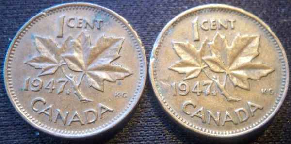
The best way to see true variations in lettering/numbering with accuracy is on uncirculated samples imo.
Pillar of the Community
cladhunter13's Avatar
Canada
1161 Posts
 Posted 01/29/2012  5:21 pm  Show Profile   Bookmark this reply Add cladhunter13 to your friends list Get a Link to this Reply
Agreed.

Most likely attributed to average wear and tear to circulated coins.
Pillar of the Community
Scissel's Avatar
Canada
693 Posts
 Posted 01/29/2012  6:11 pm  Show Profile   Bookmark this reply Add Scissel to your friends list Get a Link to this Reply
There are two font styles for the 1947 ML cent: pointed and blunt. I wouldn't be surprised if there are also minor varieties with different leaf positions. It would be an interesting study for someone to do.


1947-Far-Leaf--1947-Near-Leaf-With-Different-Font-Style
Valued Member
Canada
112 Posts
 Posted 01/30/2012  06:12 am  Show Profile   Bookmark this reply Add countryboy to your friends list Get a Link to this Reply
I read somewere on ebay that their is 2 varieties of the 47 cent ., far leaf., and near leaf . also saw the different font style 4 on other 47 cents. so how can you say that its worn dies .Ugly
Valued Member
Canada
284 Posts
 Posted 01/30/2012  09:10 am  Show Profile   Bookmark this reply Add mysterious_dr_x to your friends list Get a Link to this Reply
Here's a link (in french) on the subject, it gives some more information.
http://www.numicanada.com/pieces-de...-1947&id=151
  Previous TopicReplies: 6 / Views: 2,348Next Topic  

To participate in the forum you must log in or register.


Disclaimer: While a tremendous amount of effort goes into ensuring the accuracy of the information contained in this site, Coin Community assumes no liability for errors. Copyright 2005 - 2026 Coin Community Family- all rights reserved worldwide. Use of any images or content on this website without prior written permission of Coin Community or the original lender is strictly prohibited.
Contact Us  |  Advertise Here  |  Privacy Policy / Terms of Use

Coin Community Forum © 2005 - 2026 Coin Community Forums
It took 0.26 seconds to rattle this change. Forums