| Author |
 Replies: 9 / Views: 1,278 Replies: 9 / Views: 1,278 |
|
|
Pillar of the Community
United States
1370 Posts |
Picked this one up for $38.....I'm a sucker for the 81-s plus a sucker for toning....the toning seemed a tad unusual to me which was a plus. Grading thoughts? 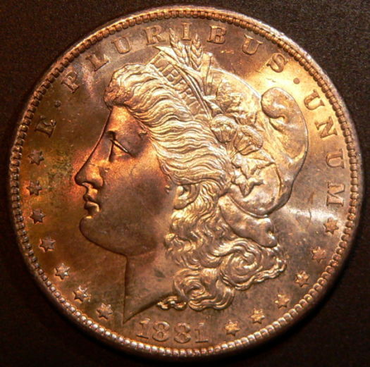 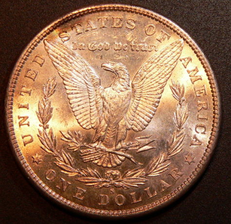 |
|
|
|
Pillar of the Community
United States
7192 Posts |
It looks like she spent to long on the tanning bed.
|
|
Pillar of the Community
United States
5854 Posts |
The toning does seem to be unusual. It just happens to cover the focal points.
|
|
CCF Sponsor
United States
702 Posts |
63/64 is my best guess. The lighting is a little tough; the toning seems to mask some of the dings (in front of the nose?) pretty well. Obv could go 62, then again, might go 63+ in my book.
Either way, for $38 it's a heckuva deal shadowtrooper78!
|
|
Pillar of the Community
 United States
1370 Posts |
Yeah this one is a tough one for me to grade....the cheek is pretty clean....The worst area is in front of the nose....but other than that the fields are pretty clean.....any suggestions on lighting for toned coins?
|
|
CCF Sponsor
United States
702 Posts |
shadowtrooper78, is your background black?
|
|
Pillar of the Community
United States
1370 Posts |
Yes the background is black
|
|
CCF Sponsor
United States
702 Posts |
Do you like these better?   I'm not sure that I do. That's just photoshop magic, to remove the color cast. Personally, I like all coins (but especially toned coins) with just one or two equal light sources, about equidistant. In this coin's case, you might need one light slightly closer to the right hand of the image to catch the toning. It looks like here you might have natural light plus a couple of lights on it? Either way, these are not bad pictures at all! |
|
Pillar of the Community
United States
1370 Posts |
Gotta love photoshop. I would say somewhere in between with the brightness would hit the coin on the head.....both are close mine is slightly darker, your's is slightly too bright. Right now I use a halogen about 2 feet from the coin plus a smaller light source (purchased at ikea) around 2 inches away to get the luster aspect in there. I may dump the halogen and get me another ikea light.
|
|
CCF Sponsor
United States
702 Posts |
2 inches! Wow! That's close. If the lights are cheap, I'd get another. I picked up two on sale at an office supply store and I'm able to white-balance out most of the cast to get a pretty reasonable color. I think I paid $9 each for my lights. They're just energy efficient desk lamps, the architect's kind.
I've tried halogens and LED's, but I find the light is too harsh, so I end up either not getting the cast out or I have to put them miles away.
I like having identical lights because it makes the lighting across the coin more evenly colored. I tried to take the cast out of your very nice pictures using some fancy techniques, but they ended up a little on the red/green side for my taste. But it's especially tough because it's clear you have a yellow light and a white light (or a white light and a blue light). So when you add the variable of toning, that makes it really hard to have a clear idea of what the coin looks like.
As I said, aside from the lighting issues, these are some really nice pictures! Once you get your lights straightened out, you're going to have some excellent work to share.
|
| |
Replies: 9 / Views: 1,278 |
|


