| Author |
 Replies: 12 / Views: 2,217 Replies: 12 / Views: 2,217 |
|
|
Pillar of the Community
United States
1228 Posts |
|
|
|
|
Moderator
 United States
14463 Posts |
I can't decide between #1 and #3.  |
|
Pillar of the Community
United States
2543 Posts |
Personally, I like #2 and #5.
|
|
Pillar of the Community
Canada
1411 Posts |
#1 is my favorite.. #3 is the second best  |
|
Bedrock of the Community
13014 Posts |
That is a hard choice. There's several in there I would want. I dunno if I could pick just one.
|
|
Pillar of the Community
Germany
1063 Posts |
Number 1. I'm not American but that Eagle is pretty cool.
|
|
Valued Member
United States
80 Posts |
I appreciate the diversity in design they tried to include with 9, but I don't think they really pulled it off successfully. It does represent the theme "To Promote the General Welfare" in a more comprehensible way, but it looks kind of odd and doesn't fit with the other coins in the series. AEP-R-09 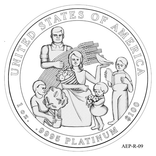 |
|
Pillar of the Community
Canada
3167 Posts |
Yeah  How does the 1st coin fit into the general welfare category anyways? If someone can tell me why it works in that topic, I'd have to chose between it and #5. Why is there some random guy hacking at her with a mallet in #4? |
|
Pillar of the Community
United States
7191 Posts |
If I had to choose it would be #3, aesthetically it is the best. If we are to be focused on the topic "general welfare" we should use the apple design but change it to food stamps as this seems to depict the welfare state of our country now.
|
|
Pillar of the Community
614 Posts |
#3, no doubt about it! I love steampunk XD. I wish they would send these designs to coin forums so that we could vote for them as well!
|
|
Pillar of the Community
United States
1200 Posts |
I think #2 or #3 are my winners because of superior classical aesthetics. I agree w/ Noah about #4 and I think #9 is an unartistic "craft"-level sketch--not at all an aesthetically well-done or sophisticated design. But, as always... "To each his own..."
If they go w/ #2, I may have to save up and buy a couple.
|
|
Pillar of the Community
614 Posts |
I wish they did 1/10 oz's. :(
|
|
Bedrock of the Community
United States
14454 Posts |
I like some of the designs but since I know they pick the worst looking designs possible I am guessing it will be any on t6he lower line that we will see on the coin., the others are to nice looking to be picked. I believe my 12 year old could come up with some better designs than those on the lower line, those look horrible
|
| |
Replies: 12 / Views: 2,217 |
|


