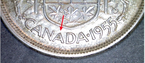
Hi guys..Nothing earth shattering, but have you ever noticed that the 50 cent coins from the 40's and 50's has something common but strange..Look at the picture below. On these coins the middle "A" in the word Canada is always smaller the the other "A's"...strange but true...haha.
The die cutter didn't know what he was doing. He didn't show his calligraphic abilities in this case.
In reality, it is only a small mistake, but you have noticed it.
With normal card or sign lettering, the points of A', M's, N's, V's and W's extend either above or below a projected invisible line which connects the flat tops or bottoms of all the other letters. That does not happen here. The points of the A's don't appear to be high enough, although they actually are. The tops of the A's only equal the height of the other letters, but don't extend beyond the line as they should do.
sel_69l...you are correct...I was a printer for a couple of years and letters like "A"..."C"..."O"..etc. had to be taller than others to adjust for the illusion of being smaller..Here they did not take that into consideration.
Disclaimer: While a tremendous amount of effort goes into ensuring the accuracy of the information contained in this site, Coin Community assumes no liability for errors. Copyright 2005 - 2026 Coin Community Family- all rights reserved worldwide. Use of any images or content on this website without prior written permission of Coin Community or the original lender is strictly prohibited. Contact Us | Advertise Here | Privacy Policy / Terms of Use










 Posted 03/23/2014 02:16 am


