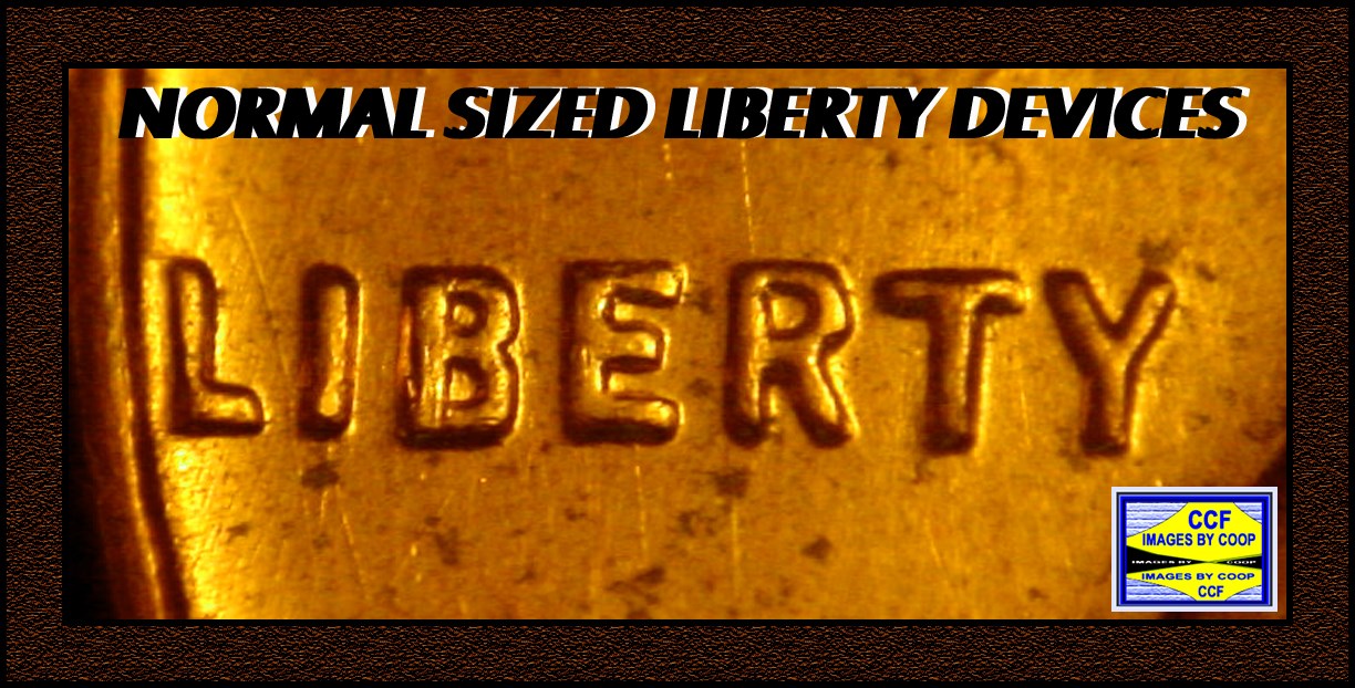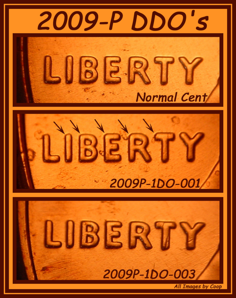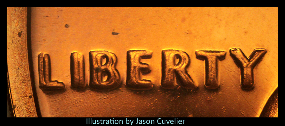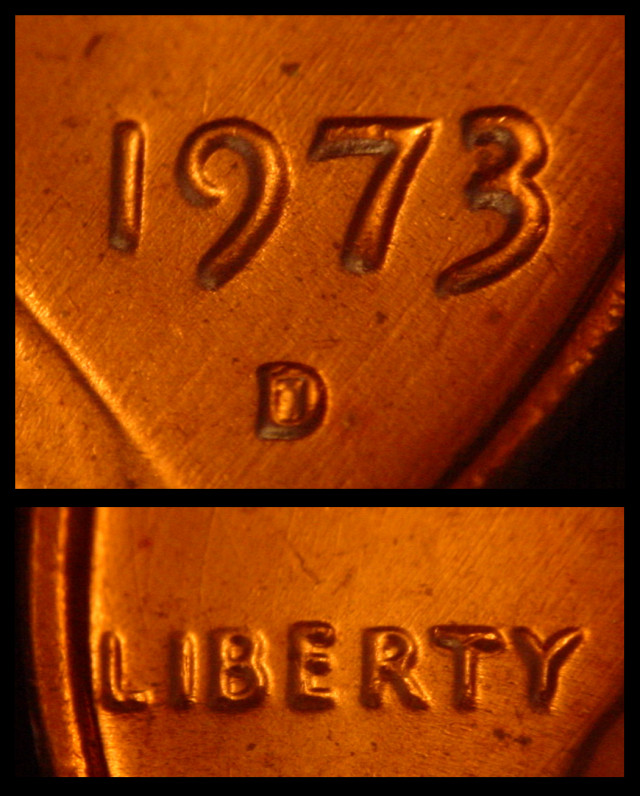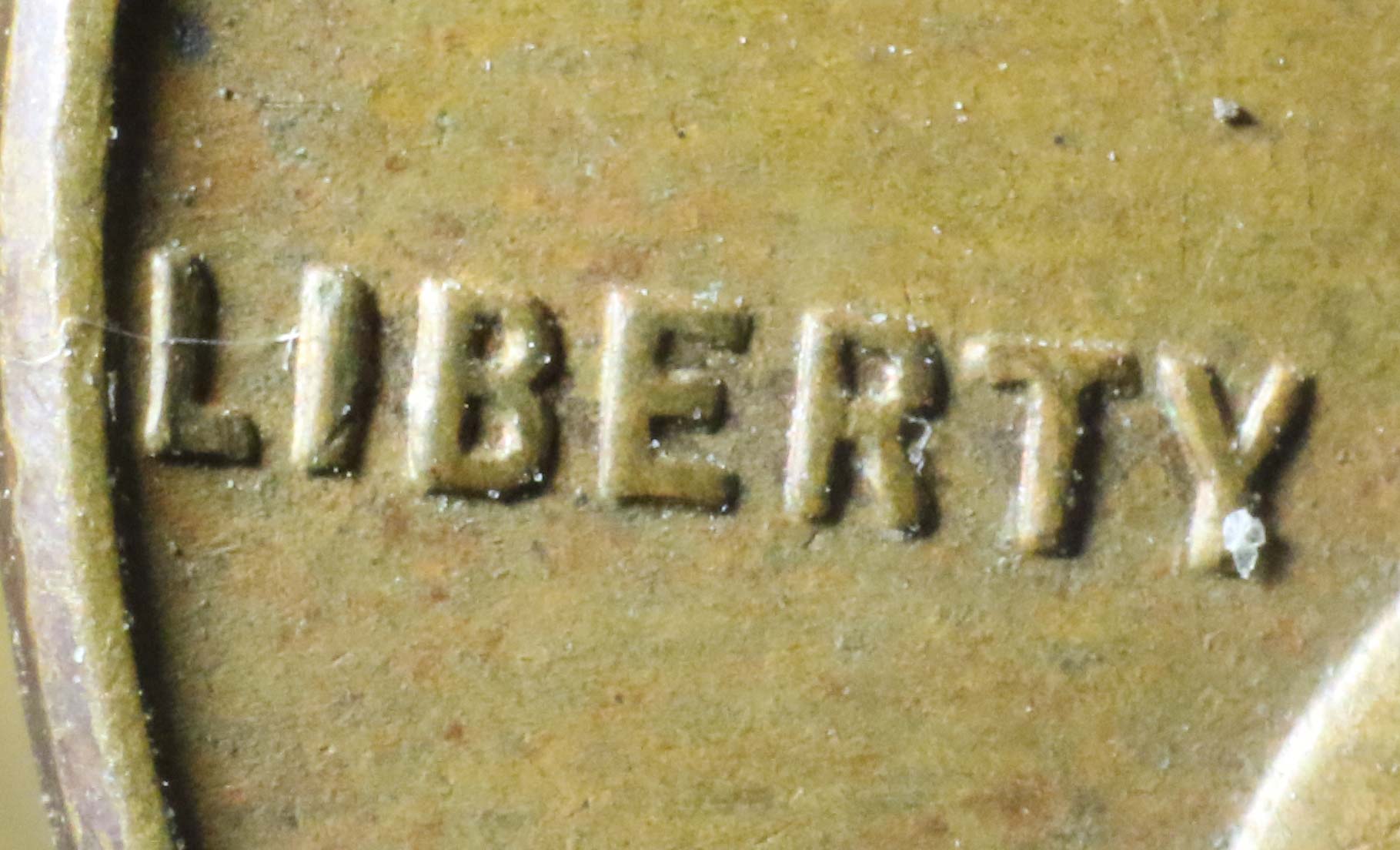
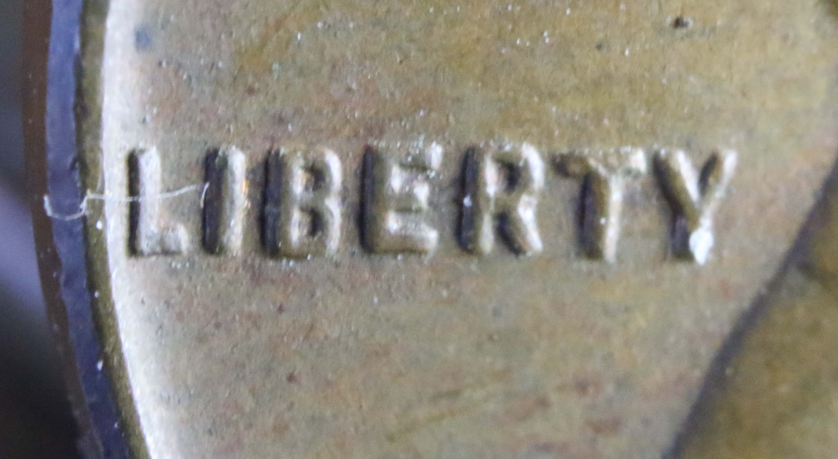
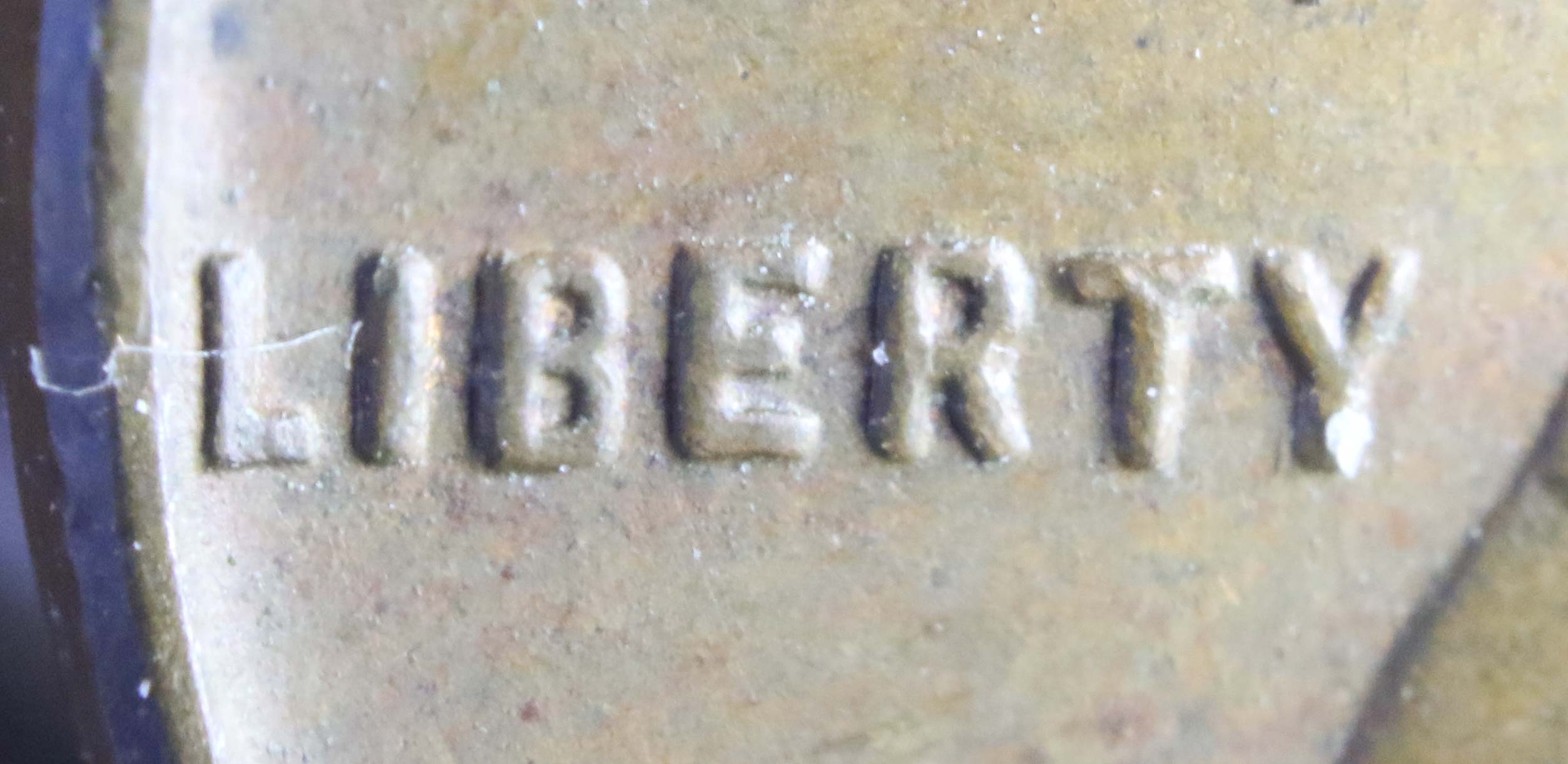
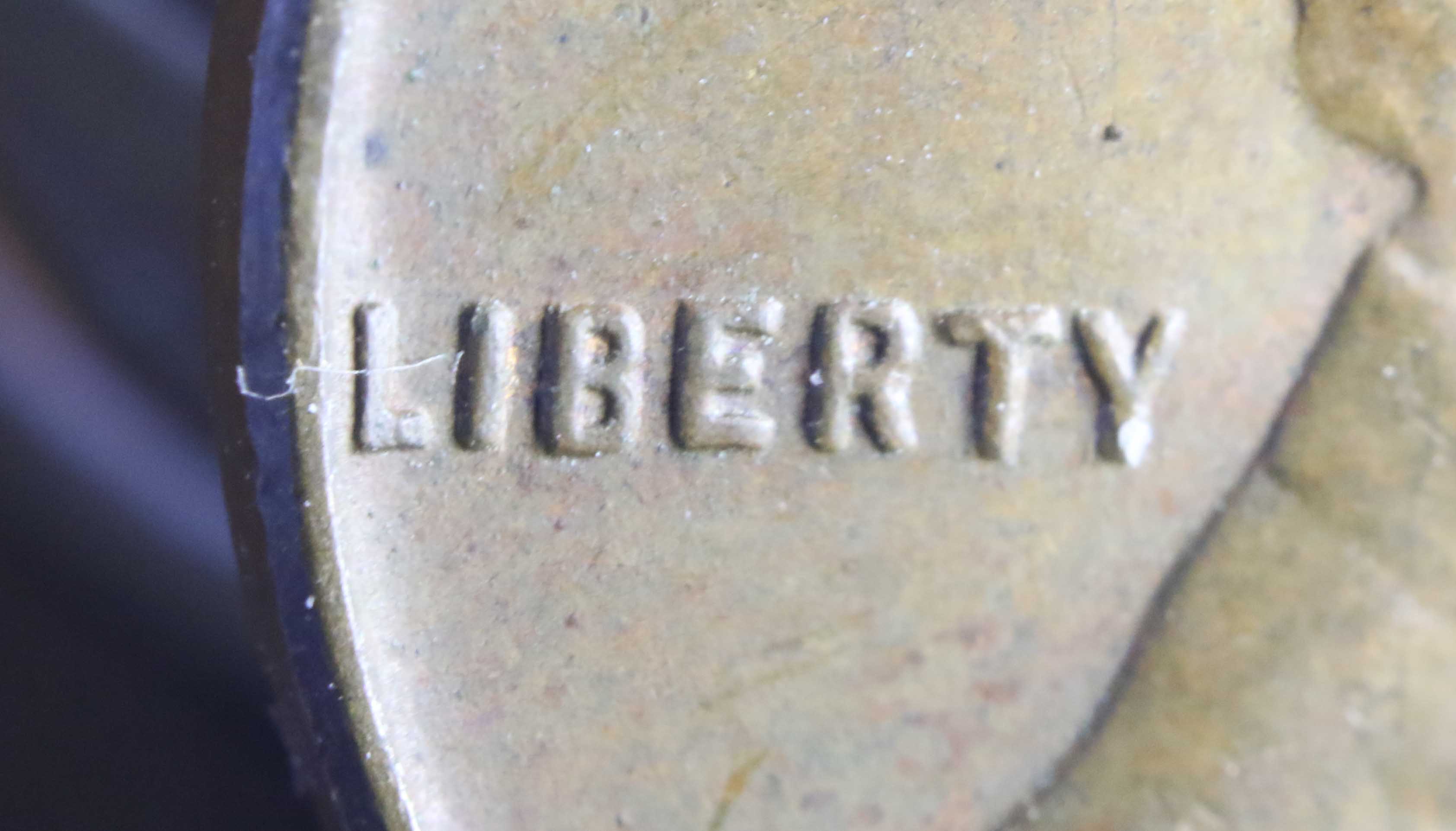
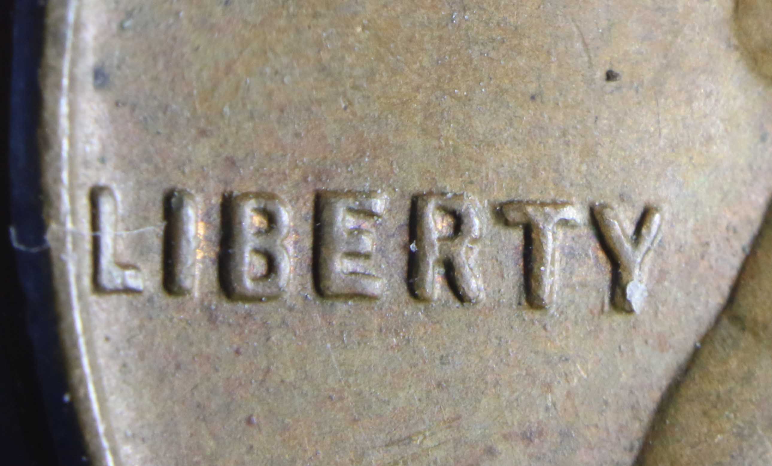


Yes, and I admit I was looking at other things and didn't think about that one, the reducing... On the vertical of the E, wouldn't you say it looks enlarged, or is the E just different in this series? I have noticed that in some of the years the font gets really weird like the BERT or IBERTY seems to be an enlarged set of letters compared to the rest of the word.
I had it set aside for a few days and would go back, sneak up and look at it. I was still unsure, so I finally decided to post it before I threw it in the coin machine pile. Its there now.. :)
Thanks,
Robert
I had it set aside for a few days and would go back, sneak up and look at it. I was still unsure, so I finally decided to post it before I threw it in the coin machine pile. Its there now.. :)
Thanks,
Robert