| Author |
 Replies: 38 / Views: 5,341 Replies: 38 / Views: 5,341 |
|
Pillar of the Community
Canada
2187 Posts |
I'm looking forward to some of the coins next year
What do you guys think? The nickel, loonie and quarter for me are my favorite. But I also like the simplicity of the dime.
I can't put the dropbox link to the pictures of the coins, but they're on the mint's website. Edited by Paulsz
11/02/2016 1:14 pm
|
|
|
|
Pillar of the Community
Canada
1505 Posts |
Thanks for sharing. I am a fan and think I will grow to like them even more. Very happy they do not look like a grade 4 students art project.
Nikle is probably my favorite and I think the dime will look really good in silver or maybe some kind of frosted proof version.
|
|
Pillar of the Community
Canada
1747 Posts |
|
|
Pillar of the Community
Canada
2845 Posts |
And the winners.. 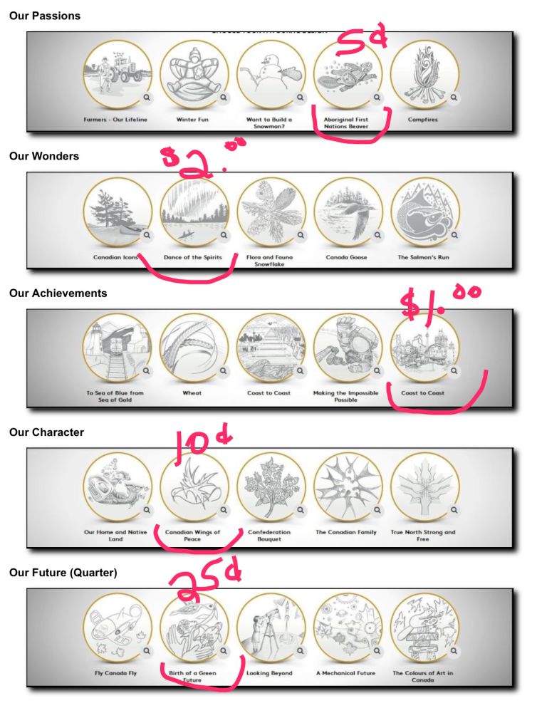 |
|
Pillar of the Community
Canada
3733 Posts |
so these will be issued as regular coins? you don't have to buy the proof set to get them.?
|
|
Pillar of the Community
United States
4867 Posts |
Are these replacing the regular circulating coins for next year?
|
|
Valued Member
China
171 Posts |
Awful. Beaver roadkill and an anorexic leaf. So disappointing.
|
|
Pillar of the Community
Canada
2845 Posts |
Yes, these have been chosen to become the 2017 circulation coins, in celebration of Canada's 150th anniversary. They'll replace the traditional coins that are released into circulation, for the year 2017 only,
|
|
Pillar of the Community
Canada
705 Posts |
  I really wish my design made it through :'( |
|
Pillar of the Community
 Canada
5588 Posts |
|
|
Valued Member
Canada
137 Posts |
Definitely disappointing for me, there's no comparison to the 1967 set.
|
|
Valued Member
Canada
457 Posts |
I actually like the Loon :) And the Dime isn't to bad. 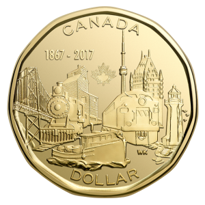 |
|
Pillar of the Community
 Canada
2187 Posts |
Getting mixed feelings from the community. I guess we'll wait to see what they look like in hand. For the dime, I might have preferred the "Our Home and Native Land" entry.
|
|
Pillar of the Community
Canada
5588 Posts |
Although some may look good in a picture, having those busy designs cramped onto a tiny coin leaves them cluttered.
|
|
Pillar of the Community
Canada
1571 Posts |
I'd go with "true north strong and free" for the dime. Especially if it was coloured to reflect Canada's multi-culture. But I guess if it was done like the old unicef boxes teachers used to give us kids on Halloween to collect pennies while going door to door, it may be considered politically incorrect.
(If anybody knows what unicef boxes I'm talking about, please reply because my wife never heard of schools sending kids out collecting for UNICEF on Halloween, and thinks I'm making it up. Lol. Perhaps it was a local public school thing. Looking back, having a string around your kids neck with a box full of change probably wasn't a great idea and along with the political incorrectness, it probably wasn't loved by parents. I'd pay double face value just to go through 5-10 of those boxes today. I'm sure there would be some great coin finds)
Back to the new coins... I would have thought more entries like Wilsonwu89's $2 (peace) piece would have been selected. It actually says something even without reading "peace" on it. As a peace keeping country, it seemed more fitting than The twoonie that was selected, which really takes long looking at to figure out what's going on.
The other entries posted above by WildflowerAB are runner ups I'm assuming? They weren't too special either. I'd love to see more of the entries that were not selected
|
|
New Member
Canada
32 Posts |
I'm also a fan of the less busy designs but the dollar doesn't look bad rendered. On a side note, I do recall unicef boxes at Halloween. They were sent home from school every year in the late 70s/early 80s. We always managed to fill ours.
|
| |
Replies: 38 / Views: 5,341 |


