| Author |
 Replies: 48 / Views: 8,141 Replies: 48 / Views: 8,141 |
|
Pillar of the Community
United States
4870 Posts |
What are your thoughts on the shield design on cents from 2010-present? I'm not particularly fond of it. I actually thought some of the other design candidates were better. I preferred these over the shield design.    Edited by TheForce
04/04/2018 2:57 pm
|
|
|
|
Moderator
 United States
191045 Posts |
I like it. I have always liked it. I liked it when it was a candidate ( technically my second choice). I know that makes me atypical and I am okay with that.  |
|
Pillar of the Community
Sweden
1078 Posts |
I like it too, infact more than the previous design. It's simple, yet clearly defined as to what it is: One cent. Feels modern.
|
|
Pillar of the Community
United States
2023 Posts |
I like it too for its simplicity. Looking at modern commemoratives and larger bullion pieces, the art is often more detailed and appealing with increasing face value. It doesn't make much sense that the smallest denomination should have a very intricate design.
That said, I really like the last of the images above (LP-17). A bit larger and with a wider wingspan, it would look great on a bigger piece. The others look kinda cartoony for my taste.
|
|
Valued Member
United States
393 Posts |
Hi, I think the shield is very symbolic for our country. This is my opinion. I am not starting a contoversial response. I think it was put there on purpose to let us all be aware of what's coming, one way or the other. Economically, Chinese Yuan started taking over the Petro Dollar. The other aspects of life, it will come, one day at a time. The reason why, I am enjoying this coin hobby. Learning a little bit at a time. Thanks to all the coin teachers, and analysts.
|
|
Pillar of the Community
United States
3484 Posts |
|
|
Pillar of the Community
Canada
1535 Posts |
LP-17 is an excellent design, much better than the current design.
|
|
Pillar of the Community
 United States
4870 Posts |
I tend to gravitate towards LP-17. That design would look super on a larger coin.
|
|
Moderator
United States
191045 Posts |
I did like this shield design better...  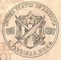 |
|
Pillar of the Community
United Kingdom
1688 Posts |
I like the LP-17 design. Never liked the shield design.
|
|
Rest in Peace
United States
17900 Posts |
Tough for the eagle to fly on 15 when it has two left wings.
I like 17 better, although it doesn't matter since the Zicolns won't survive long.
|
|
Moderator
United States
191045 Posts |
Quote:
Tough for the eagle to fly on 15 when it has two left wings. Left wing is viewed from below, right from above. |
|
Bedrock of the Community
United Kingdom
18069 Posts |
I also like the shield design! I prefer it to the British 'shield jigsaw puzzle' where you have to piece the coins together to make the shield!
|
|
New Member
United States
37 Posts |
LP-17 looks good, but all of those ridges would make it easier for the elements (or whatever) to get through whatever finish they're now using, and cause them to get those fantastic black spots we all know and love. Assuming that's what causes them, of course.
~MΩNSTER~
|
|
Moderator
United States
191045 Posts |
 to the Community, SawtoothJack! |
|
New Member
United States
37 Posts |
Thank you. Long time reader, first time poster. Still working on getting things figured out on here. Haha
~MΩNSTER~
|
| |
Replies: 48 / Views: 8,141 |


