| Author |
 Replies: 14 / Views: 1,455 Replies: 14 / Views: 1,455 |
|
|
New Member
Australia
42 Posts |
Attached are scans of two coins which display uniformly thickened letters and dates as well as a scan of a normal die. I do not consider the variety coins to be: 1. Extensive doubling as there is no sign of the normal lettering and date which is on normal doublings. 2. Wear as it is too uniform and there are no transitional coins showing the stags of wear. 3. Damage by being struck because the spaces at the top of the As, Rs, etc are not filled or filling in by spread which would be the case if the coin was struck. And would be incredible if it could be so uniform. 4. The rims show no sign of spread.   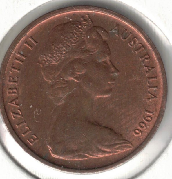 |
|
|
|
New Member
 Australia
42 Posts |
Same scaled image  |
|
New Member
Australia
42 Posts |
|
|
Pillar of the Community
Australia
599 Posts |
Would have have some better pics please.
Watch your top knot
Edited by echidna
11/01/2021 09:40 am
|
|
New Member
Australia
42 Posts |
Unfortunately cannot choose quality of coins in which differences are discerned. If some one has an UNC copy I would be pleased to exchange old for new. When looking through scanned 1966 1c coins obtained as part of bulk Lot from Noble Auction 125 I noticed one where the lettering and date looked "fatter" than the "normal" ooin scanned next to it. Then found another. In looking through about 1,500 1966 1c coins in my bulk accumulation I found one more!!. You need to scan at least 10 coins and scale up so two fit on screen so can compare. If there is a 'Fat"one there you can tell difference. The 1 in 1966 is clearly fatter and the other parts of the date appear fatter. The left hand slope of each A is about twice the width of normal in the fat one. Other uprights such as the two uprights of the H and the 11 are also discernibly fatter, as is the B and other letters and the 'bosom' of the B is fatter also. 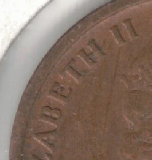 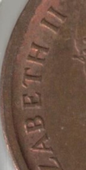 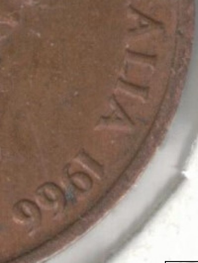 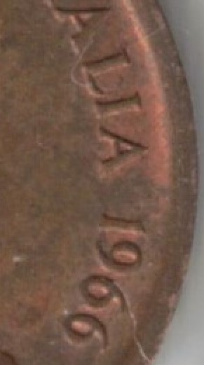 |
|
Valued Member
Australia
369 Posts |
 ...Here is an Unc example...Definitely Rare in my opinion. |
|
New Member
Australia
42 Posts |
|
|
Pillar of the Community
Australia
599 Posts |
It appears to be a DDO. Hence the wider letters etc. Watch your top knot
Edited by echidna
11/07/2021 7:07 pm
|
|
New Member
Australia
42 Posts |
Disagree with DDO assessment. (Doubled Die Obverse) In all DDOs I have seen (and mainly machine doublings I would expect) the outline of the standard design can be seen and the doubling is a partial outline next to the standard design. Effectively a marginal mirroring or shadowing effect next to the standard design. I stand to be corrected but if you can show one example of a variety where collectors accept it as a doubling and the doubling appears as a fattened letter or number and not as a partial outline of the image next to the standard design then please upload to this topic. Am prepared to broaden my knowledge. There is not one shred of any the standard design with adjoining mirroring on any of the enlarged letters or numbers of this variety. Not one single letter or number shows the outline of the standard letter or number size. I cannot understand why collectors are so keen to say it must be die wear, or pre or post mint damage or doubling or struck thru oil or some explanation other than a difference with the Die. The 'no SD' is accepted as a variety not as mass Die fill! The 1977 2c DDO is accepted where a Die maker did something causing the depressions in the Die to be doubled in the 77 and part of ELI. And you can clearly see the outline of the standard design next to the doubling. Why cannot a Die have been dealt with by the Die maker running his/her tool along the depressions in the Die inadvertently making the coin depressions to be slightly widened so that when pressed (pounded) onto the planchet the outline of the letters and numbers come out slightly larger than normal. |
|
Valued Member
Australia
369 Posts |
It is die wear. The 1966 dies were flogged to death. A new die is sharp and wears down over time creating this effect.Just my humble opinion.
|
|
Pillar of the Community
United States
4404 Posts |
Looks like DDO to me. Two slightly misaligned hubbings of equal strength. A nice Class I doubled die. I can see split serifs on the second E in ELIZABETH and the ST in AUSTRALIA. Aussie copper's and airgem's coins appear to be from the same die. |
|
New Member
Australia
42 Posts |
|
|
Pillar of the Community
Australia
1364 Posts |
Yes, there is definitely something going on with that second 'E'. 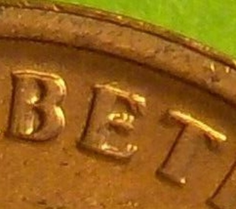 |
|
Valued Member
Australia
369 Posts |
Looks like a trip to Specsavers for me. Missed the split serifs.  |
|
New Member
Australia
42 Posts |
Thanks to the Unc specimen from Airgem and the clues from Tanman2001; I agree with Echidna that it is DDO. A nearly perfect and complete Die Doubling of all the letters and numbers. (Much better than a worn Die Airgem!!) The signs of doubling are: 1. Indent in the top of the A in ELIZABETH and the second two As (third clearer than second) of AUSTRALIA - which of themselves would probably be disregarded. 2. A line in the left leg of the first A of Australia - which is about the only sign that these are not the normal size lettering. 3. The doubling of the following serifs on: - All three arms on each E - The leg of the L in ELIZABETH - The leg of the Z - The cross bar of the Ts; and - The top of the S. Thanks to the quality of Airgem's coin and the serifs it is possible to establish the Double Die status and rule out any other considerations. The only question I have is :- Airgem. Had you noted the variation in the coin before my post? |
| |
Replies: 14 / Views: 1,455 |
|


