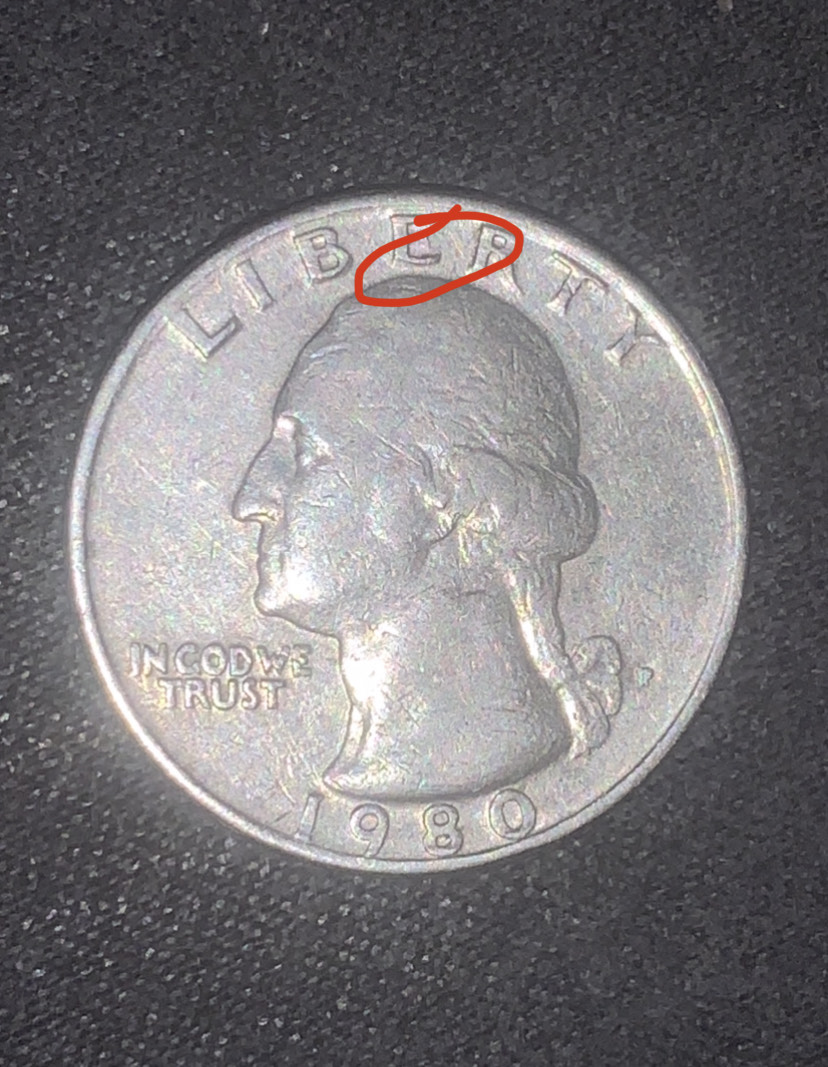
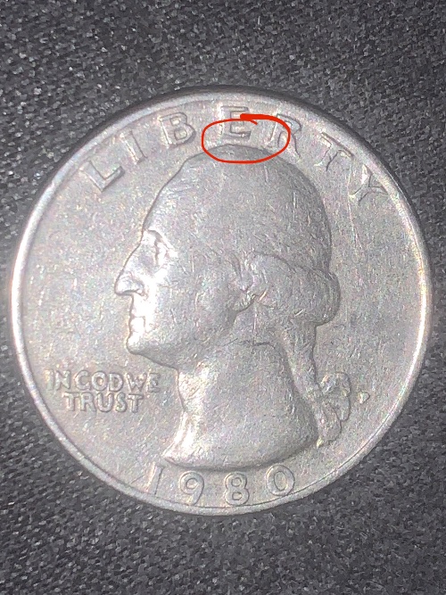
The lower portion of the "E" in Liberty seems to be thin and rounded. I've attempted to compare it to others but having difficulty seeing it clearly. Can anyone see it? Is it an error
Possible tiny hit moving the metal some, but also wear on the coin has probably narrowed the lower portion of the E some accentuating the curve of the font.
Disclaimer: While a tremendous amount of effort goes into ensuring the accuracy of the information contained in this site, Coin Community assumes no liability for errors. Copyright 2005 - 2026 Coin Community Family- all rights reserved worldwide. Use of any images or content on this website without prior written permission of Coin Community or the original lender is strictly prohibited. Contact Us | Advertise Here | Privacy Policy / Terms of Use