| Author |
 Replies: 22 / Views: 3,481 Replies: 22 / Views: 3,481 |
Page 2 of 2
|
|
|
|
New Member
United States
32 Posts |
This might be the best reverse of the set so far. It looks good in the business strike and proof strike. In the reverse proof strike it is outstanding. And I love the obverse. Lady Liberty stands out. The view of her raised arm with the torch is unencumbered by distractions. Simple yet refined.
|
|
Moderator
 United States
188770 Posts |
I should add that I do like the Hubble design.  |
|
Bedrock of the Community
United States
17884 Posts |
Quote:
I was using Google trying to find out why edge lettering was chosen for dollar coins. It was felt that too many inscriptions cluttered up the coin and that by moving them to the edge it would allow a "larger canvas" for the designers artwork. |
|
Pillar of the Community
 United States
6514 Posts |
Quote:
It was felt that too many inscriptions cluttered up the coin and that by moving them to the edge it would allow a "larger canvas" for the designers artwork.
Seems like a good enough reason. But still, the obverse is stark. Check out my counterstamped Lincoln Cent collection: http://goccf.com/t/303507Edited by chafemasterj
01/12/2021 2:46 pm
|
|
Moderator
United States
188770 Posts |
They moved stuff front/back for the quarters, no reason they could do the same for the dollars. The edge lettering here is unnecessary.
|
|
Bedrock of the Community
United States
20753 Posts |
I never did like those sized of dollar coins.
|
|
Bedrock of the Community
United States
10038 Posts |
Quote:
Would be a good coin to put into general circulation so that
all of America can be reminded of, and celebrate the achievement. They would end up being stored at taxpayer expense like the rest of them. https://www.npr.org/2011/06/28/1373...nobody-wantsAlthough this article is ~10 years old now, I cannot find any news about the coins still being in storage or recycled or ? I wonder what happened to them. I do like the Hubble design, but as has been mentioned, the other side is overly non-filled with design. Quote:
I think they just wanted to justify keeping the edge lettering equipment they bought for the presidential series.
My thoughts also. They never seem to learn what collectors like and dislike anymore. Edited by Earle42
01/12/2021 10:48 pm
|
|
Moderator
United States
188770 Posts |
Quote:
They would end up being stored at taxpayer expense like the rest of them. Yup. Need to kill off the dollar note if you want that to work, otherwise, just leave them NIFC. |
|
Bedrock of the Community
United States
17884 Posts |
Quote:
I cannot find any news about the coins still being in storage or recycled or ? I wonder what happened to them.
There tends to be a fairly steady draw down of around 6 million coins a month for use in cities with major public transit such as subways etc. So in the 9 years since that article they have probably managed to dispose of about 600 million or so of them. As a comparison, back whe the Sac dollar came out Wal-mart managed to dispense 100 million in one month. The Treasury Dept considers the Wal-mart promotion a failure. |
|
Pillar of the Community
 United States
4870 Posts |
It only failed because dollar notes weren't withdrawn from circulation. Everyone by now would be use to using dollar coins had that happened.
|
|
Pillar of the Community
United States
1667 Posts |
I'm not a fan of the font used for the U.S of A and the state.
I get it they were trying to pull off the open As of the retro connecting NASA logo, but as a whole if this continues the series is gonna be a hot mess as a whole with them getting "creative" with reverse lettering to make them "different" ...
Edited by Big-Kingdom
01/14/2021 4:45 pm
|
|
Moderator
United States
188770 Posts |
Quote:
It only failed because dollar notes weren't withdrawn from circulation. Everyone by now would be use to using dollar coins had that happened. Yup. Like I said, need to kill off the dollar note if you want it to work. |
|
Pillar of the Community
United States
2627 Posts |
I really like the reverse design of the Hubble dollar, and the obverse has grown on me over the years. Too often designers are afraid of negative space and the end result is cluttered (e.g. the 2021 Crossing the Delaware quarter reverse), so I like that the Mint took a chance with the obverse of the Innovation dollars.
That being said, the obverse still has the appearance of a token, and I've always despised edge lettering.
|
|
Pillar of the Community
United States
7276 Posts |
I really like the innovation series. I believe our coins today have too much stuff on them. I mean look at the new Washington quarter, they even added "crossing the Delaware" Nice clean design, that's what the innovation dollar series is. 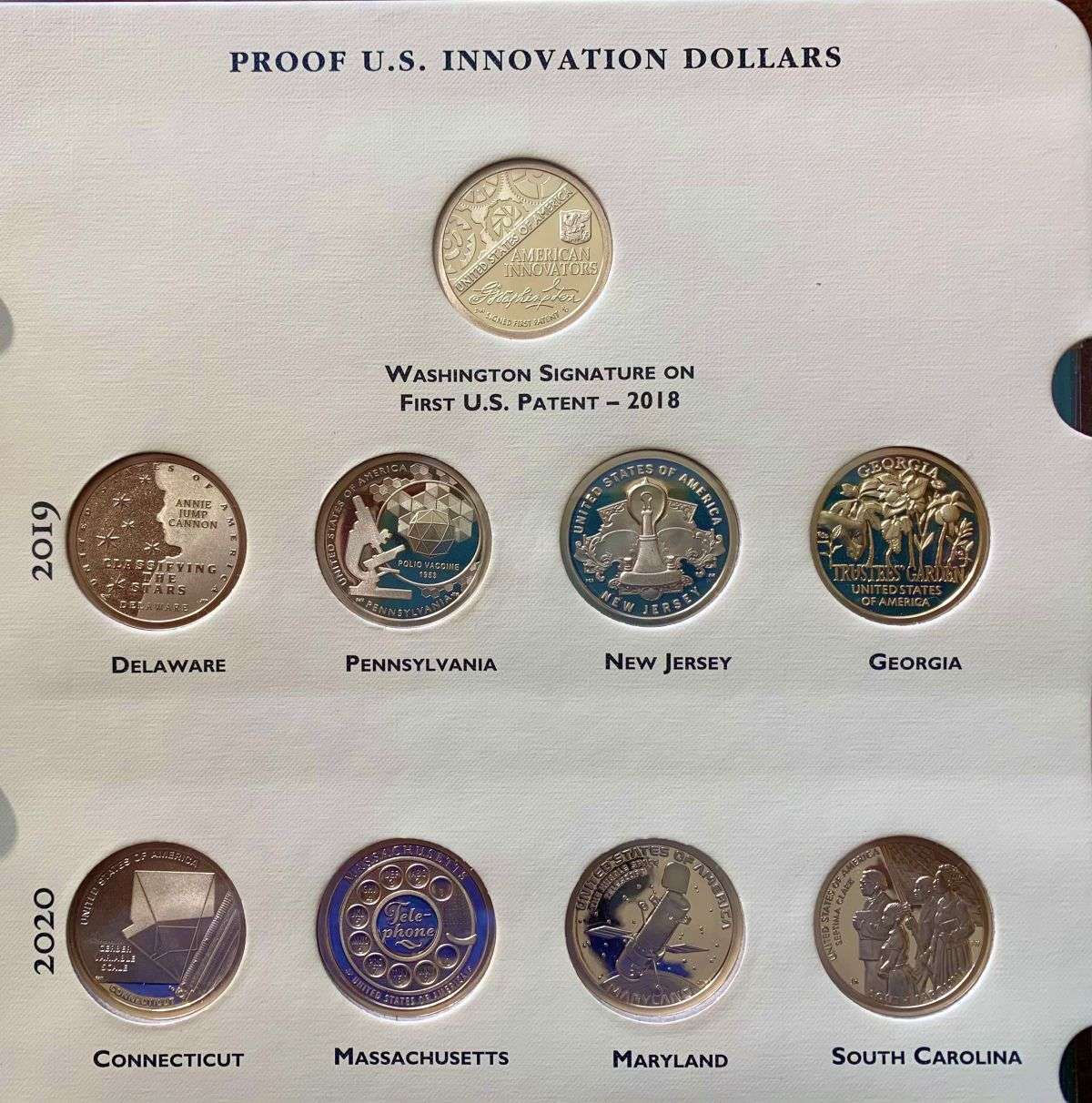 |
|
Valued Member
United States
173 Posts |
I like the design of the American Innovation for both sides. The open spaces on the Statue of Liberty side offer a challenge to the collector of business strikes to find those with little or no bag marks and scratches on the open fields. For that reason, most of the business strike (only available through the US Mint or if found in circulation, likely low grade MS ones put into circulation by collectors)range between MS 62 - 66, I see very few grade above MS66. Also I am quite happy they do NOT put them into circulation as here in the NYC area you can easily get some nice high AU Presidential dollars from vending machines and even the bank. YOu also get tons of 2000 and 2001 Sacs as well as 2009 and 2010 Native Americans. You can even spot (albeit rarely) current Native American dollars. So plenty of small dollar coins to use. As one of the posters repeatedly said, we have to drop the paper dollar for dollar coins to be used. One thing though, I do encourgae colelctors of AI dollars to put some into circulation to have people enjoy themand to lessen the population of Mint State coins. |
|
Page 2 of 2
|
Replies: 22 / Views: 3,481 |
Page 2 of 2
|


