| Author |
 Replies: 30 / Views: 4,541 Replies: 30 / Views: 4,541 |
|
|
|
Moderator
 United States
14463 Posts |
I had never seen the 1935 portrait before. I think it is cute.  |
|
Pillar of the Community
Australia
7096 Posts |
Quote:
I had never seen the 1935 portrait before. I think it is cute.
And just think, that child 18 years later had to become the Queen, The poor old bugger has been doing it ever since. |
|
Valued Member
Canada
94 Posts |
trout1105: I think the Queen looks fantastic for her age. However, Ugly is not saying she is ugly but that her portrait on our coins does her no justice at all. I agree with him 100%.
Oh how I wish they'd have updated her portrait for the diamond jubilee! :(
|
|
Pillar of the Community
3352 Posts |
Here is a pretty fair comparison: => first coin is an 1896 quarter with "77" year old Queen Victoria => the second coin is a 2004 quarter with "78" year old Queen Elizabeth 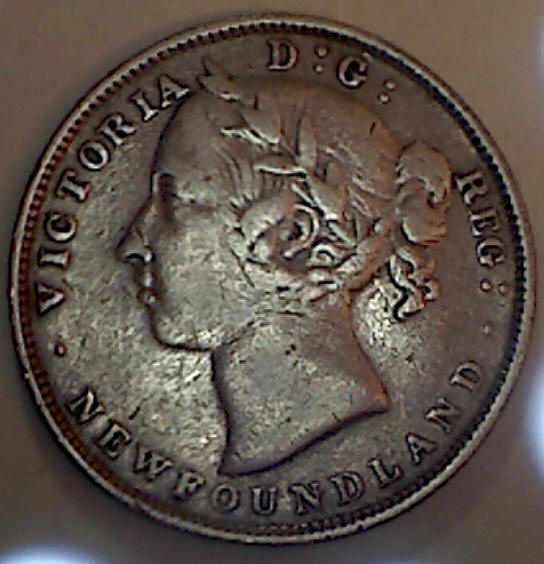 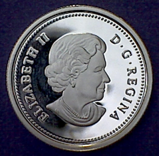 ... sorry that I used a bit of a worn-out obverse for Victoria (I wasn't trying to sway the votes Liz's way!) Hey don't get me wrong => Queen Elizabeth rocks and I think she's still looking pretty spry for her age, but I'm sure they could have found a more regal and flattering portrait, ya know? Edited by stevex6
01/09/2012 07:59 am
|
|
Pillar of the Community
Australia
7096 Posts |
Quote:
first coin is an 1896 quarter with "77" year old Queen Victoria
I doubt that a 70 odd looked like that,In fact this is a young Victoria portrait, The Veiled head is the last portrait of this Magnificent Queen Edited by trout1105
01/09/2012 08:53 am
|
|
Pillar of the Community
3352 Posts |
trout1105 => I'm pretty sure that portrait is from my 1896 Newfie 20 cent? (but I'll verify thatwhen I get home ... I'm currently blowin--up stuff at work at the moment)
EDIT => hi gain => I just went and searched for a few 1896 coins (Newfie & Canada) and "yup, that's the portrait that they were using"
... however, you are probably correct => maybe they were still using this younger image of Victoria even though she was well into her 70's ?
Edited by stevex6
01/09/2012 11:23 am
|
|
Pillar of the Community
 Canada
1733 Posts |
We didn't use the veiled portrait, just the crowned portrait.
Doesn't matter, all her portraits were regal in my opinion, there was no mistaking her for my housekeeper.
|
|
Pillar of the Community
3352 Posts |
|
|
Valued Member
Canada
227 Posts |
I also think the 2011 portrait ofthe Queen is atrocious. I think a portrait of Kate Middleton would be in order. She is one of the most ‘natural' stunning women of our time. But I've always been a sucker for a pretty face.
|
|
Pillar of the Community
3352 Posts |
... or maybe Pippa Middleton?  |
|
Valued Member
423 Posts |
I think the Royal family has been trying to change it's image for some time to fit into todays world. They have been selling assets and have people working her image and how she is presented to the world constantly.
She seems more presented as a person instead of a symbol. The current image seems more in line with todays reality.
|
|
Pillar of the Community
Canada
1733 Posts |
Thanks realpenny, nicely stated for that point of view.
|
|
New Member
United States
21 Posts |
Quote:
Since 1953, I find that each new portrait has been successively less attractive than the one that preceded it. I wish Canada had used the Maklouf effigy starting in the 80s like a lot of the other countries (I've never liked the Machin effigy, or the fact that Canada held on to it for 5 years longer than most other places). I don't know quite how to describe it, but it seems more "solid" than the imitation that the RCM picked. |
|
Valued Member
Canada
223 Posts |
Ive always thought that the 35 portrait was the nicest of them all. I understand she is an old woman now and they try to reflect her properly but I agree she should at least appear regal and this portrait doesn't make her look that way. I guess we can console ourselves with the fact this is most likely the last protrait of her before a new monarch adorns our coinage
|
|
Valued Member
Canada
491 Posts |
Ibagli is right the Maklouf is by far the nicest effigy as an adult. RCM is doing better than the Rank-Broadley design, although its quality is high often truth can be quite disconcerting. As a tribute to Maklouf an image of his design: 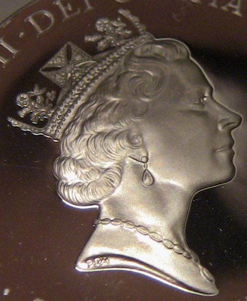 |
| |
Replies: 30 / Views: 4,541 |


