| Author |
 Replies: 40 / Views: 5,370 Replies: 40 / Views: 5,370 |
|
|
|
Pillar of the Community
United States
655 Posts |
When it comes to Spanish coins I'll go with the older ones any time.   |
|
Moderator
 Australia
16842 Posts |
Yes, coin designs are getting less appealing. They have to be. Mints can't afford to make beautiful, attractive coins any more, because that costs money. When the goal is to churn out the maximum number of coins in the minimum possible time, then the care and detail needed to make attractive coins has to be sacrificed.
Don't say "infinitely" when you mean "very"; otherwise, you'll have no word left when you want to talk about something really infinite. - C. S. Lewis
|
|
Pillar of the Community
United States
3253 Posts |
There are some nice new things out there. But the "shield" reverse Lincoln Cent is a pure obscenity. They'd have done better to celebrate Lincoln's bicentennial by making the reverse blank. |
|
Pillar of the Community
Australia
2180 Posts |
I also agree that new designs are less appealing. I think Australia's current line-up isn't too bad but it's nowhere near my favourite. Today's designs have nothing on things like: Edward VII British Florin  Canadian $5  They're things you could really appreciate getting in change. I wonder, do many sets get chosen by competitions these days? Edited by Mr T
06/08/2013 03:33 am
|
|
Pillar of the Community
United Kingdom
4208 Posts |
Theres some good stuff around but its not getting great. I think the low relief thing is doing it. I wouldnt mind the new US cent design, which I like, but its so...flat. If it were deeply struck on a pure copper planchet, that would be good. I would totally collect some of those.
However, some of the classic US designs (and a lot of designs from the 1920s-30s) are nice. Some of the soviet coins are nice. The new UK designs are pretty nice too - I might prefer it, if only Britannia was put back on to something.
|
|
Pillar of the Community
United Kingdom
856 Posts |
Quote:
Silver', don't take this the wrong way, but those "new" coins resemble tokens to me. Well, of course, most coins are tokens now. In the UK the value of a coin was equivalent to the value of the metal it was made from .. at least up until 1816. But nobody can afford to make them like that any more because as soon as metal prices rise then people would start melting down their money! So now the face value of a coin is simply something generally agreed upon. The days when merchants would weigh foreign coins and assess how much silver they contained to decide their worth have long gone, never to return. Now they are made of steel and coloured or CuNi and in an attempt to make them more difficult to fake the designs are tweaked. That doesn't mean there aren't some attractive coins out there, but it seems the main elements of design goes into the bullion (which of course governments profit from) rather than the circulating coinage (which probably is a drain on the economy) where designs are often based on competitions among the public (school children for some of the UK's recent Olympic based coins). I guess maybe the purpose of coins has shifted. Yes, they are a means of payment. But many older coins were a means of advertising - either the power or continuity of the monarchy, or, like Britannia on British coins, a sign that however far you were from England, you were still within the realms of the Empire. Of course, there were times when most coins looked the same. People couldn't generally read, so making your coinage similar to everyone else's meant it had more chance of being accepted. But the fact that coins then were made by hand gives them character that (for me at least) machine made coins usually lack. So for me it's not actually the designs. It's no longer making coins by hand, or in a rickety machine so the edges were uneven and some parts sharper than others, that makes them less appealing to me. The quirky differences of individual coins is now a thing of the past. I just find uniformity boring I guess! |
|
Pillar of the Community
United States
3253 Posts |
So, just to clarify, Tom, do you feel coins got too newfangled with the advent of the steam press in the 1830s, or when the screw press started replacing the hammer and anvil in the 1500s?
|
|
Valued Member
United States
289 Posts |
Mt.T, that is one beautiful coin  Tom, you point is very accurate. We will not longer have all the wonderful variations that we saw in the past. However, when I first started collecting and saw the Capped Bust designs it was not what differences between the coins that was so fascinating to me but the design itself. Only here on the forums did I learn more. I know the cost of producing the coins has increased so much which is what forced Mints around world to design (if one can even call it that) with minimal detailing out of durable and inexpensive materials. I dealt with costs of production for much of my life. I would design items that companies sold, they would do well for 2 to 3 years. They would then need to increase PM (profit margins) from 36% to 44%. I was then told to RE design them to be "thinner" and not to worry about the durability as much, since they were less expensive the customer would "not mind" if the durability was no quite as it was before. And this.....is the mindset in industries and governments worldwide.  |
|
Pillar of the Community
United Kingdom
856 Posts |
Quote:
So, just to clarify, Tom, do you feel coins got too newfangled with the advent of the steam press in the 1830s, or when the screw press started replacing the hammer and anvil in the 1500s? Well, as I mentioned elsewhere philadelphian, I collect hammered coins, so generally the latter. However I don't mind early (British) milled coinage so much because, to my eyes, it still has character. As an example I like this:  but this just doesn't do it for me:  Odd, and a subtle difference maybe. But if we all liked the same thing it would be a bit boring perhaps! Edited by Tom Goodheart
06/08/2013 09:45 am
|
|
Pillar of the Community
United States
3486 Posts |
In addition to being real money and a way to portray a country's prestige, the question of commercial needs demands a bit of attention as well. The gorgeous 1907 High Relief $20 gold piece was changed to meet the needs of banks to stack them. Fraser's design of the Bison Nickel was challenged before being accepted - would it stack and would it fit into mechanical machines? (It would, with a redesign.) Nickelodeons, subways, Automats, buses, juke boxes, etc. If it fits, if it works, it is accepted. Then, 1965 - Silver is removed from US coins. "Collectors are hording coins!" was the cry heard from the government. No mention that the vending machine industry was swallowing up coins faster than they could be produced. Today, who needs coins when the machines accept plastic? Ans so, why bother to make coins look attractive? |
|
Valued Member
 Spain
134 Posts |
Quote:
The new UK designs are pretty nice too - I might prefer it, if only Britannia was put back on to something. You still have Britannia on the 50p, don't you? :)  Thought IMO that's one of the worst Britannia designs ever minted; nothing to do with the Edwardian Florins up there, that's a real beauty. But I find interesting the fact that even though that 50p coin is a sexagon, it has the same diameter in all its points; making it a virtual circle when measured. I like the Spanish coins up until Franco's time... even the regular peseta looked sort of cool. 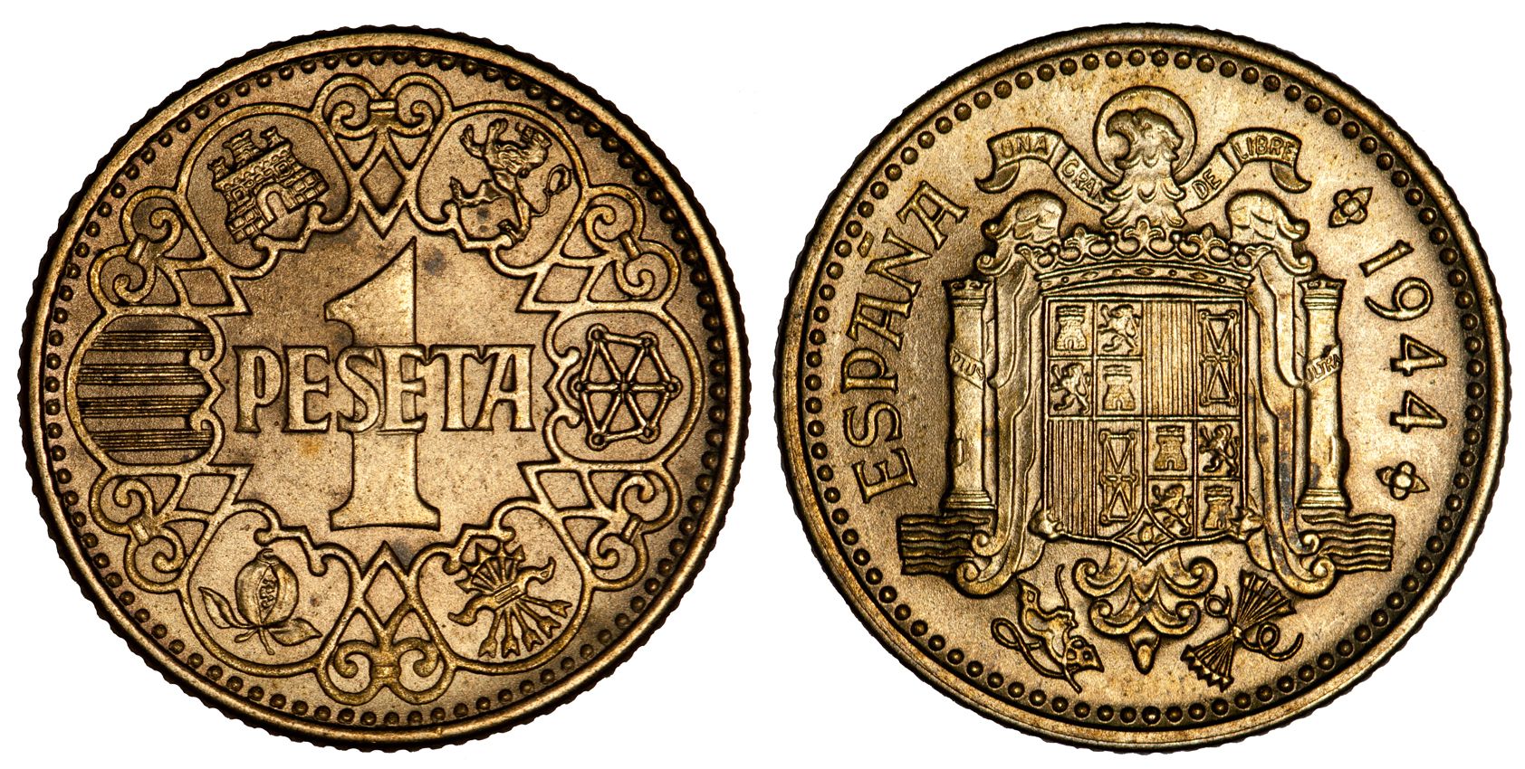 And the large 50 pesetas were really nice...  Edited by silvermaniac
06/08/2013 1:41 pm
|
|
Pillar of the Community
Canada
2805 Posts |
After reading this thread, I decided to go through my mixed world coin bag and pick out my favorite modern coins.  The results were surprising - turns out I just like big, clear numbers. But I think all of these are examples of what you can do with coinage nowadays. The problem coins seem to all come from a spirit of "modernization" - we get sterile designs because the prevailing spirit of the time is towards that minimalist style. The Euro is supposed to be cutting-edge, so it's a bit... austere (ha ha get it). The gulden from the reign of Beatrix are essentially meaningless, just a grid and some numbers. The problem is that minting is deeply rooted in tradition, and it doesn't mix well with excessive minimalism (if only because the big, blank fields will look funny!). I still think that you should put subjects on coins that are at least vaguely national - the orange blossoms on the Netherlands Antilles 25c, the various arms and crests that are on the sides that I didn't photograph, etc... - because you're trying to make your country look good. Here are the Canadian half designs used from 1937 to now. They're just our coat of arms with a date and denomination, but I think our coat of arms looks pretty good so I don't mind it. But then, all of our Canadian coinage features national icons, with the possible exception of the loonie (not really strongly associated with Canada) - but then it became a national icon...  Edited by nalaberong
06/08/2013 3:26 pm
|
|
Pillar of the Community
Russian Federation
5174 Posts |
I finally remembered a post-2000 (well mostly - technically started 1997) lovely coin design... Moldova 50 bani (mid-2000s, might be still minted).
I think I have three of these now; there had probably been another one that I sent away on Secret Santa last year.
|
|
Pillar of the Community
Australia
2180 Posts |
Quote:
Mt.T, that is one beautiful coin Not mine unfortunately. Quote:
we get sterile designs because the prevailing spirit of the time is towards that minimalist style Yeah, I really feel that's the case too. Lots of older coins have such busy, full designs but they do look good. |
|
Bedrock of the Community
United States
10038 Posts |
Most post silver US coins are not appealing to me. The designs I do like are the Ike REV (and later SBA), the 2013 Sac REV, the JFK Half REV, the new shield on the cent (makes me think of classic designs I guess), and some of the State Quarters such as the Utah (Trains touching noses - b/c I have a glass insulator like was used on this line!). The ASEs OBV, being classic and one of the most beautiful, I love. Its REV is nice, but I think it could have been more ornate. I actually stopped being serious about Canadian coins when I saw how - IMHO - terrible the album page of the "everyone's grandma effigy" of The Queen looks when compared to former effigies. And also since they started to mint a new design on a coin for every day the sun comes up, I have felt they have done a poorer and poorer job - with an occasional - hey cool!). But I love the designs from approx. 2000 and before. The beautiful design of their coins is what made me want to collect them. |
| |
Replies: 40 / Views: 5,370 |