| Author |
 Replies: 23 / Views: 8,654 Replies: 23 / Views: 8,654 |
Page 2 of 2
|
|
|
|
Pillar of the Community
 United States
6130 Posts |
Are you sure that one isn't a Chuck E. Cheese token?  |
|
Pillar of the Community
Thailand
1509 Posts |
I would nominate the Irish Euro cents and Euros. The same old harp on all the denominations (excluding the odd commemoratives). Repetitive and uninspiring.
|
|
Pillar of the Community
Russian Federation
5186 Posts |
That OP coin is actually pretty nice  I'd propose the modern Bulgarian coins' design (other than the 1 lev, which is nice). Not only are all the denominations pretty much identical (except for size, color, and numbers), but the picture on them is the Madara Rider, which - in that particular version at least - is itself borderline ugly. Just ugh. At least they're pretty much all the same date, so I didn't have to collect anything more than a denomination set  |
|
Bedrock of the Community
United Kingdom
18626 Posts |
I thought I'd bump this thread as I got one of these 2006 Johnson's Dictionary coins in change the other day. I thought they were boring and uninspired when they were released, and after 16 years of circulation I think they look even worse! True, a dictionary is a difficult thing to depict on a coin, and a picture of a big book would also have been rather boring, but why not a portrait of Dr Johnson himself, perhaps with his beloved cat Hodge on his lap? 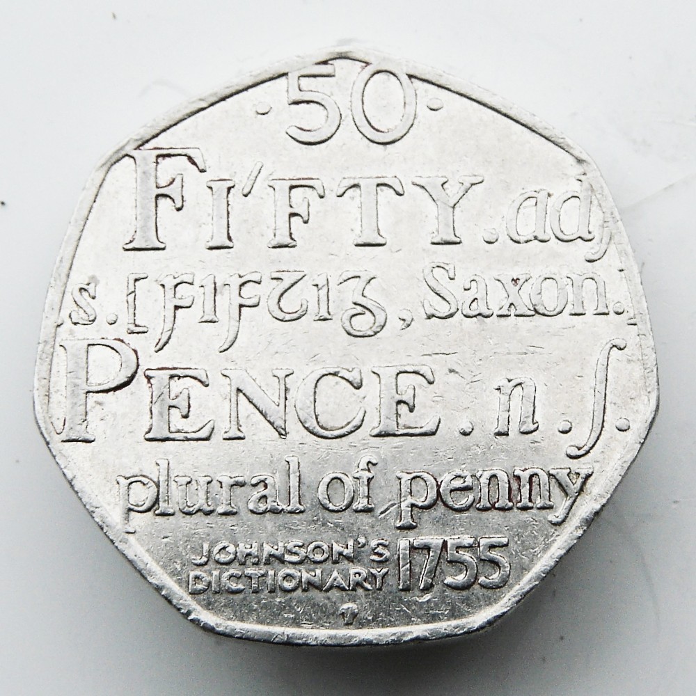 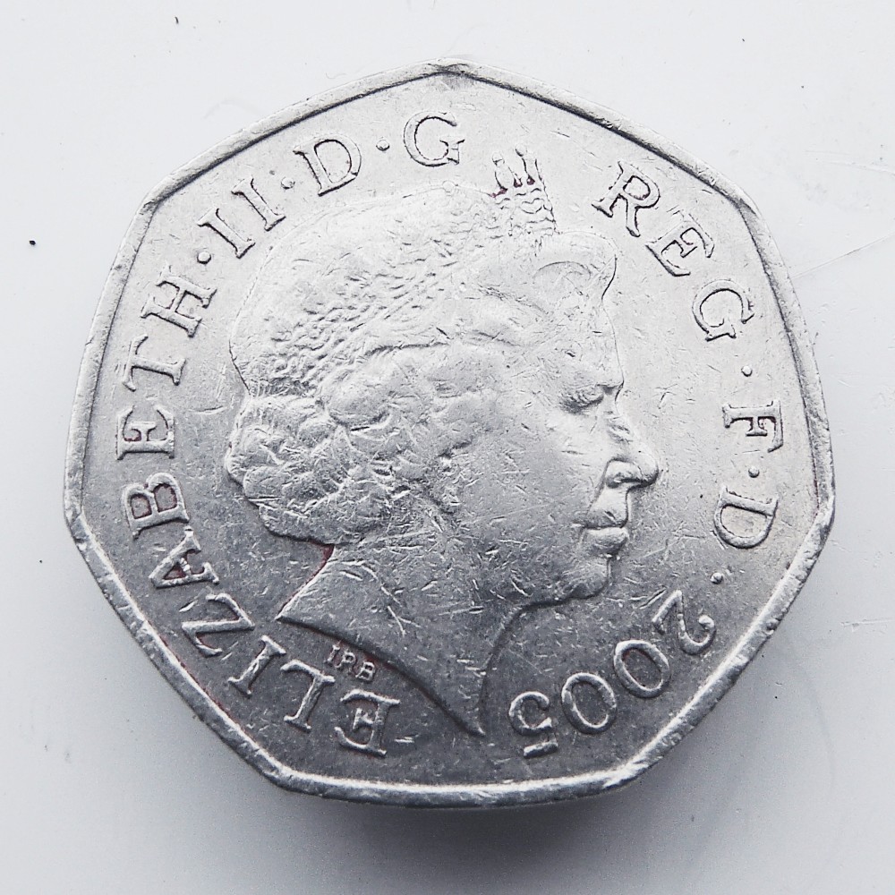 Edited by NumisRob
03/28/2021 5:27 pm
|
|
Bedrock of the Community
United States
19531 Posts |
NumisRob-- Indeed, that is a less than awe-inspiring example.
|
|
Pillar of the Community
Russian Federation
5186 Posts |
For what it's worth, I personally think that it's one of the neatest coins in the entire 50 pence commemorative series I could hardly call it uninspired. Unorthodox, yes, but that's a different thing. (I tried to get one of those myself at some point, though I forgot if I succeeded or not.) Quote:Looks like a token It's nothing compared to the glory of the Bosnia and Herzegovina convertible mark...   (Though Romania "wins" on consistency: other Bosnian denominations aren't that bad.) |
|
Pillar of the Community
Australia
1617 Posts |
Fin235 - I suspect the obverse of the Netherlands euro is worse. I thought Beatrix was a mushroom at first glance.  And as for mistaken icons on Euro coins - the Slovenian Prince's stone looks like a blueberry muffin.  I don't think the oak saplings on the pfennigs is bad given the significance and the fact that other German coins tied in with the theme. I do think the coin should have been changed once Germany had recovered from WW2. THQ - I think you're a bit harsh with the Statehood Quarters. There are some duds but some aren't that bad, although I might be a bit softer critic being an outsider. Must admit, there are some pretty uninspiring coins posted. My pick? For design and topic I choose our very own 2010 20c piece. The design itself I find lacklustre and who in their right mind (except accountants) would want a coin celebrating 100 years of taxation!  I'm not aware of any other country to produce a coin for their tax department.  |
|
Moderator
 United States
194816 Posts |
Quote:
I thought Beatrix was a mushroom at first glance. I scrolled down the page before reading. I saw the image and thought that was a mushroom, then read this. |
|
Pillar of the Community
4628 Posts |
Crazy designs on the Dutch coins are not enough, they have also inflicted the art on their colonies and newly independent members of the Nederlandophone community. Aruba modern coins (Other Antillies I think has weird coins too)   Again, the Dutch graphic and moderne artists are blamed, the series runs from 10 cents to 5 guilders/florins/wotsits and each coin is squae, round or some other shape.   Mauritius - Deer is okay (But design dates from the 1930s and is a bit dated in 2021) but that unsmiling dude has been on all their coins since the 80s. Can't they get rid of the de rigeur personality cult/Father of the nation theme and put a shield or something on the coins instead. I have a mountain of Mauritian coins and all have this guy on them. Edited by Princetane
04/01/2021 7:55 pm
|
|
Moderator
United States
194816 Posts |
Very interesting!  |
|
Bedrock of the Community
United Kingdom
18626 Posts |
Another of my less favorite recent UK commemoratives - the 2013 Benjamin Britten 50p. The weird 'rusticated' look on the reverse always makes this coin seem more worn than it really is, and, like the Alphabet 50p, it just gets worse after a few years in circulation. I also thought the attempt to cram the denomination on the obverse with all the Queen's titles made it look a bit cluttered:   |
|
Moderator
United States
194816 Posts |
Quote:
The weird 'rusticated' look on the reverse always makes this coin seem more worn than it really is Oh my!  |
|
Bedrock of the Community
United States
19531 Posts |
That 2013 Benjamin Britten would be a strong candidate for inclusion on the 'Mt Rushmore' monument to lame coin design.
Edited by ijn1944
04/14/2021 09:07 am
|
|
Pillar of the Community
Russian Federation
5186 Posts |
Quote:
That 2013 Benjamin Britten would be a strong candidate for inclusion on the 'Mt Rushmore' monument to lame coin design. ...yeah. And I thought the Wyoming quarter was boring. |
|
Moderator
United States
194816 Posts |
|
|
Page 2 of 2
|
Replies: 23 / Views: 8,654 |
Page 2 of 2
|







 First Page

 Posted 10/15/2015 05:19 am





