| Author |
 Replies: 17 / Views: 4,025 Replies: 17 / Views: 4,025 |
Page 2 of 2
|
|
|
|
Moderator
 United States
97576 Posts |
 to CCF I would love to see a close up of that. it does seem to be a bit off kilter there. |
|
Valued Member
United States
356 Posts |
 with Dearborn. A close up of Liberty would be good. Plus, a quick acetone bath for this Cent (even though it looks to be previously cleaned) may be in order to see if it would remove some of the gunk and buildup around the devices but that's up to you. Edited by Scuba1
03/18/2021 12:45 am
|
|
Moderator
United States
97576 Posts |
I tried to enlarge it using the origional image. 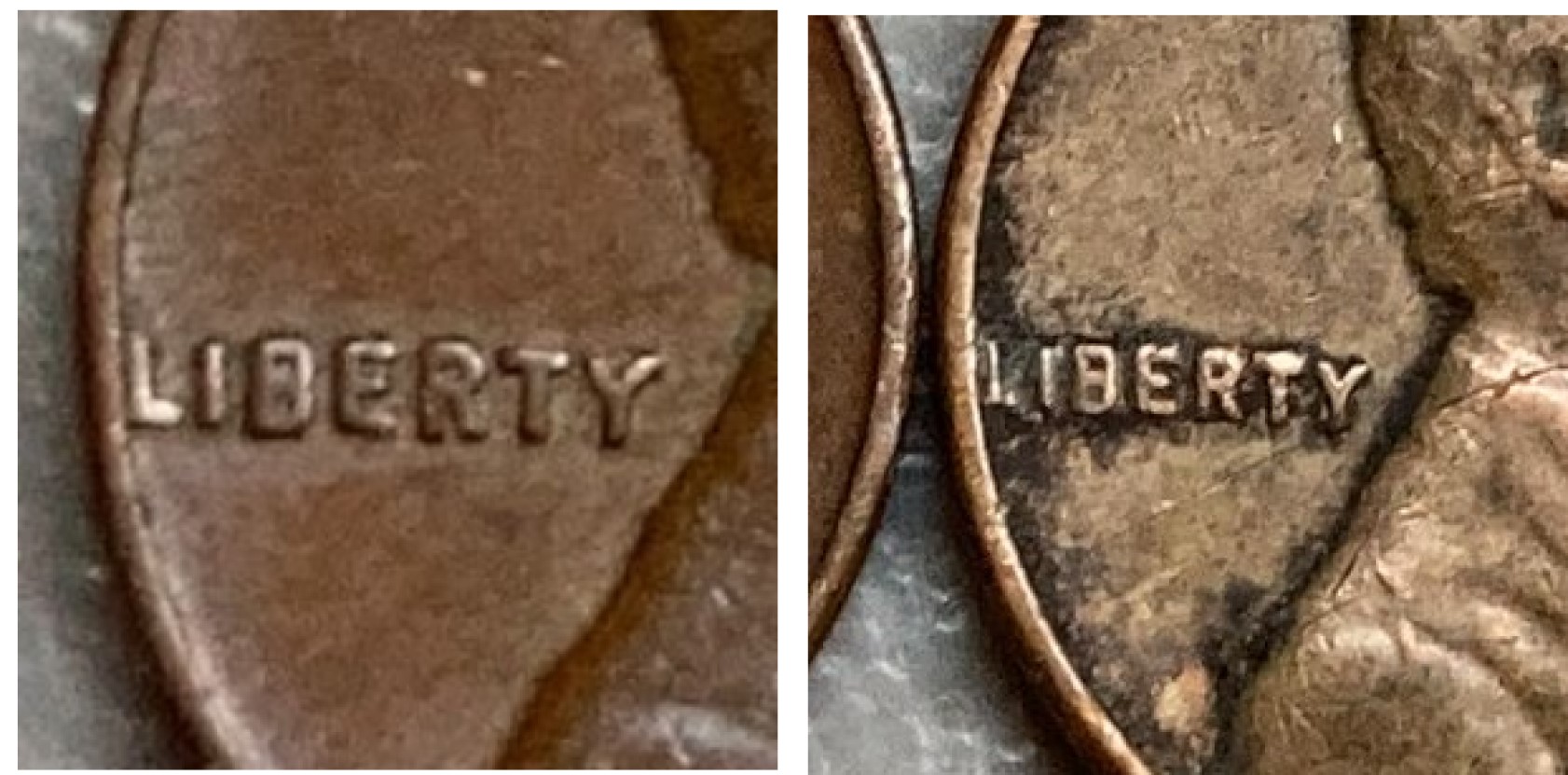 |
|
New Member
 United States
5 Posts |
I hope this helps. Can't really do much with my phone.  |
|
Moderator
United States
97576 Posts |
with Scuba1 on the 'Y' being displaced. I think he gives a good explanation for what we are seeing on this coin. |
|
Bedrock of the Community
United States
10635 Posts |
Your "Y" took a hit which knocked it slightly out of place. Simply post mint damage ( PMD), no premium I'm afraid.  to the CCF!  |
|
Pillar of the Community
United States
7068 Posts |
IMO...the RT of Liberty has taken an upward blow making the Y look lower....keep looking to CCF good luck on future finds, have fun and keep asking when in need.... |
|
Pillar of the Community
Canada
6244 Posts |
I crop the image and analyse. Greasy Fingers was right. The line you take always between "B" and end of "Y"  Edited by silviosi
03/18/2021 01:49 am
|
|
New Member
United States
5 Posts |
Did the I in 'In God' get knocked down a bit too?
|
|
New Member
United States
5 Posts |
Thank you to everyone that took a look at my coin! I'm learning lots!
|
|
Pillar of the Community
Canada
6244 Posts |
no to @ AmateurCoinGuy. In general for those years the I or one (1) was not well center or smaller.
|
|
Bedrock of the Community
United States
19213 Posts |
I'm thinking the top of T in LIBERTY was hit and moved metal north, making the T look slightly taller. Then, the base of Y took a hit which pushed a little metal south. Net effect caused the Y to appear lower.
Not that it matters, the coin appears to have been cleaned at some point. Fun.
|
|
Bedrock of the Community
United States
62064 Posts |
The hit to the top of the 'T', makes it look taller and the 'Y' is lower on all of the coins. So the contact mark on the 'T' makes it look too low.
|
|
Bedrock of the Community
United States
94367 Posts |
Makes "cents" to me. to the CCF! |
|
Moderator
United States
189462 Posts |
to the Community! |
|
Page 2 of 2
|
Replies: 17 / Views: 4,025 |
Page 2 of 2
|


